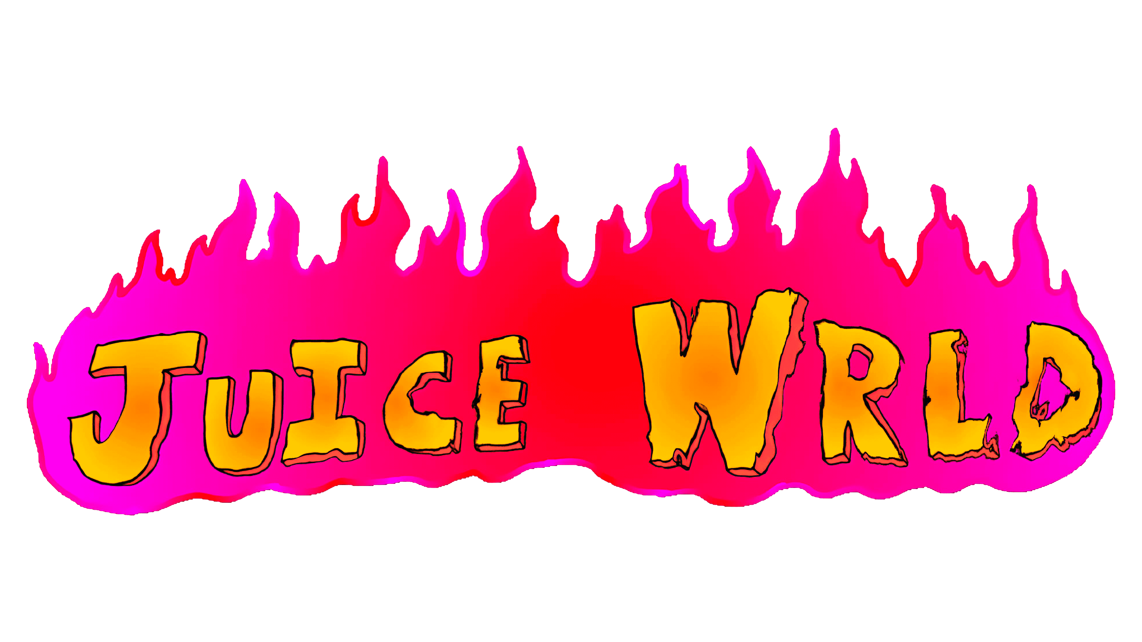
Juice WRLD Logo
Jarad Higgins (aka Juice WRLD) was an American performer and music creator who mostly produced rap songs. Despite the prohibitions of a conservative Christian mother, he has been fond of rap culture since childhood. In his large family, his brothers instilled in him a love for Gucci Mane, Lil Wayne, and other artists. His singing career lasted from 2015 until 2019 when an untimely death ended his career. He’s considered one of the most influential American rap artists of the mid-2010s, in large part due to his song “Lucid Dreams”.
Meaning and History
Jared Anthony Higgins was born in 1998 in Chicago. He published his first track on SoundCloud in 2015 under the pseudonym JuiceTheKidd. At the age of 19, he released the song “Lucid Dreams”, which became his biggest hit. In early 2018, label giant Interscope signed a $3 million deal with him. Goodbye & Good Riddance was released in May and is currently 7th on Billboard. His “Lucid Dreams” is in the top three, with two more in the top 100. His pseudonym appeared in the title of the film “Juice” with the participation of the rapper he loved to listen to. The second portion appeared when Jared felt that Juice sounds too simple for a concert and added a cooler word.
What is Juice WRLD?
Juice WRLD is one of the youngest hip-hop artists. Music has always been part of his life as he learned to play the piano when he was only four years old. At school, Jared became interested in rock and pop music and began to play the guitar and drums. He had an amazing and generally happy career as a musician and managed to release three full-length albums.
2015 – 2019
The official logo was a wordmark of the rapper written using mismatched capital letters. It is obvious that all the uneven lines and different heights of the letter were made on purpose. The coloring of letters is a gradient of yellow and orange. They have a thin, wiggly outline that looks like it is a pencil drawing. The other part of the logo is a flame that serves as the background for the name. It is a gradient of neon pink flame with a red in the middle. It made the logo look more dramatic. The uneven edge of the letters combined with the flame makes it seem that the flame either burned the letters or they are partially hidden behind it. Overall, there can be a lot of meaning hidden behind the details of the logo that the creator wanted to illustrate to the fans of the hip-hop artist.
Font and Color
The logo uses bright colors – pink, red, yellow, and orange. Such colors and the fact that one color gradually blends with another can be traced to the use of drugs by the artist and the fact that he freely talked about this topic in his songs. The letters are handwritten and have a 3D look thanks to the double outline on some sides. The outline is done using a thin black line that is very uneven, making it look as if the letters caught on fire.


