Julius Meinl Logo
Julius Meinl is a prominent Austrian producer of coffee, tea and other tea-time snacks and beverages made for afternoon consumption. In fact, it’s one of the oldest coffee manufacturers in Austria, at least on an industrial scale. Their history dates back to as early as 1862.
Meaning and History
The business was opened in 1862 by one Julius Meinl, who incidentally gave the name to this company (and to all of his direct male descendants, interestingly enough). This makes the company amongst the first businesses to produce and sell roasted coffee on a massive scale.
1924 – 2004
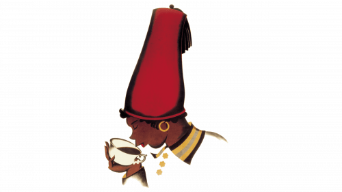
The logo introduced in 1924 depicted a realistically drawn dark-skinned boy with a tall red fez hat (referring to the Turkey – the country that popularized the drink for the Europeans). On the logo, the boy is drinking the coffee out of a cup he holds in his left hand.
The logo is very details, and there are many more nuances to the boy’s appearance. That’s why the logo often had to be simplified to be displayed on the labels.
2004 – today
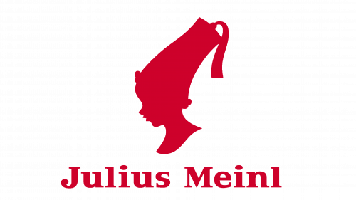
The 2004 redesign saw the boy turn into a red silhouette, effectively removing any clear traces of nationality from him. His shape mostly stayed the same, although he doesn’t drink the coffee anymore, but rather looks straight.
Emblem and Symbol
Before, you would often see the dark-skinned boy simplified for affordability purposes. They often removed the clothing details or made the coloring simpler. At the same time, there was a common yellow background added to the logo so that the forms and colors could stand out in contrast.


