Jurassic Park Logo
Jurassic is a large media franchise that includes several movies, novels, as well as many other forms of entertainment. It is based off the book published in the 1990 that tells a story about a failed amusement park with live dinosaurs in it. The whole shtick is that people keep trying to tame them but fail miserably.
Meaning and History
![]()
The novel was published in 1990, and in the same year Universal bought the rights to make a move out of it. 3 years later, the movie came out and became an instant classic. The franchise then entered a less successful age, but it’s still enjoyable to watch, even though they are obviously milking the idea at this point.
1993 – 1997
![]()
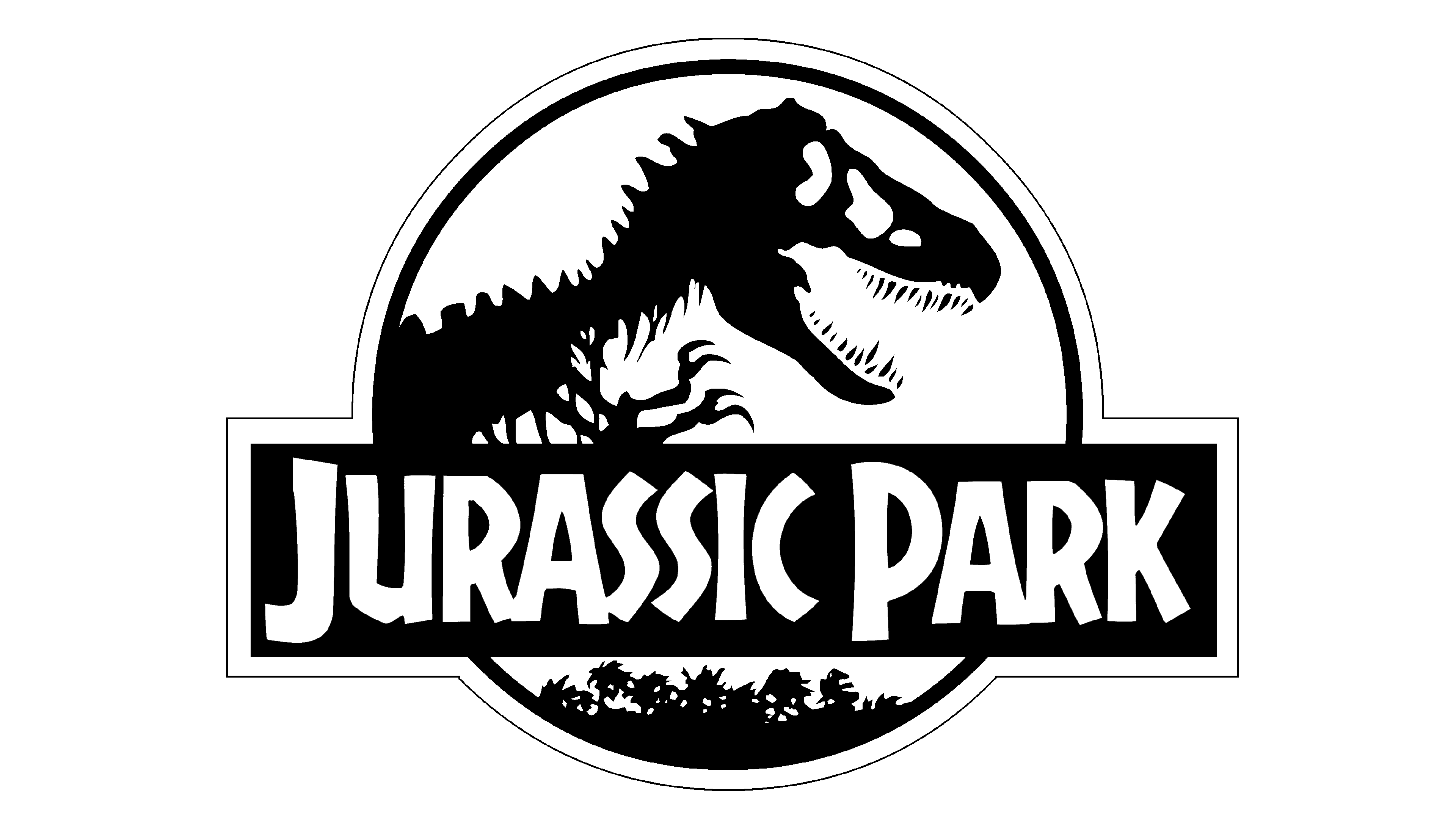
The first movie used this logo for most purposes. It’s a red circle with a black silhouette of a tyrannosaurus’ skeleton depicted on it. In the lower half of the circle is a black rectangular plaque with the words ‘JURASSIC PARK’ written in uneven white letters with thin streaks of red in them – styled as bones, obviously.
They also often outlined it in thick yellow.
1997 – 2001
![]()
The adaptation of the second book came out 4 years later. This one was given a logo that was basically built on the previous emblem. It was the same emblem, but with several additions.
Firstly, they put cracks all over the logo to highlight increased desperation in the film. Secondly, the plaque now read ‘THE LOST WORLD’ and then ‘JURASSIC PARK’ (below and smaller). The design was pretty much the same.
In addition to the yellow frame, they also added a thick black layer of outline.
2001 – 2015
![]()
The logo for Jurassic Park III was a bit different. They added volume to everything, which meant there was some texture and shading on the logo now. The black tyrannosaurus was replaced by a metal raptor with a longer snout and scarier features. Where the bottom of the circle featured jungle before, it also featured pterodactyls now.
The plaque was also metallic, but the text was the same design. It now read ‘JURASSIC PARK III’, where the number was just three consecutive claw marks.
The yellow outline was also replaced by metal, but the black additional layer persisted.
2015 – 2018
![]()
For the movie Jurassic World that came out 14 years later, they updated the concept just a bit. The volume and shading were even more prominent now, but almost all details migrated from the very first logo.
However, this time all the black details were metal grey with multi-layered texture. The letters stayed the same, but they were also pushed forwards a bit. And it obviously said ‘WORLD’ and not ‘PARK’ now.
The background noticeably changed from universally red to blue with additional lighting and shades in places.
2018 – 2022
![]()
Jurassic World: Fallen Kingdom was almost completely identical to its prequel’s emblem. This time, however, the background switched from blue to grey.
2022 – Today
![]()
In June 2022, the United States witnessed the release of Jurassic World: Dominion, marking the culmination of the dinosaur trilogy and a fitting conclusion to the Jurassic Park franchise. As the science-fiction action movie hit the screens, it became evident that its logo featured the iconic depiction of the upper portion of a Tyrannosaurus Rex skeleton: the head, neck, and forelimbs. This very illustration had its origins in the book cover designed by Chip Kidd in 1990, drawing inspiration from the works of renowned American paleontologist Henry Fairfield Osborn.
Contemporary designers reimagined the emblem, introducing a fresh color scheme. Instead of the previous gray, blue, or red hues, it now boasted a vivid yellow shade, accentuated by an orange gradient at the edges. The central area was the brightest, creating the illusion of backlighting. This palette rendered the circular base reminiscent of a fragment of amber, with rough, chipped edges. In the center, the silhouette of a Tyrannosaurus Rex faced left, displaying a mottled orange-brown coloration with dark and light accents. True to tradition, the artists meticulously detailed every bone, including the vertebrae, ribs, skull, and jaws, while sharp teeth and claws were portrayed with precision.
Interestingly, the creators of Jurassic World: Dominion paid homage to the iconic emblem within the movie itself. An Easter egg for fans, it appears towards the film’s conclusion as the T-Rex prepares to engage in battle with the Giganotosaurus. At a certain moment, the T-Rex passes by a ring-shaped fountain, revealing its profile in a manner reminiscent of the iconic Jurassic Park logo.
Emblem and Symbol
There were also additional emblem for spin-offs and other media. For instance, there is a show that started in 2020 on TV called ‘Jurassic World: Camp Cretaceous’. Its logo is basically just the usual Jurassic Park logo but made from wood + the show name beneath it in the same writing style but with orange tint to it.
When did Chip Kidd make the Jurassic Park logo?
The original version of the Jurassic Park logo was introduced by Chip Kidd in 1990, a few months after the artist started working on it. However, the in-house team of designers had to work on the badge for a bit more, before it was officially adopted and debuted in 1993.
Who drew the Jurassic Park logo?
The iconic Jurassic Park logo, introduced at the beginning of the 1990s, was created by a young American artist Chip Kidd, and slightly refined by the designers from the Universal Pictures team, to look more confident and intense on the tv screen.
What dinosaur is in the Jurassic Park logo?
The dinosaur on the iconic Jurassic Park logo is a huge and dangerous Tyrannosaurus Rex, one of the best-known dinosaurs, famous for its size and aggressive behavior.
What are the Jurassic Park colors?
The dark and dramatic badge of the Jurassic park franchise is executed in a black and red color palette with white and yellow elements used to make the image more readable and distinctive.


