Lidl Logo
Lidl is a global discount supermarket chain headquartered in Germany. Known for its cost-effective offerings, Lidl operates over 11,000 stores across Europe and the US. Focusing primarily on grocery items, the brand also ventures into household goods and apparel. Part of the Schwarz Group, it’s one of Europe’s leading grocery retailers. Its strong presence spans from its home market, Germany, to Eastern Europe and recently, a growing footprint in the US. The company emphasizes sustainability and efficient operations to keep prices competitive. Owned by Dieter Schwarz, Lidl continues to expand its market reach.
Meaning and history
Lidl, founded in 1930 by Josef Schwarz in Germany, began as a fruit wholesaler. By the 1970s, under Dieter Schwarz, Josef’s son, the company pivoted to the supermarket sector, inaugurating the first Lidl store. Inspired by the Aldi concept, Lidl expanded rapidly in Germany.
During the 1990s, Lidl started its European expansion, entering markets like the UK and France. As the years progressed, its presence spanned across most of Europe. Each market entry was strategic, often challenging established retailers with its aggressive pricing.
The 21st century saw Lidl delving into new areas like online shopping and tapping into the US market in 2017, creating waves in its grocery sector.
Ownership remained consistent within the Schwarz family. Dieter Schwarz, instrumental in Lidl’s growth, still retains ownership. The company’s ethos revolves around efficient operations, enabling it to offer quality products at competitive prices. Throughout its journey, Lidl has transformed from a small wholesaler to a global supermarket giant, retaining its reputation for affordability and quality.
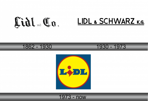
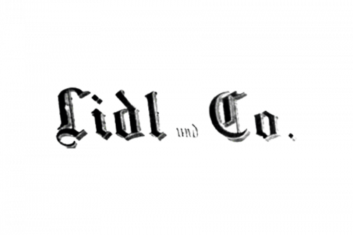
1862 – 1930
This emblem showcases a script rendered in a luxurious traditional typeface with hints of gothic nuances. Beyond the distinct “Lidl und Co.” phrasing in German, the logo exudes sophistication and refinement. Dominantly colored in timeless black—a classic pick for enduring brand identities—it’s complemented by shades of charcoal. This subtle gradient imparts depth, giving the lettering a tactile, layered feel. The combination of the typeface and color palette crafts an image that stands out, capturing attention while paying homage to classic design principles. The choice of these elements speaks to the brand’s dedication to blending tradition with modern elegance.
1930 – 1973
Over time, the firm opted for a streamlined emblem. Crafted primarily in a deep charcoal hue, the typeface echoed the characteristics of Mensionery Extra Black by Creative Fabrica. The rebranded title, Lidl & Schwarz K.G., signified the company’s growth and broader horizons. A solid line, matching the lettering’s weight, underscored the entire phrase. This element not only provided a sense of foundation but also elevated the design, infusing it with an aura of significance. The updated visual identity skillfully blended simplicity with a hint of prominence, reflecting the evolving ambitions of the organization. The minimalist approach allowed the brand’s essence to shine, emphasizing its expanding influence in the market.
1973 – Today
Established in 1930, Lidl chose distinctive corporate hues – a mix of blue, yellow, and red – representing trustworthiness, warmth, and steadfastness.
From its inception, the brand’s emblem was forged, a design that remains consistent even today. The foundation showcases a blue square, mirroring unwavering quality, stability, and trust. Nestled within is a yellow orb bordered in red, an emblematic nod to Lidl’s commitment and amicability. Dominating the core is LIDL’s insignia, boldly articulated in shades of blue and red. A tilted lowercase ‘i’ stands out, its slant rendering it prominently amongst its counterparts. This imaginative flair in design doesn’t just intrigue; it captivates.
This vibrant and recognizable logo not only instantaneously links to the brand but is also lauded by industry connoisseurs for its innate ability to instill trust and kindle a shopping interest among consumers.
