Macy’s Logo
Macy’s is one of the largest and most popular department stores not only in the US but also in the world. It has hundreds of stores and is one of the most popular in the United States. With huge sales, big discounts and a truly huge range of products from all directions, its stores are always crowded. Macy’s online store presents almost the same range of goods as in traditional outlets.
Meaning and History
The history of Macy’s began in 1858 with the advent of a small clothing store in New York, at the intersection of 14th Street and 6th Avenue. The owner of the store, Roland Hussey Macy, gradually gained popularity by introducing several new for that time sales approaches. On the first day, the store earned only $11.06, but by the end of the first year, Macy’s revenue was $85,000, and by 1924 Macy’s in New York became the largest store in the world.
What is Macy’s?
Macy’s is a one-stop shop with a huge selection of quality products across a variety of categories. Macy’s huge assortment, as well as the talent to sell the best brands at the lowest prices, is a legend in American retail. The legendary chain of the store is present online and beckons with its great offers.
1920 – 1932
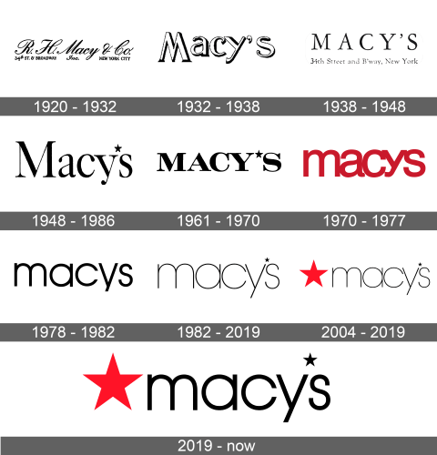
The first logo of the Macy’s stores looked very much like many other logos during that time. It is cursive writing that looks like it was written with a quill pen. The wordmark had an abbreviation of the founder’s name followed by Macy & Co. The second line, which had smaller font, had the address of the store aligned to the left, “Inc.” in the center, and “New York City” on the right end. It was a truly elegant logo.
1932 – 1938
The next logo was short and simply said “Macy’s”. The word was white with a black shadow, which made it seem that they are three-dimensional. Letter “M” looked like an inverted “W”, while the remaining letters, written using serif typeface, are aligned in such a way that “M” is stretched above and below.
1938 – 1948
An updated version of the logo also said “Macy’s”, but all the letters were capitalized and of the same size. Under the name of the company, an address line was added back to the logo. It used the same font style but a smaller font size made it possible to match the length of both lines.
1948 – 1986
The logo was updated one more time. It used a very similar font, including black color, as the previous logo. This time, only the first letter was capitalized, and instead of the apostrophe before the “S”, the logo had a now-familiar star. It was small with five points and set above the letters.
1961 – 1970
After some time, the logo got transformed. All the letters were now uppercase and the same height. The same font and color were preserved, but the letters were now much shorter and thicker. The star got lowered between “Y” and “S”.
1970 – 1977
The Macy’s logo was fully redesigned in 1970 and featured a bold red color. It still was just the company’s name, but it was written in lowercase letters and lost the apostrophe. The letters were printed very close to each other, so each was touching the other at least in one spot.
1978 – 1982
The black color was used once again to write the word “Macy’s”. Although the letters were still lowercase, the typeface was changed. The letters now looked thin and stylish. They were the same height, except for “Y”, which extended a little lower than the other letter. The “S” looked narrow in comparison to all the other letters. There was no star or apostrophe just like in the previous design. An alternate version, though, did use an apostrophe and had the first letter capitalized.
1982 – 2019
An even more minimalistic version was introduced in 1982 and was used alongside the other logo. The letters looked even more delicate. A tiny star has appeared in the logo and was placed above the letters. In an alternate version, a thin apostrophe was used instead and although there was more space between the “Y” and the “S” and letters in general, it was positioned above the letters and not between. Overall, the emblem looked very elegant.
2004 – 2019
The red was brought back, but now it was used to color a five-point star that was drawn to the left of the wordmark. The bottom of the star and wordmark have lined up, but the top point was rising above it. The wordmark itself has not changed a bit, which made the company’s logo very recognizable and preserved that stylish feel. In some cases, the star was positioned above the wordmark and was almost the same width as the word itself.
2019 – Today
The logo introduced back in 2004 has not changed much. The only difference was a slightly bigger star that was used instead of an apostrophe and a thicker, bolder font.


