Lincoln Logo
The history of the Lincoln brand is an example of the American dream coming true. For more than 100 years, the brand has been the representation of wealth, luxury, and prosperity. From the early days, only high-end cars equipped with 8 and 12-cylinder engines were produced under the Lincoln brand. Each model’s aesthetic has improved through time, its interior has been supplemented with contemporary technology, and its technical specifications have been enhanced.
Meaning and History
Henry Leland launched the new business in 1917. The Lincoln brand was initially only used to make V8 engines for military aircraft. A comparable engine was put in Henry’s Lincoln V8 automobile in 1920. The model was perfect, so Henry and his son felt it was time to create the Lincoln Motor Car Company of Delaware, a manufacturer of automobiles. The American president was honored with a firm name. Henry Ford bought the company in 1922, as Leland had financial problems after trying to build premium cars. The Lincoln Motor Company is still Ford’s luxury division.
What is Lincoln?
The American brand Lincoln specializes in the production of luxury cars, crossovers, and SUVs. The main sales countries for Lincoln are the United States and China, although it is also sold in other Asian countries, Canada, and Mexico.
1917 – 1922
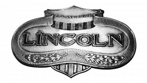
A silver medallion with delicate details, which included plant leaves at the bottom and multiple lines around it. The “Lincoln” inscription was done in bold, serif font of black color and featured closely spaced all-capital letters. The logo had a 3D appearance and was used by the brand until it was purchased by Ford.
1922 – 1939
The new version was based a lot on the original version but used a shape that looked more like an oval as the base and darker colors. Besides the brand name, which was printed using a very similar font, the company added “Ford” at the top and “Detroit” at the bottom. Although there were no intricate designs, the logo looked sophisticated and strong.
1939 – 1954
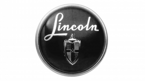
The new logo looks very moody, dark, and powerful. It is represented by a dark purple circle with a lighter border that gives it some volume. A coat of arms was placed in the bottom half, while beautiful cursive writing decorated the top portion of it. It was done in white to stand out against the dark background and symbolize perfection.
1954 – 1964
The emblem now looks much lighter and there is a pattern on the circle along with an additional brown border. The coat of arms now was done in color instead of black. This was a fresh, interesting spin on an emblem that was used by the brand for 15 years.
1964 – 1972
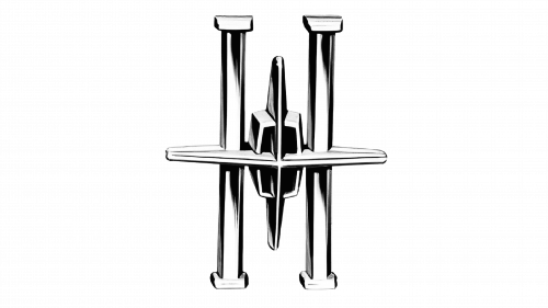
A completely new, futuristic design completely changed the brand image. A four-pointed star was held by two columns. The logo not only had volume but also featured a symmetry that added to the perfection of the emblem. It was done in silver with black accents and did not feature any inscriptions.
1972 – 2012
A minimalistic version of the emblem was designed in 1972. The star was just two lines crossing and getting thinner towards the ends. The two columns were replaced by a vertical rectangle with the vertical lines being slightly curved. Along with the simple lines of the brand name underneath, this was a stylish and iconic brand image for many years.
2012 – Today
Although the previous idea was preserved, there were several notable changes. First of all, the star emblem was placed on the left. It got a more rounded form and the star ends were no longer going behind the frame. Instead, it had a thin white outline which made it look as if it was placed on top of the frame. The name was printed in two lines as it was now expanded to “The Lincoln Motor Company”. It was done using a bolder font. A vertical line ran between the two elements of the logo.
Font and Color
The silver, which was used in several logos, is meant to stand for elegance and luxury. There was also a lot of black, which was the only color since 1972. In addition, there was a 25-year period during which the company used purple in its logo as main color. It has always been associated with royalty and the upper class. Until 1939, the company went for bold, serif font and all-capital lettering. Then, the name was printed using delicate, cursive writing. It was finally replaced by a simple, stylish, sans-serif font.


