Line Logo
LINE Corporation, currently under the ownership of Z Holdings, a subsidiary of SoftBank Corp., is at the forefront of the technology sector, predominantly specializing in app development and internet services. With its iconic messaging app, LINE, it dominates markets primarily in Asia, like Japan, Taiwan, Thailand, and Indonesia. The firm expands its horizons through various services like digital payment platforms and online advertising, aiming to diversify its offerings and fortify its presence in the ever-evolving digital landscape, addressing the multifaceted needs of its expansive user base.
Meaning and history
Originating as a disaster response solution, LINE Corporation evolved under the aegis of NHN Japan, a local subsidiary of South Korea’s NHN Corporation, post the 2011 Tōhoku earthquake. Launched in June 2011, LINE, the flagship messaging app, swiftly ascended to prominence, catering to a global user base. Subsequent to its initial success, in 2013, LINE Corporation became a separate entity from NHN Japan, asserting its distinct corporate identity. In July 2016, it marked a pivotal milestone, entering the stock market with listings on the NYSE and TSE.
Witnessing multifarious transitions, LINE persistently endeavored to diversify its services, introducing features like LINE Pay for digital transactions and venturing into AI and blockchain technology. 2020 marked a significant shift as LINE Corporation merged with Z Holdings, a subsidiary of SoftBank Corp., aiming at synergizing their technologies and resources to facilitate innovative digital solutions and fortify their footprint in the technology realm.
Throughout its journey, LINE has navigated through metamorphoses in ownership and strategic orientations, consistently striving to accentuate its services, fostering connectivity, and unveiling groundbreaking technological solutions, thereby maintaining its resonance in the dynamic digital world.
2011 – 2013
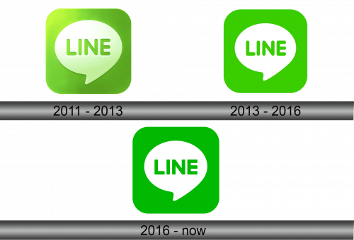
To create a logo that is visually appealing, straightforward, indicative of a distinct function, and memorable, the creators embraced geometric principles. They started with a square, moderating its four corners to mitigate its harshness, rendering it more fluid. Within this modified square, a white dialogue bubble is situated, reminiscent of those found in comic strips, subtly suggesting that the application is a conduit for user interaction and information exchange.
Positioned centrally within the dialogue bubble is the name of the internet service, articulated in bold, uniform, grotesque capital letters, emphasizing its clarity and prominence. The logo is also adorned with a lens flare, strategically positioned in the upper left segment. Additionally, the designers integrated a central gradient, juxtaposing a lighter shade in the middle with a surrounding green, enhancing its aesthetic appeal and visual coherence. This methodical design approach ensures the logo encapsulates the essence of communication while maintaining simplicity and visual harmony, an emblematic representation of interaction in the digital realm.
2013 – 2016
Following the reimagining, the symbol preserved its form, dimensions, element arrangement, and quantity, undergoing alterations solely in its color scheme. In this iteration, the designers omitted gradient transitions, reflections, and white highlights, opting for a stable color palette instead. Lime green emerged as the predominant hue, instilling the emblem with a renewed sense of contemporaneity and distinctiveness. This color imbues the logo with a fresh, modern vibe, enhancing its overall appeal and ensuring it remains a recognizable entity in the contemporary visual landscape, reflecting the brand’s commitment to staying relevant and aesthetically pleasing.
2016 – Today
In July 2016, modifications were subtly introduced by the designers, impacting not only the color scheme but also the textual element. The creators transitioned the color palette to more saturated tones, incorporating a deep variant of green. The previously sleek typeface was replaced with one possessing sharper angles, eliminating the curvature at the terminations of the letters. Consequently, the speech balloon manifests with enhanced clarity and precision. These nuanced changes, although minimal, contributed to refining the visual identity of the logo, emphasizing its distinctive elements and reinforcing its prominence in the brand’s representation.
