Lionsgate Logo
Lionsgate stands as a prominent film and television studio, recognized globally. Frank Giustra, a notable figure in the entertainment industry, founded it. The creation took place in Vancouver, Canada, marking its origins in a city known for its vibrant cultural scene. The studio came to life with a clear purpose: to produce and distribute compelling, innovative content across various media platforms. Lionsgate quickly distinguished itself through its unique storytelling and ability to connect with audiences worldwide.
Meaning and History
The journey of Lionsgate began in 1997, with Frank Giustra’s vision leading the way. It wasn’t long before the studio made significant strides, acquiring Trimark Holdings in 2000, a move that expanded its library and distribution capabilities. In 2003, Lionsgate further solidified its presence by purchasing Artisan Entertainment, thereby enlarging its footprint in the film and television landscape. These strategic acquisitions played a pivotal role in shaping Lionsgate into a powerhouse, known for its diverse and influential content. Over the years, the studio has maintained its commitment to creativity, often venturing into uncharted territories to tell stories that resonate.
What is Lionsgate?
Lionsgate is a leading film and television production company with a global reach. It specializes in creating and distributing a wide range of entertainment content. Known for its innovative storytelling, Lionsgate has produced numerous critically acclaimed movies and TV shows, earning a place in the hearts of audiences around the world.
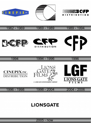
1962 – 1969
The logo presents a bold blue rectangular background with slanted edges. It showcases the word “CINEPIX” in striking yellow capital letters. The typeface is straightforward, clean, and sans-serif, exuding a professional yet dynamic vibe. Adjacent to “CINEPIX”, the word “INC.” appears in a much smaller scale, suggesting a formal corporate identity. The blue and yellow contrast sharply, ensuring the name commands attention and is memorable. The overall design is minimalist yet effective, encapsulating the company’s brand in a simple color palette and design.
1969 – 1989
This logo transforms the visual dynamic entirely. It features a bold, abstract design with a half-circle intersected by geometric shapes. The pattern within the semi-circle includes horizontal lines and dotted textures, offering visual depth. A sharp corner extends into a quadrilateral, with an inner stair-step pattern cascading downwards. This design departs from the straightforward text of its predecessor, embracing a more artistic and symbolic approach. The monochrome palette remains, ensuring the brand’s classic feel while venturing into more avant-garde territory. The composition is a thoughtful play of light and dark, solid and patterned, encapsulating a modernist aesthetic.
1989 – 1994
In this evolution, the logo shifts to a literal representation with the inclusion of “CFP” and “DISTRIBUTION” in bold, solid black letters. The text is straightforward and unembellished, conveying a direct and no-nonsense image. The addition of a unique emblem, consisting of horizontal lines and a stylized flower-like figure, introduces a graphic element. This symbol is suggestive of both motion and radiance, perhaps hinting at the company’s role in dynamic film distribution. The overall design represents a melding of the textual with the graphical, creating a more complex and layered visual identity. The stark black on white color scheme maintains the strong contrast seen in previous iterations.
1994
This logo is a monochromatic, rugged-textured design comprising four capitalized letters: C, F, and P. The lettering is bold and appears as if it were stamped or stenciled, giving a worn-out industrial look. The texture inside the letters mimics a sponge-like pattern or a wall roughened by heavy spackling. Each letter connects to its neighbor, suggesting cohesion or a link between the components they represent.
1994 – 1996
In this updated logo, the letters “CFP” are still bold and interconnected, but the texture within them is less pronounced, creating a cleaner appearance. Below these letters is the word “DISTRIBUTION” in a plain, sans-serif font that contrasts with the textured, uppercase letters above. This text is evenly spaced and unembellished, providing a stark, straightforward counterbalance to the stylized letters of the acronym above. The overall look is more streamlined and modern compared to the previous version.
1996
The logo transformation presents a classic serif font spelling out “CINEPIX INC.” above a horizontal line with “DISTRIBUTION” underneath. The design has shed its previous textured look for a clean, crisp finish. The letters are evenly spaced, exhibiting a formal and traditional aesthetic. The incorporation of “INC.” adds a corporate dimension, contrasting with the previously more abstract style. The entire design is more refined and aligns with conventional corporate branding, moving away from the edgy and artistic flair of its predecessor.
1996 – 1998
The logo shifts dramatically from a traditional textual representation to a bold, abstract design. It features the letters “CFP” merged into a cohesive, interlocking form. The ‘C’ and ‘P’ are designed to encircle and frame the ‘F’, which stands vertically at the center. The lines are thick, sharply cut, and entirely black, which contrasts with the previous logo’s more conventional typeface and inclusion of a company descriptor. This design is minimalist yet dynamic, with a focus on geometrical interplay rather than on readability or explicit messaging. It suggests innovation and modernity, emphasizing a stark departure from the traditional corporate image conveyed earlier.
1998 – 2004
This logo represents a significant artistic shift, embracing an elegant, stylized lion figure beside the text “LIONS GATE FILMS”. The lion is composed of swirls and stars, evoking a sense of motion and magic. Below, the text “A LIONS GATE ENTERTAINMENT COMPANY” grounds the logo, clarifying its corporate affiliation. This design contrasts with the previous logo’s textured look by offering a clear, mythical quality. The typography is classic, with strong serifs that add a formal touch. The overall effect is one of refinement and creativity, projecting the company’s cinematic focus and storytelling prowess.
1996 – 1998
Moving from the illustrative to the typographic, this logo emphasizes bold lettering with “LGF” prominently displayed. The abbreviation overshadows the full “LIONS GATE FILMS” text below, creating a hierarchy. The design is stark, leveraging only black and white, focusing on strong, sans-serif fonts for impact. The removal of the lion figure marks a pivot to a more modern, corporate aesthetic. This logo values simplicity and clarity, ensuring instant brand recognition through its assertive and unembellished text. The visual transition represents a shift towards minimalism in the brand’s identity.
2005 – Today
The logo has further embraced minimalism, now displaying “LIONSGATE” in a continuous, bold, sans-serif font. There’s a shift from acronym to full name, indicating a more straightforward brand representation. The uniformity in letter size and the absence of space between the words enhance readability and impact. This design decision suggests a seamless, unified brand identity, prioritizing simplicity and directness. The black on white color scheme remains, maintaining the stark contrast and visual punch of earlier designs. Gone are any additional elements or text, leaving a logo that’s crisp, modern, and assertive.


