Los Angeles Rams Logo
The year 1936 marks the time when a lawyer and businessman Mr. Marshman and football player Damon Wetzel created a new team. The latter also became the first coach of the football players. They are the only team in the league to have won championships in all three cities they played for. The Rams have won three NFL championships and are the only team to win championships from three different cities (Cleveland in 1945, Los Angeles in 1951, and St. Louis in 1999).
Meaning and History
This is a team with a rich past. During almost 100 years of its existence, the players have switched locations several times and returned to LA as their base in 2016. This team has surprised its fans multiple time, including when they painted the helmets in 1948. The worked was done by a fullback Fred Jerk, who worked during the off-season as an artist, painted ram’s horns on his team’s leather helmets.
What is Los Angeles Rams?
This is an American club that is based in California and plays football. The National League (NFL) is surely proud to have the team representing it. In 2016, team owner gave Los Angeles a chance to call this team their once more. The Rams began the 2017 season with new head coach Sean McVeigh.
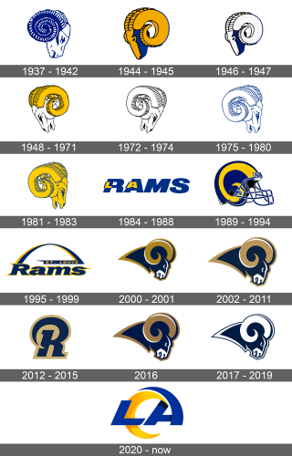
1937 – 1942
It was not hard to guess who the ram image belonged to. Facing right, the head on the logo was drawn very realistically, although it only used one shade of blue and white. The horns, which were predominantly blue, captured the attention and brought fear to opponents.
1944 – 1945
The war was over and a team started a new chapter with a new emblem. The ram was now facing left and the horns highlighted with yellow while black and blue were used for contours. The front of the head was also yellow, but the back half was blue.
1946 – 1947
The Rams were representing another city. Yet, the same old ram was standing behind the team, which showed their commitment and passion.
1948 – 1971
The logo was updated and acquired more details, including visible ears. The horns were pained gold, while the head was white. A black was used for contouring. Another noticeable feature was a ram’s mouth – it was open to show that the animal is taking a deep breath before a great attack.
1972 – 1974
Several years later, the team used the same logo but it left just the black contours. The white ram was switched to facing right again.
1975 – 1980
The team brought back the original colors and used blue for contours instead of black. The head is also not as bent anymore.
1981 – 1983
The Rams still used the same image of a ram for their logo. To make it more striking and reflect the energy of the team, the color yellow was used in combination with blue outlines.
1984 – 1988
The logo of the team was given a complete redesign. It was the big word “Rams” written in blue capital letters. Smaller letters “L” and “A”, were added on top of “R” and “A” in yellow color with a blue shadow. Against the white, the name of the team looked magnificent.
1989 – 1994
Another drastic change was made and the world saw a helmet instead of words or the ram. There were some details that were brought from the past. Besides the colors, the helmet had a horn drawn in yellow curving on the side. The logo was well thought-through and easy to associate with the team.
1995 – 1999
The team was now playing in a different city, which was reflected in its logo. It was a word “Rams” with an arch coming out of a capitalized “R”. A blue banner that was right under the other end of the arch had “St. Louis” written in yellow. The “Rams” and the arch were blue with a yellow shadow that added volume to these elements.
2000 – 2001
The ram image was brought back in the 2000s. It differed from what the team used previously but still reminded everyone who cared about the team about its origins. The animal had gold horns and an outline of the same color. The ram itself was deep blue color with white highlights.
2002 – 2011
The team has slightly adjusted the shade of the gold color used to print the emblem. The blue also did not look as dark anymore.
2012 – 2015
The horns and outline of the ram now had an even lighter shade of gold. This was done because the uniform of the NFL teams was supplied by Nike starting from the 2012 season. An alternate logo in the same blue and gold shades featured an “R” with a curve that had a noticeable hint of horns.
2016
As the LA saw its team again, the players kept the well-recognizable visual representation it has been using for over 10 years.
2017 – 2019
To mark a new era in its history, the colors were changed once more. Now, the team was using only deep blue and white. The shape of the animal has not changed. The word “Rams” with “Los Angeles” written in a smaller font right on top of it was used as a wordmark. It had the same colors.
2020 – Today
A more striking logo was developed for the team. It was “LA” written in blue. The letter “A” had the top curving to the left with a pointy end. A second yellow curve with orange shade, which looks like “C”, was added right under the “A”‘s curve and clearly was meant to represent a horn. It was a perfect representation of the team’s story with a modern spin to it.
