Marvel Comics Logo
Marvel was originally a brand that published a lot of superhero comic books. Their history dates back to 1939, although they’ve been rather more known for their cinematic universe. In fact, Marvel Cinematic Universe has become amongst the largest movie markets in the past decades.
Meaning and History
Back in the day, Marvel has been known under other names – such as Timely and Atlas. The reason why they stopped on ‘Marvel’ was a bit underwhelming. Basically, the guy who chose the name liked how it sounded, and that’s about it. There’s largely no deeper meaning buried inside.
1939 – 1951
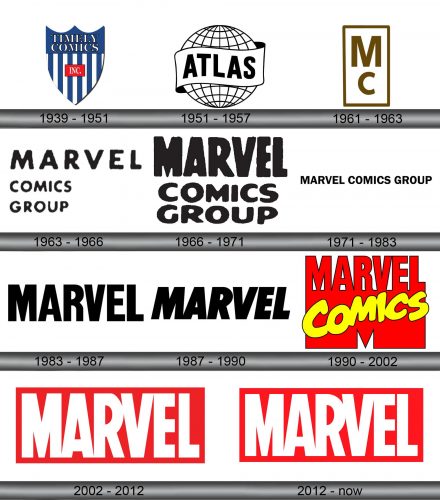
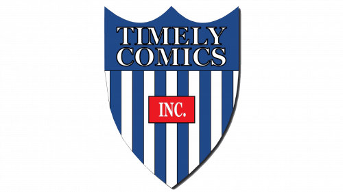
At first, the company was called ‘Timely Comics’ and their style was a bit different from what you’re used to for these brands. It was a shield (the usual type Americans use for their branding) colored in deep blue with some vertical white stripes down the lower two thirds of the thing.
Text-wise, there was a white company name written in serif on the top third outlined in black, and in the middle they put the red square with the little ‘INC.’ inscription inside.
1951 – 1957
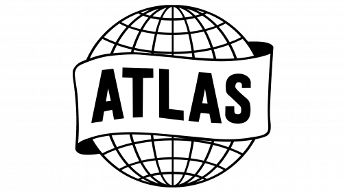
The second variant was when they renamed the company ‘Atlas’ for a few years. Basically, it was a picture of Globe covered in grids (all black and white), as well as a ribbon that flew around the orbit with the name ‘ATLAS’ on it in thick wavy letters.
1961 – 1963
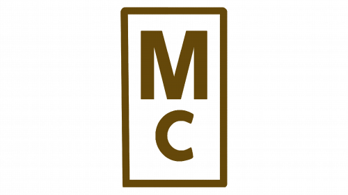
By this time, the brand has already been renamed ‘Marvel’, although this design was nothing like what we have today. It was just a white vertical rectangle with brownish green outline and two letters – big ‘M’ and smaller ‘C’ below it – in the same color. That stood for ‘Marvel Comics’.
1963 – 1966
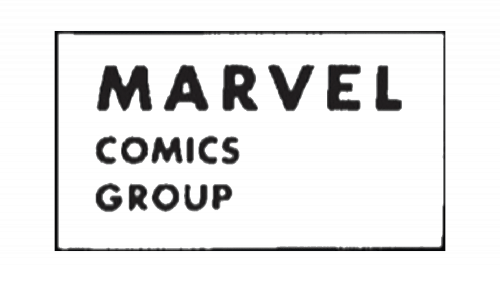
In 1963, they were officially known as ‘Marvel Comics Group’. This time, the general logo was purely text. The name of the company was written in plain yet fluid letters, each word was given its own line. The word ‘Marvel’ was rather bigger and had more space between the characters.
Usually, they would paint it black, but it’s not uncommon to encounter other colors.
1966 – 1971
They changed the concept a bit in 1966, as well as the font. That new style actually resembled the modern design very much. They’ve written the word ‘Marvel’ in tall bold letters with little interval between them. It was usually red and maybe surrounded by some superhero elements.
1971 – 1983
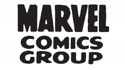
In 1971, they combined the concepts from 1963 and 1966. It was again a three-word logo with each word getting its own line. The lower words were a bit smaller and not as tall, but they weren’t scaled down as much as the 1963 design. The word ‘Marvel’, however, was just as it was in 1966, but mostly black.
You could sometimes see it painted red or green, but the main variant was always black.
1983 – 1987
This was a plainer approach. They simply took the now-standard three-layered logo and straightened it out. All the words were now on one level. The style of the letters was much like the 1966 style, but a bit different – plainer and with less fluidness.
1987 – 1990
This time they simply made the text a bit thicker and tilted it to the right, and that’s about it. Everything else was completely the same.
1990 – 2002
By 1990, the name has already changed to ‘Marvel Comics’. They reflected that on this logo. The designers simply took the 1983 design, painted it red and also added a large, very wide letter ‘M’ as a continuation below the main text. Then they’ve written ‘comics’ in a cartoony yellow type to remind you about their key purpose.
2002 – 2012
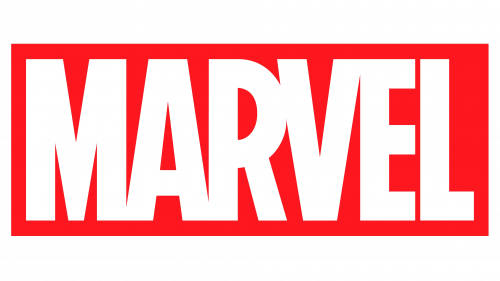
In 2002, they’ve come up with the same style they’re using even today. It was a red rectangle with the 1987 text design but with even less interval between the characters. The letters themselves were painted white, and were all in uppercase, as usual.
2012 – today
In 2012, they changed the coloring to a slightly brighter hue and changed the proportions of the letters and the rectangle shape just a bit.
Emblem and Symbol
Apart from the main office, Marvel has several subdivisions. ‘Studios’ is one of the prominent divisions – they are the ones making films. They, for instance, had the word ‘Studios’ attached to various parts of the logo since 2008. Now the word is in the same proportion and size sitting to the right of the main emblem but in black.
