Maybach Logo
The history of Maybach represents the birth and fall of one of the most iconic and expensive vehicle brands. Yes, the manufacturing of these vehicles has been discontinued since 2012 Maybach has always placed an emphasis on the dependability and premium class of its products and services. It will always be prized for its elegance, dependability, comfort, uniqueness, and a lot more. Maybach is undoubtedly a luxury vehicle. The most recent versions had stunning, exquisite designs and all the newest technologies. The brand image was always upheld, and the designers made an effort to make each new model worthy of the grandest and most pricey premium-class vehicle.
Meaning and History
Karl’s father Wilhelm Maybach, the company’s founder, was a significant player in the brand’s success. The development of small and light engines captured the interest of both Wilhelm Maybach and Gottlieb Daimler. Their sons tested the engine they built on a motor bicycle in the fall of 1885. They then used it to power a four-wheeled vehicle, a boat, and other vehicles. Only a year after gaining independence in 1918, Maybach Motorenbau GmbH developed its first automobile. Almost a century later, sales went down as Daimler AG’s efforts to revitalize the legendary brand were unsuccessful. As a result, this brand’s production came to an end at the end of 2011.
What is Maybach?
After 2011, production ceased for the remarkably exclusive and premium vehicles that Maybach rightfully belonged to. In the early 2020s, new Maybach models were developed. All fans of this legendary, luxurious, and classy brand are surely looking forward to what the future has to bring.
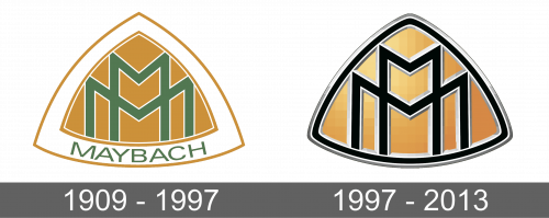
1909 – 1997
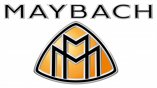
The emblem resembled a triangle pointing upwards, but with slightly arched lines. It had a wide white border that was outlined by thinner orange ones. In the center, two overlapping “M”s had a calm shade of green with a thin white outline. They had different widths and heights. All their ends reached the borders of the main triangle. The orange color used to fill the center triangle and the border is quite unique, which set the emblem apart from its competitors. This color is filled with energy and excitement, the feelings that definitely arose when seeing automobiles of this brand. At the bottom of the white border, the emblem spelled out the full name using a basic, sans-serif font and title case letters of a green color.
1997 – 2013
The color palette was the main update. It was now black, white, and orangish-yellow. There was also no “Maybach” inscription and the o325uter border. Instead, the border was about the same thickness as the letters. To make it look powerful, the creators made all the white lines almost match the thickness of the black lines. These modifications also created a more cohesive feel.
Font and Color
The custom font used for the inscriptions in the brand image looks very similar to Radiate Sans Regular Semi Expanded. An orange color is closely associated with this brand as it was used in both versions of the logo. It adds a feeling of energy and confidence. There is also white. In the original version, the designers used grassy green, which was later replaced by black. This added a classic, formal touch. The previously used green might have symbolized growth and safety, while balancing out the orange.
