Michelob Ultra Logo
Michelob Ultra is definitely a newcomer to Anheuser-Busch’s range of light lagers. It dominates the market in the light beer category with low alcohol and calorie content aimed at people leading an active lifestyle. The Michelob Ultra Pure Gold brand became a new addition to the popular Michelob Ultra beer line. This variety is claimed to be the company’s first light beer made from organic grains. Anheuser-Busch is the official beer sponsor of the NBA and WNBA. Moreover, the brand signed a partnership with the Formula 1 team Williams Racing for the 2023 season, which further supports its strong standing.
Meaning and History
Michelob began brewing in 1896 at the Anheuser-Busch brewery as a cask beer for connoisseurs. Initially, Michelob’s share of the production volume of the entire Anheuser-Busch product range was extremely small. Since the 70s, the line of products under the Michelob brand has been expanding. Michelob Ultra was introduced to the North American market in 2002. In 2018, the company released Michelob Ultra Pure Gold, an organic version of a light lager. A little over a year later, the brand released Michelob Ultra Infusions, a new version of the beer with an exotic fruit flavor. Finally, in 2019, the company also launched Michelob Ultra Amber Max, a gluten-free version of the beer. The name of the beer comes from the small village of Měcholupy (Czechia).
What is Michelob Ultra?
Michelob Ultra is the fastest-growing beer brand in the United States. It is one of the best light beers in the United States, which has long been popular with consumers. The company currently holds the third position among US beer brands. This top brewer pledges to give only the best to beer fans who trust their brand. They carefully choose the ingredients for Michelob Ultra.
2002 – 2020
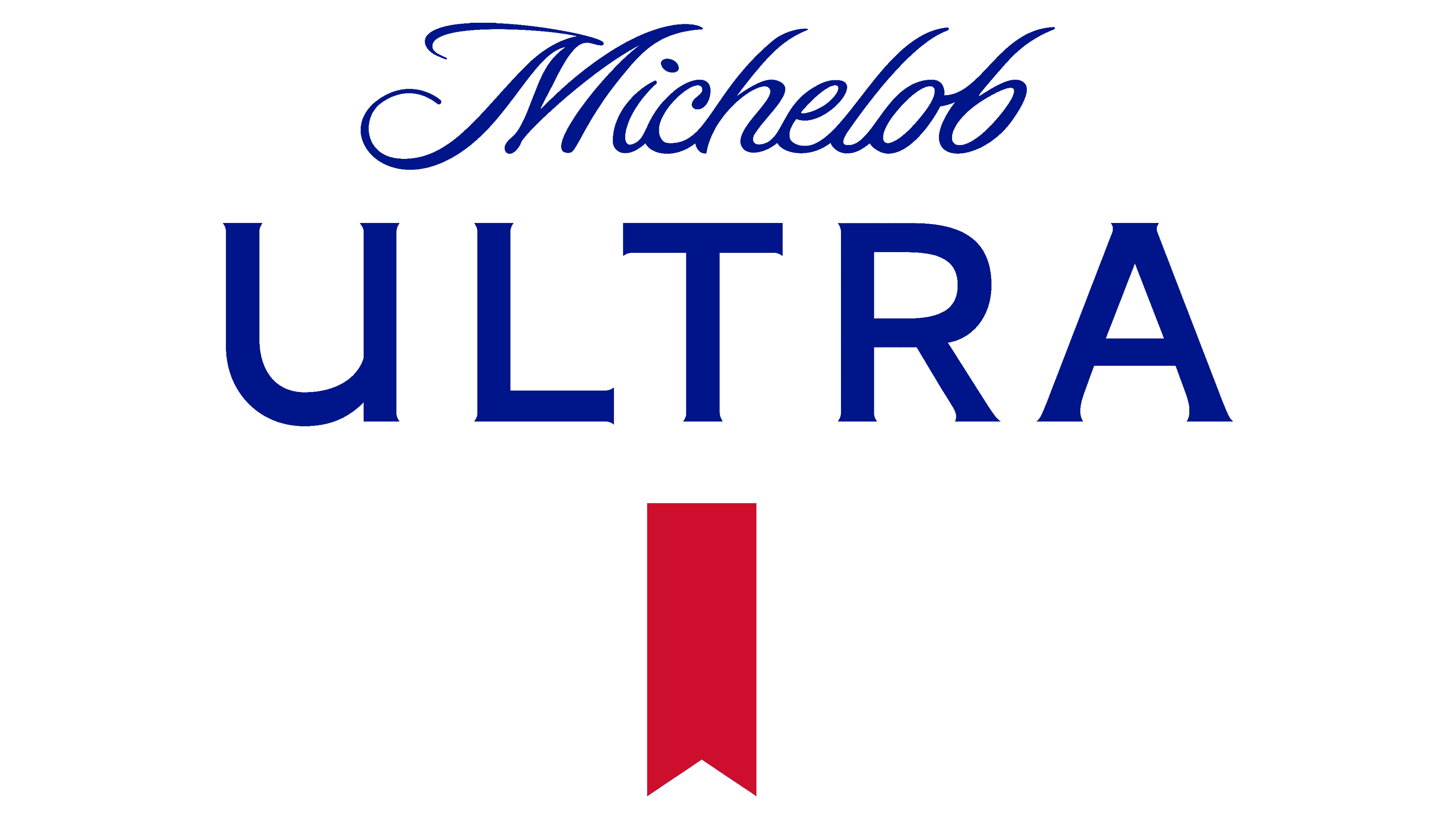
The brand name was not only split between two lines, in this logo but also divided by two different fonts. The upper line, which had “Michelob”, was printed using a very elegant and delicate cursive font with beautiful curves. The lower line used a contrasting font that featured thick lines, all uppercase letters of a significantly larger size, and bracketed slab serifs that added a touch of sophistication. The inscriptions were done using a rich blue color. A contrasting, bright detail was added at the bottom of the logo in the form of a pennant. It was split in half by lighter and darker shades of red, which created an illusion of perspective.
2020 – Today
The fonts used for the updated logo in 2020 look very similar to the original ones. The elegant and classy cursive font differed mainly in the look of the letter “M”, which had slightly different decorative curves. When it comes to the “Ultra” portion of the name, it was still printed using a bold font with all uppercase letters. The bracketed slab serifs were replaced by more delicate flare serifs. The new font also had no white highlight lines featured in the earlier versions. Another modification included a solid, darker red for the pennant. The logo looks more stylish and modern thanks to the fact that there are less distracting details.
Font and Color
The original logo of the brand featured a cursive font called Sloop ScriptBoldThree for the “Michelob” line. The second line was done using a bracketed slab font similar to Carrig Display but with the addition of white, thin lines in the center of each stroke. In 2020, the cursive font was replaced by a font that resembles Sloop Script by Lipton Letter Design, while the “Ultra” portion of the brand name was printed using Snag Medium font or Recognition Bold font with the addition of barely noticeable flare serifs.
The blue color dominates the logo. It is typically used by companies to create a strong, confident, and trustworthy brand image. The red color adds a splash of passion and excitement and even dares the consumer to try the drink. It is a perfect bright detail that captures the attention.


