Microsoft Bing Logo
Bing, owned by Microsoft, is a web search engine established in 2009. It serves as a multifaceted platform offering search services for web pages, videos, images, and maps. Bing is renowned for its user-friendly interface and innovative features such as Video homepage and Image Search. It operates globally, striving to deliver precise and relevant search results to users. It’s a prominent player in the search engine market, positioning itself as a substantial competitor to Google, with a focus on integrating AI to enhance search experiences.
Meaning and history
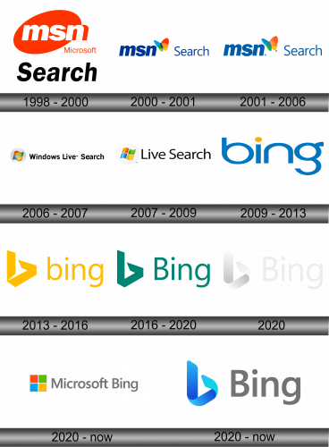
Microsoft Bing, initially known as MSN Search, started its journey as a search engine in 1998. It underwent a series of rebrands, becoming Windows Live Search and later, Live Search. In 2009, it adopted the name Bing, marking a significant rebranding phase. Bing introduced a concise and visually impactful logo, reflecting the new direction and focus. It has since been integrating Microsoft’s Fluent Design language to create user-friendly interfaces.
Bing has consistently evolved, adapting to the dynamic digital environment, and innovating its search features. In 2020, it tested a Fluent Design-influenced logo and introduced a modified version in 2023 to coincide with the launch of Bing Chat and the “New Bing” website. Despite the numerous transformations and design enhancements, Bing remains a crucial component in Microsoft’s extensive ecosystem, pushing the boundaries in the search engine market. The journey of Microsoft Bing exemplifies a blend of evolution, innovation, and a sustained commitment to delivering refined search experiences.
1998 – 2000
The inaugural emblem for the software, unveiled in 1998, featured a bifurcated design: it boasted a vibrant red and pristine white symbol, hosting the diminutive “MSN” inscription nestled within a robust, horizontally-expanded oval, underscored by the subtly bold, medium-weight, sans-serif depiction of “Microsoft,” formatted in title case. This distinctive badge was situated atop a background of immaculate white, overshadowing the prominently bold and slanted “Search,” delineated in jet black.
This pioneering design communicated a synthesis of dynamic energy and precise functionality, with the vivid red capturing attention and the uncomplicated, streamlined typography emphasizing clarity and accessibility. The dual representation of the brand, through both the “MSN” and “Microsoft” inscriptions, established a clear connection with the parent company, subtly reinforcing the reliability and innovative spirit of the software. The italicization of “Search” offered a hint of motion and urgency, reflecting the software’s swift and efficient search capabilities, while the overall balance and composition of the elements conveyed a sense of stability and trustworthiness, foundational pillars for the burgeoning digital platform in its initial stages.
2000 – 2001
In the era when this distinctive design was embraced, the service was known as MSN Search. The ‘MSN’ segment was characterized by letters of ample dimensions, albeit in lowercase, and were rendered in a shade of blue. At its vertex, a splendid butterfly was illustrated, its wings adorned with colors reminiscent of the Windows logo. The ‘Search’ component, presented in a consistent blue hue, employed the standard Windows typography.
This design symbolized a harmonious blend of simplicity and vibrancy, with the butterfly element adding a touch of whimsical elegance and representing transformation and evolution, reflective of the service’s innovative aspirations. The uniform blue color scheme served to emphasize coherence and reliability, while the utilization of the recognizable Windows font subtly reinforced the connection to the larger Microsoft ecosystem. The juxtaposition of generously-sized letters with the delicate butterfly visual created a balanced and aesthetically pleasing representation of the brand, conveying its commitment to providing user-friendly and efficient search services in the evolving digital landscape. The overall composition of the logo reflected the service’s dual nature of being approachable and sophisticated, catering to a diverse user base with varying needs and preferences.
2001 – 2006
The initial unveiling of the logo coincided with the inception of the search initiative, MSN Search. The emblem was a fusion of three principal components—two textual elements and one illustrative symbol. The initial elements designated the service’s moniker, with the subsequent one embodying a Microsoft butterfly insignia, flaunting wings in a quartet of hues—azure, emerald, crimson, and amber. The acronym “MSN” was rendered in diminutive case, albeit featuring prominently in terms of print size. The term “Search” adhered to conventional lettering norms, amalgamating both capital and minuscule alphabets. The logo epitomized a coherent blend of typographic and symbolic elements, subtly reflecting the multifaceted essence and the colorful array of services encapsulated within the Microsoft’s search initiative. The contrasting font sizes and the harmonious color palette underscored the distinctive identity and the integrative approach of the emerging search entity.
2006 – 2007
With the advent of Windows Live Search supplanting MSN Search, the creators embarked on a transformative journey to revamp the logo. Its appearance metamorphosed into a more simplified version, integrating a title along with Microsoft’s recognizable emblem. The inscription was positioned to the right, and the symbol found its place to the left. There was a substantial separation interspersed between the words.
This modification was indicative of a minimalist approach, reflecting an evolution in design philosophy, aiming for clarity and directness. The revised alignment and the liberal spacing between textual elements were deliberate attempts to accentuate the distinctiveness and improve the visual readability of the brand elements. The amalgamation of iconic imagery with concise typography served to underscore the symbiotic relationship between brand identity and functional orientation in the evolving digital landscape. The refined aesthetic was a harmonious convergence of tradition and modernity, maintaining a seamless balance between familiarity and innovation. The thoughtful redesign aimed to resonate with the user base, encapsulating the essence of the brand’s progressive vision and its commitment to user-centricity in the rapidly evolving tech ecosystem.
2007 – 2009
Post the beta version examination, the design connoisseurs opted for a more streamlined textual element, retaining merely the term “Live Search.” They refined the typography to be more slender and elegant, reminiscent of the initial version.
This redesign was a meticulous endeavor to infuse sophistication and subtlety into the brand representation. By refining the textual elements and opting for a more minimalistic approach, the creators aimed to enhance visual clarity and ensure a seamless user interaction. The sleek and graceful letters are a nod to the original aesthetics, signifying a harmonious blend of innovation and tradition. The intent was to forge a connection with the users, conveying the essence of the brand’s evolving identity, while maintaining an aura of refined simplicity and understated elegance in the evolving digital milieu. The designers’ thoughtful approach to typography underscored the brand’s commitment to aesthetic coherence and functional excellence, offering a visually harmonious and user-friendly interface in the multifaceted online landscape.
2009 – 2013
The year 2009 marked a pivotal moment in the evolution of Bing’s logo, introducing the search engine’s revamped name for the first time. The fundamental focus remained on the textual representation, as prior. The symbol was embodied by the word “bing,” presented in lower case, featuring large, uniform-height, and rounded letters. An orange dot adorned the top of the “i,” while the remaining constituents were imbued with a blue hue. The letter “g” was distinctively crafted with a whimsical, curling tail by the designers.
This transformation signified a refreshing visual approach, symbolizing innovation and modernity. The contrast between the orange dot and the blue letters represented a harmonious blend of energy and reliability, reflecting the brand’s dynamic and trustworthy nature. The rounded letters conveyed a sense of approachability and friendliness, essential attributes in the competitive search engine domain. The intricate detail of the curling tail on the “g” added a unique and playful touch to the overall design, portraying the brand’s creative spirit and distinctive identity. The blend of simplicity and intricacy aimed at creating an inviting and memorable visual experience, resonating with diverse users globally and reinforcing the brand’s presence in the evolving digital landscape.
2013 – 2016
The revitalized logo emerges as a daring geometric symbol, embodying precise lines and acute angles, evoking images of a boomerang. The emblem, strategically placed to the left of the inscription, exudes a contemporary vibe owing to its razor-sharp contours. The characters have transitioned to a more refined and elongated form, with increased spacing interspersed between them. The graphic and textual elements of the logo coalesce through a singular color palette; designers have opted for a sandy yellow hue to paint them.
This modification in design serves as a harmonious blend of modernity and precision, aligning with a vision of innovation and sleek aesthetics. The thin letters signify elegance and sophistication, while the widened inter-character spacing promotes clarity and readability. The choice of a unified sandy yellow color symbolizes unity and coherence in the brand’s identity, creating a seamless visual experience. The innovative alignment and bold geometric structure of the logo are reflective of the brand’s forward-thinking approach and commitment to maintaining a sharp and distinctive presence in its domain. The overall composition of the design elements encapsulates the brand’s evolving essence and its pursuit of excellence in a modern context.
2016 – 2020
The evolution of the service was signified by another transformation of its distinctive emblem. It embraced a shade of green and introduced an uppercase letter at the commencement of the word “Bing.”
This transformation not only marked a new phase for the service but also brought a fresh vibrancy with the infusion of the green tint. The capitalization of the initial letter, “B,” in “Bing,” highlighted a sense of formalization and importance, symbolizing a new chapter and an elevated stature in the service’s journey. This redesign subtly communicated the ongoing enhancements and refinements in the service, reflecting a commitment to progression and adaptability, while simultaneously maintaining its core essence. The fresh, lively green serves as a symbol of growth, renewal, and a forward-thinking approach, aligning perfectly with the service’s evolutionary path and its aim to stay relevant and efficient in the ever-changing digital landscape. The amalgamation of these elements in the redesign weaves a visual narrative of transformation and renewed vigor, embodying the service’s aspirations and its steadfast focus on innovation and user-centricity.
2020
Throughout 2020, a revamped logo, drawing inspiration from Microsoft’s Fluent Design system, underwent various stages of testing, with a blue rendition prominently featuring in search results.
This reimagined logo had a brief lifespan, being employed merely for a couple of days starting from April 1, 2020. Post this transient period, on April 3, 2020, the service reverted to the utilization of its preceding logo. The transient nature of this logo iteration reflected a continuous exploration of visual identity strategies, with the emphasis on ensuring optimal resonance with user preferences and evolving design trends. The brief integration and subsequent reversion signify a dynamic approach to brand representation, showcasing a willingness to experiment with varied aesthetic elements while maintaining a consistent user experience. The oscillation between logo designs during this period illustrated an ongoing commitment to aligning visual expressions with overarching brand values and user-centric design principles, aimed at fostering enhanced interaction and engagement within the digital search landscape.
2020 – Today
Upon the formal proclamation by the company’s executives about the rechristening of the service to Microsoft Bing, the rebranding was instantaneously implemented. The logo welcomed the distinctive emblem of its proprietor – a prominent square, segmented into four equal portions, each exhibiting a distinct hue. The creators broadened the textual element, incorporating the corporate designation. Both terms are now exhibited in letters of moderate breadth and are rendered in a subdued shade.
This rebranding symbolizes a significant evolution, integrating a visual that is synonymous with the parent company, enhancing brand coherence and unity. The amalgamation of vibrant segments within the square encapsulates the diverse, multifaceted nature of the organization, while the muted tone of the text reflects a sense of professionalism and subtlety. This thoughtful blend of colors and design elements narrates a story of synergy and advancement, harmoniously uniting the innovative spirit of Bing with the established reputation of Microsoft, thereby reinforcing the collaborative essence and the continual pursuit of excellence that is inherent in the service’s newfound identity. The strategic inclusion of the corporate name serves to reinforce the brand’s lineage and its commitment to delivering quality and reliability, cementing its stance in the competitive landscape.
2020 – Today
An altered rendition of the initial 2020 emblem was introduced, featuring more prominent, bolded text and operating concurrently with its predecessor. In 2023, subsequent to the inaugural unveiling of Bing Chat, this logo marked its presence on the “New Bing” website. This evolution represents a juxtaposition of modern aesthetics with established design elements, aiming to facilitate a seamless transition and user familiarity. The enhancement in text boldness serves to augment visibility and recall, ensuring that the brand identity resonates emphatically amidst the evolving digital landscape. The introduction alongside pioneering features like Bing Chat signifies the continuous endeavor to align the visual symbology with innovative service offerings, establishing a coherent and dynamic brand narrative. The symbiotic existence with the prior logo underscores a balanced approach to innovation and tradition, reinforcing brand heritage while embracing contemporary design paradigms. This strategic unveiling aims to consolidate brand positioning and foster enriched user interactions within the progressively sophisticated and competitive realm of online search and related services.
