Most Famous Logos in Brown
The shade of brown holds significant value in logo design, symbolising stability, reliability, and a connection to the earth. Its prevalence in the natural world, from the soil to tree barks, imbues brown with a comforting and grounded feel. In the realm of logo design, brown is chosen to convey warmth and a sense of welcome, offering flexibility whether it serves as a background or the dominant colour in a design.
Brown is one of the colors that can be used in branding to create a feeling of trust and reliability in the audience. Lighter shades like beige or taupe can make a brand seem more friendly and accessible, while darker tones like chocolate or espresso can suggest richness and depth. Through the use of brown in combination with materials that create an impression of nature, such as wood or leather textures, brands can reinforce the tactile sensation of their visual identity, making it more credible and high-quality. This hue is especially suitable for companies that want to convey the impression of tradition, luxury, or an environmentally friendly approach.
Brown’s versatility extends beyond a single application; it can seamlessly integrate with a wide range of colour palettes, making it a robust choice for brand identity. Its ability to harmonise with vibrant colours as well as neutral tones allows designers to create diverse and striking logos. Accessories and elements in brown, within a logo, can serve as a balancing feature, grounding more vivid colours and ensuring the design remains cohesive and visually appealing.
The spectrum of brown, from the lightest to the deepest shades, is a rich palette of colors that designers can use to create logos with a wide range of expression. Its natural element and versatility make it a preferred option for different areas, which can create a feeling of warmth, elegance and security. Whether it is used as a primary colour or an accent, brown provides a stable and grounding foundation for logos, so it is a timeless and versatile option in the designer’s toolbox.
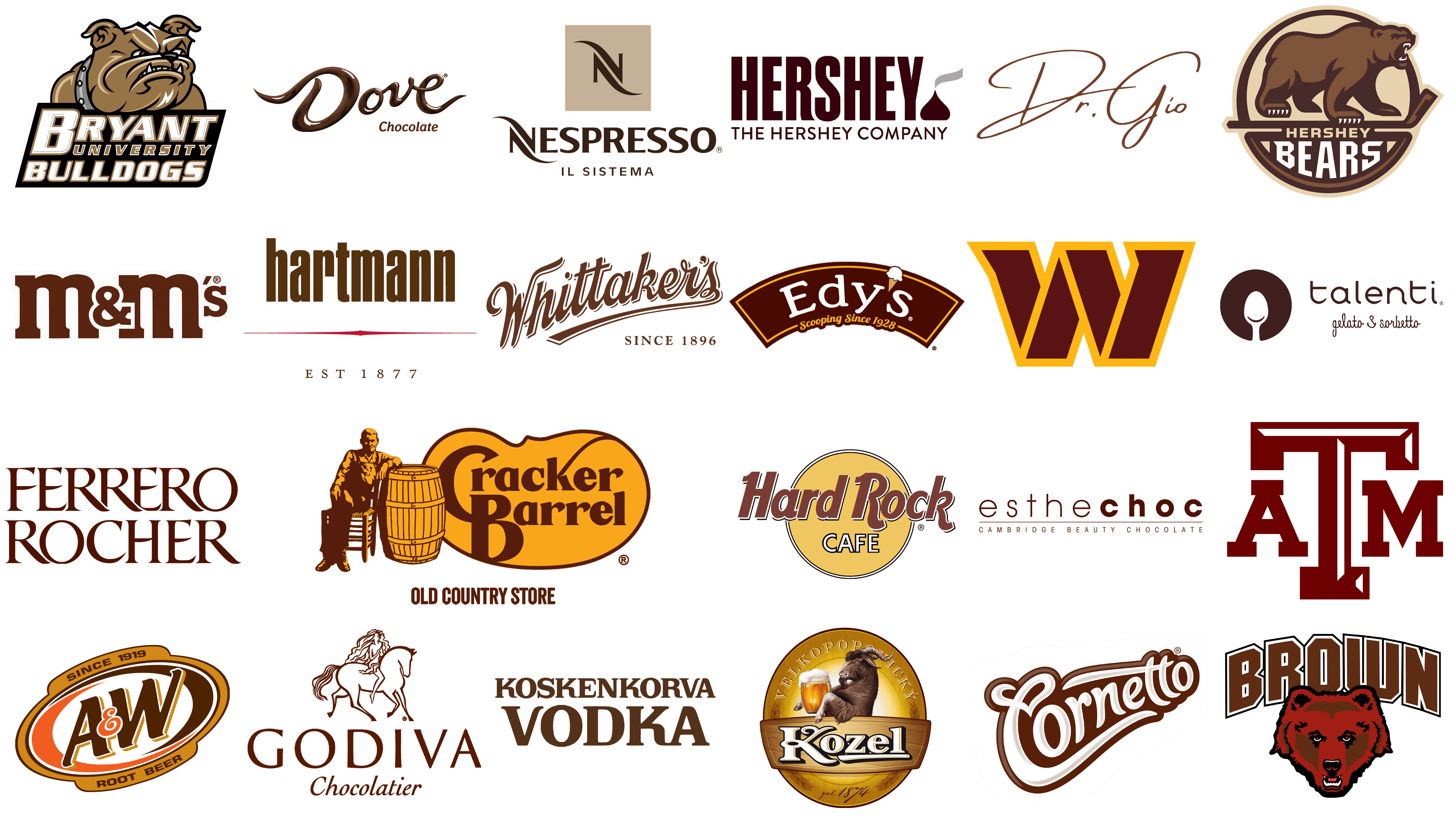
A&W Root Beer
![]()
In 1919, a flavor emerged that would captivate America, laying the groundwork for A&W Root Beer. Known for its creamy, sweet taste, this root beer has become an iconic American beverage. People have cherished its rich taste for generations, making it a symbol of American culture. The experience extends beyond just drinking; A&W’s nostalgic drive-in restaurants offer this root beer in frosty mugs, enhancing its appeal. The brand embodies more than a drink, it’s a piece of Americana that invites all to enjoy its unmatched flavor in the soft drink world. The A&W logo, with its amber and cream hues, reflects the beverage’s creamy notes. Its classic design and “SINCE 1919” tagline honor the brand’s long-standing heritage.
Brown Bears
![]()
Across northern Eurasia and North America, the Brown Bear stands as a majestic species. These bears, scientifically known as Ursus arctos, rank among the largest of their kind. Notably, the Kodiak bear, a subspecies, can weigh over 1,500 pounds. Brown bears have a diverse diet, from fish to vegetation, demonstrating their adaptability. The logo of the Brown University Bears captures the essence of this formidable animal. Featuring a detailed, lifelike bear set against a shield, it symbolizes strength and excellence. The logo’s bold “BROWN” lettering complements the bear’s powerful image, reflecting the university’s high standards.
Bryant Bulldogs
![]()
Bryant University, based in Smithfield, Rhode Island, showcases the Bryant Bulldogs in NCAA Division I sports. Competing fiercely in the Northeast Conference, these teams embody the spirit of athletic excellence. The bulldog mascot represents the athletes’ perseverance and tenacity, core values of Bryant University. The logo features a muscular bulldog, poised with determination. Its spiked collar and strong stance symbolize the competitive nature of Bryant’s teams. The bold, block typography of the logo underscores the university’s commitment to excellence, mirroring the bulldog’s formidable presence.
Cornetto
![]()
Since its debut in Italy in 1959, Cornetto has defined indulgence in ice cream. Part of the Unilever family, this brand is famous for its cone, combining creamy ice cream, sauce, and toppings in a crunchy wafer. Cornetto caters to a wide range of tastes, becoming a global symbol of ice cream joy. The logo’s playful script and brown and white color scheme reflect its classic flavors and the joy of indulgence. This design captures Cornetto’s essence, making it a visual representation of the brand’s delightful offerings.
Cracker Barrel
![]()
Founded in Lebanon, Tennessee, in 1969, Cracker Barrel Old Country Store, Inc. uniquely blends a restaurant with a gift shop under a Southern country theme. This chain offers more than traditional Southern comfort food; it provides a journey into America’s nostalgic past. The décor, filled with antique Americana, enhances the dining experience, making it a haven for families seeking nourishment and nostalgia. The Cracker Barrel logo, featuring a man leisurely sitting by a barrel, invites patrons into this old-timey experience. Its cursive script and warm mustard background further invoke feelings of warmth and a return to simpler times.
Dove Chocolate
![]()
Mars, Incorporated introduced Dove Chocolate in the 1950s, quickly establishing it as a standard for smooth chocolate. Known as Galaxy outside the United States, Dove offers a luxurious chocolate experience through its varied product line, including bars, truffles, and ice cream. The Dove Chocolate logo, with its flowing script and creamy brown color, embodies luxury and the smooth, rich taste of its chocolate. This design, suggestive of chocolate melting, promises an indulgent experience with every bite, appealing directly to chocolate aficionados.
Dr Gio Cosmetics
![]()
Dr. Gio Cosmetics is making its mark with innovative skincare and beauty products that marry scientific research and aesthetic appeal. Focused on high-quality, effective solutions for all skin types, this brand stands out for its inclusivity in beauty regimes. Dr. Gio aims to balance skin health with aesthetic beauty, emerging as a notable name in cosmetics. The logo, featuring elegant, signature-style typography in warm brown, speaks to personalized luxury and craftsmanship. It reflects the brand’s commitment to a personal touch and its organic approach to beauty, appealing to those seeking bespoke skincare.
Edy’s
![]()
Since 1928, Edy’s (Dreyer’s in the Western U.S.) has been synonymous with rich, flavorful ice cream made from high-quality ingredients. Offering a broad spectrum of flavors, from classic to contemporary, Edy’s is about more than ice cream – it’s about creating joyful moments and lasting memories. The logo’s arch, mimicking an ice cream scoop, along with its chocolatey hues and playful iconography, evokes nostalgia. The tagline “Scooping Since 1928” highlights the brand’s long-standing tradition of quality and joy, inviting consumers to relish in the nostalgic enjoyment of every scoop.
Esthechoc
![]()
Cambridge Chocolate Technologies introduced Esthechoc, a revolutionary brand that combines premium chocolate enjoyment with skincare science. Known as the world’s first beauty chocolate, it leverages the power of cocoa polyphenols and Astaxanthin antioxidants to enhance skin vitality and radiance from within. This confectionery-cosmeceutical hybrid promises not only a delightful taste but also a boost to skin health. The Esthechoc logo, with its modern, clean design, mirrors the innovative blend of beauty and science. The straightforward typography speaks to the brand’s sophistication and forward-thinking approach. Its rich brown color highlights the chocolate aspect, while the luxury wellness positioning is clear in its tagline, presenting a unique indulgence that caters to both taste and beauty.
Ferrero Rocher
![]()
Since its launch in 1982 by Michele Ferrero, Ferrero Rocher has become a symbol of luxury in the chocolate world. Gold-wrapped chocolates showcase sophistication with their layered texture and flavors. A whole hazelnut, encased in hazelnut chocolate within a thin wafer, then wrapped in milk chocolate and chopped hazelnuts, defines celebration. The Ferrero Rocher logo exudes luxury with its deep brown, regal typeface. It reflects the brand’s dedication to premium sweets. The logo’s capital letters highlight Ferrero Rocher’s excellence in creating exceptional chocolates. They guarantee an indulgent experience with every bite.
Godiva Chocolatier
![]()
Since its founding in 1926 in Belgium, Godiva Chocolatier has represented the zenith of Belgian chocolate craft. Renowned for its luxurious truffles and chocolate-covered treats, Godiva is a beacon of indulgence and artistry in the chocolate world. The brand’s ethos, inspired by Lady Godiva, resonates with boldness and generosity. Godiva’s global acclaim is a testament to its unwavering commitment to excellence and innovation. The logo, featuring an elegant, regal horse, and refined chocolate-brown script, captures the essence of Godiva’s Belgian roots and its mastery in chocolate making, offering a signature of unparalleled chocolate artistry.
Hard Rock Cafe
![]()
Hard Rock Cafe has been an emblem of music, entertainment, and dining since its inception in 1971 in London. With locations in over 70 countries, it serves as a tribute to rock ‘n’ roll, offering an immersive dining experience surrounded by music memorabilia. It’s more than a restaurant, it’s a celebration of rock ‘n’ roll’s enduring spirit. The logo, featuring a circular emblem with mustard background and bold brown lettering, embodies the cafe’s dynamic energy. The iconic ‘R’ symbolizes the cafe’s deep roots in the music world, offering guests a taste of musical heritage alongside their meals.
Hartmann
![]()
Established in 1818 in Heidenheim, Germany, Hartmann stands at the forefront of medical and hygiene product manufacturing. With a focus on wound care, incontinence management, and infection prevention, Hartmann dedicates itself to enhancing healthcare outcomes worldwide. Its trusted range of products is recognized for quality and innovation by both healthcare professionals and consumers. The Hartmann logo, characterized by its professional and elegant design, showcases the brand’s commitment to reliability and tradition. The logo’s earthy tones and sophisticated red underline highlight Hartmann’s heritage and meticulous attention to detail, underpinned by the “EST 1877” declaration that celebrates its legacy in healthcare excellence.
Hershey
![]()
Founded in 1894 by Milton S. Hershey, The Hershey Company stands as a testament to American chocolate and confectionery excellence. From its initial days as a caramel factory in Pennsylvania, Hershey has ascended to become one of the globe’s leading chocolate producers. It’s a brand deeply ingrained in the American consciousness, synonymous with chocolate thanks to products like Hershey’s bars and Reese’s Peanut Butter Cups. Hershey’s commitment to quality, community, and sustainability has solidified its iconic status. The logo of The Hershey Company, featuring the recognizable Hershey’s Kiss, encapsulates the brand’s legacy. The bold, block lettering of “HERSHEY” communicates reliability, while the Kiss adds a playful dimension, balancing the logo’s serious and joyous sides.
Hershey Bears
![]()
The Hershey Bears, hailing from Hershey, Pennsylvania, boast a rich history in the American Hockey League (AHL) since their inception in 1938. As one of the AHL’s most storied franchises, they have clinched numerous Calder Cup titles, underlining their prominence. Their partnership with the NHL’s Washington Capitals highlights their role in developing hockey talent. The team’s logo, featuring a ferocious bear set against a hockey puck backdrop, embodies the team’s competitive spirit. The dynamic, curved typography and the brown and cream colors pay tribute to their connection with The Hershey Company, blending sports fervor with local culture.
Koskenkorva
![]()
Hailing from the village of Koskenkorva, Finland, Koskenkorva Vodka is celebrated for its clarity and minimalist ingredients: barley and spring water. This spirit is a tribute to Finnish “sisu”, symbolizing the nation’s craft and tenacity. Koskenkorva’s global reputation is built on the integrity and tradition of Finnish distilling. The logo reflects this heritage with bold, uppercase letters and an earth-toned palette, conveying the natural purity of its ingredients. The straightforward design and clean typography mirror the brand’s approach to vodka production, emphasizing quality and simplicity.
M&Ms
![]()
Introduced in 1941 by Mars, Incorporated, M&Ms have become a global favorite, known for their candy-coated chocolate that promises to “Melt in your mouth, not in your hand”. These colorful treats, now available in various flavors, are a staple at movies, parties, and as holiday decorations. The M&Ms logo, with its bold and rounded letters, perfectly captures the candy’s shape and essence. The playful tilt of the ampersand embodies the brand’s whimsical nature. Brown, echoing the chocolate inside, dominates the logo, making it a vibrant emblem of the joy and color M&Ms bring to every occasion.
Nespresso
![]()
Since its inception in Switzerland in 1986, Nespresso, a Nestlé subsidiary, has redefined coffee consumption with its single-serve capsules and machines. Known for its commitment to quality and sustainability, the brand has garnered a following among eco-conscious coffee enthusiasts. The Nespresso logo, featuring a stylized ‘N’ against a coffee-colored backdrop, embodies sophistication and the high-quality essence of its coffee. The logo’s design, along with “IL SISTEMA” tagline, suggests a refined espresso experience, blending luxury with the art of coffee making.
Talenti
![]()
Founded in 2003, Talenti has distinguished itself in the frozen dessert market with its artisanal gelato and sorbetto, celebrated for innovative flavors and natural ingredients. The brand’s transparent jars showcase the delectable content inside, from Mediterranean Mint to Sea Salt Caramel. Talenti’s logo, with its simple elegance and spoon silhouette, evokes the brand’s artisanal quality and commitment to indulgence. The logo suggests a scoop of gelato, inviting consumers into a world of luxurious, creamy treats that emphasize craftsmanship and quality.
Texas A&M University
![]()
Founded in 1876, Texas A&M University in College Station shines as a top public research institution. It boasts rigorous academics, outstanding research, and a strong military heritage. As part of the Association of American Universities, it excels in agriculture, engineering, and the sciences. The deep maroon logo with bold, interlocking letters embodies unity, strength, and Aggie spirit. This logo proudly symbolizes Texas A&M’s dedication to educational and athletic excellence, capturing Aggie pride and tradition.
Velkopopovický Kozel
![]()
Founded in 1874 in the Czech Republic, Velkopopovický Kozel stands as a beacon of brewing tradition, producing one of the nation’s most cherished beer brands. Known for its emblematic goat and a variety of lagers from light to dark, Kozel is celebrated for its balanced flavors and premium ingredients. Embracing both age-old methods and contemporary technology, the brewery ensures every beer honors its long-standing heritage. The logo features a jovial goat with a pint, set against a backdrop that hints at Czech village life’s warmth and camaraderie. “Kozel’s” elegant typeface adds sophistication, inviting enthusiasts to partake in the rich Czech beer culture.
Washington Commanders
![]()
Originating in 1932 and recently rebranded in 2022 from the Washington Redskins, the Washington Commanders signify a new chapter for the NFL team, embracing unity, respect, and dedication. This change marks a commitment to a future reflective of collective values and the spirit of competition. The logo’s prominent “W”, set in maroon and gold, pays homage to the team’s legacy while signaling a forward-looking vision. Its angular, solid design embodies the resilience and strength characteristic of the Commanders, capturing the essence of a team poised for future triumphs.
Whittaker’s
![]()
Since 1896, Whittaker’s has distinguished itself as a premier chocolate maker in New Zealand, with a reputation for quality that spans generations. As a family-run enterprise, it prides itself on meticulous oversight of the chocolate-making process, ensuring excellence from bean to bar. Whittaker’s enjoys international acclaim, thanks in part to signature offerings like the Peanut Slab. The logo, with its fluid script, reflects the brand’s rich history and artisanal quality, with a brown color scheme that evokes the allure of its chocolates. This emblem represents Whittaker’s enduring commitment to crafting superior chocolates, infused with New Zealand’s distinctive charm.