Velkopopovicky Kozel Logo
Velkopopovicky Kozel is a major beer brand from the Czech Republic. This country is famous for her breweries, and Kozel is counted as one of the most profitable and famous. It’s also rather old, although not as enduring as some smaller operations throughout the country.
Meaning and History
The brewery that makes this beer was launched in 1875. It is located in the village of Velke Popovice (or Great Popovice). The first name of the company’s name is simply an adjective that signifies association with this city. ‘Kozel’, for its part, means ‘goat’ in Czech, and back then this animal symbolized dark strong beer in this part of Europe.
1874 – today
The first batch of beer was created in 1874, and they already had a logo of the new brewery. It was a tad different from what we have today, but the general concept persisted.
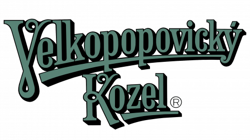
The contemporary logo of the brewery consists of two words that make up the company name. They are both green (inspired by hops, doubtless) and written in an elegant, twisting font with lots of unexpected turns. There are also lots of serif components, so you can imagine that this logo was made to look old-fashioned.
They also started adding depth some time after the inception, which resulted in the black shadows behind the letters proper.
Emblem and Symbol
The emblem people are most familiar with is the one with a goat mascot on it. For it, they basically took the word ‘Kozel’ from the logo exactly as it was, stretched it horizontally and attached a goat with a mug of beer on top. Everything else is secondary: they’d often add the first word of the name and the year of creation.


