Most Famous Logos With an Eagle
Eagles have long been symbols of majesty, strength, and freedom, attributes that resonate deeply with brands across various industries. The use of the eagle in logos is far from arbitrary; it often denotes a company’s aspirations to soar to heights of excellence, leadership, and superior vision. This connection is potent and transcultural, with the bird of prey adorning emblems from American institutions to European sports clubs, and multinational corporations.
The symbolism of the eagle is rich and multifaceted. In the United States, the bald eagle is a national symbol, representing the country’s freedom and spirit. Consequently, American companies often incorporate it into their logos to tap into a sense of patriotism and reliability. On the other hand, in other cultures, the eagle may symbolize clarity of vision, speed, and precision, traits desirable to companies aiming to project an image of efficacy and foresight.
What’s fascinating about the use of eagles in logos is not just their symbolic weight but also the diversity in their portrayal. Some logos capture the eagle in full flight, wings spread wide, suggesting expansiveness and outreach. Others focus on the eagle’s head, often in a stylized form, to emphasize focus and concentration. The color choices, too, play a significant role, with each hue carrying its own set of meanings and connotations.
This article delves into the world of logos featuring this noble bird, exploring their significance, the messages they convey, and the reasons behind their enduring popularity. We will take a closer look at a selection of these logos, dissecting their design elements, color schemes, and the nuances that make each one unique. From the highly stylized to the strikingly realistic, eagle logos are a testament to the enduring allure of this avian monarch in the realm of branding and identity.
American Airlines
In 1926, the inception of American Airlines marked a significant milestone in the aviation sector. Based in Fort Worth, Texas, this prestigious airline rapidly ascended to become a titan in the industry, acclaimed for having the most extensive fleet globally. Its impressive statistics include leading in revenue, the volume of scheduled passengers, and the breadth of destinations covered. The brand’s emblem, an epitome of elegance and dynamism, showcases a stylized avian figure soaring upwards. The wings of this bird form a striking diagonal, symbolizing ascent and progress. The palette chosen for this logo is a thoughtful blend of deep crimson for the bird’s cranium, gradually merging into a serene sky blue for the wings. Positioned adjacent to this artistic depiction is the brand name, crafted in a robust, modern sans-serif font. The nomenclature is bifurcated, with ‘American’ perched above ‘Airlines,’ both inscribed in a deep blue shade that mirrors the wing’s tint. This logo, embodying sleekness and modernity, resonates with the brand’s ethos of continuous advancement and velocity in the realm of aviation, proudly bearing the name American Airlines.
American Eagle Outfitters
American Eagle Outfitters, colloquially known as American Eagle, emerged as a prominent figure in the American retail landscape, specializing in youthful and contemporary fashion. Established in Pittsburgh, Pennsylvania, this retailer has carved a niche in the hearts of teenagers and young adults with its casual yet fashionable offerings. The brand’s symbol, a representation of liberty and youthfulness, features a navy blue eagle caught in a dramatic descent, its wings unfurled and talons ready for touchdown. This avian motif captures the essence of freedom and adventure, mirroring the brand’s appeal to the spirited young generation. Beneath this image, the words ‘AMERICAN EAGLE OUTFITTERS’ stand boldly in capital letters, colored in the same navy hue. This font choice, straightforward yet commanding, complements the eagle’s dynamic stance, encapsulating the brand’s identity of effortless, confident fashion known as American Eagle.
Anheuser Busch
Anheuser-Busch InBev SA/NV, widely recognized as Anheuser-Busch, stands tall as one of the global leaders in the brewery sector. Its origins tracing back to 1852, this brewing behemoth is renowned for its array of iconic beer brands, including Budweiser, Stella Artois, and Corona. The brand’s insignia is a regal depiction, featuring a golden eagle with wings proudly raised, perched atop an ‘A’ in a similar gilded shade. This design choice cleverly nods to the brand’s initials. Above the eagle, a lone star in gold glistens, symbolizing superiority and the pursuit of excellence. Below this emblematic figure, the name ‘Anheuser-Busch’ is elegantly scripted in black cursive, adding a layer of sophistication and historical reverence to the logo. This design reflects the brand’s rich legacy and commitment to quality in the brewing world, a testament to the name Anheuser-Busch.
Barclays PLC
Barclays PLC, a titan in the financial world, holds a distinguished position as a British multinational investment bank and financial services company. With its headquarters nestled in the heart of London, England, Barclays offers a spectrum of services that include retail banking, wealth management, commercial banking, and investment banking. The emblem that represents this financial powerhouse is a captivating azure blue eagle, its wings and head lifted in a gesture of ambition and fortitude. This eagle, a symbol of soaring aspirations and strength, is neatly encased within a shield-like figure, a representation of protection and steadfastness. Directly beneath this emblem, the name “BARCLAYS” is emblazoned in bold, capitalized letters, sharing the same vibrant blue hue, emanating a sense of trustworthiness and dependability. The logo’s design is a fusion of modernity and simplicity, with the strategic use of negative space within the eagle adding a dynamic and contemporary edge to the traditional symbols commonly associated with banking.
Sport Lisboa e Benfica
Sport Lisboa e Benfica, widely acknowledged as Benfica, is a beacon in the Portuguese sports arena, based in Lisbon. This esteemed sports club is celebrated for its professional football team, a proud collector of numerous Primeira Liga titles and European accolades. The brand’s insignia is a magnificent heraldic crest, crowned by a golden eagle with wings spread wide, perched on a red and white shield – the club’s traditional colors. The shield features a football, overlayed by a blue ribbon graced with the initials “S.L.B.” for “Sport Lisboa e Benfica.” This shield is encased by a silver band, symbolizing unity and strength. Above this, a scroll bears the Latin adage “E Pluribus Unum,” translating to “Out of many, one,” a nod to the spirit of unity and teamwork. The entire crest is surrounded by an intricate outline, lending it a noble and majestic aura.
Central Intelligence Agency (CIA)
The Central Intelligence Agency (CIA), established in 1947, serves as a pivotal civilian foreign intelligence service for the United States government, its mission being the collection, processing, and analysis of vital national security information globally. The agency’s emblem is distinguished by a regal bald eagle, its gaze sharp and vigilant, perched upon a white shield. This shield is adorned with a striking red compass rose, its center marked by a notable star, representing the agency’s directional guidance and worldwide influence. Encircling this emblem is a blue band, inscribed with the golden letters “CENTRAL INTELLIGENCE AGENCY” at the top, and “UNITED STATES OF AMERICA” along the curved bottom. This circular frame is edged with a slender golden line, adding a touch of distinction to the design, symbolizing the agency’s official status and its critical role in national affairs.
Colorado Eagles
The Colorado Eagles, a formidable presence in the world of professional ice hockey, find their home in Loveland, Colorado, competing in the American Hockey League (AHL) as the esteemed affiliate of the Colorado Avalanche in the National Hockey League (NHL). The team’s emblem is a striking representation, featuring the profile of a stylized eagle’s head, resplendent in shades of yellow and black. The eagle’s gaze is piercing, exuding an unwavering determination. Superimposed over this majestic bird is a geometric arrangement of vibrant stripes in blue, yellow, and red, evoking a sense of speed and motion on the ice. Positioned below the eagle, the team’s name, “COLORADO EAGLES,” is emblazoned in bold, block lettering. This lettering, in black with a yellow outline and white shading, creates a dynamic and three-dimensional effect. The typeface chosen is assertive and prominent, reinforcing the team’s name with an air of solidity and presence on the ice.
Crystal Palace
Crystal Palace Football Club, deeply rooted in the heart of Selhurst, South London, England, boasts a storied history dating back to its establishment in 1905. This professional football club, a mainstay in the Premier League, is renowned for its unwavering fanbase and rich legacy. The club’s emblem is a vibrant reflection of its identity, featuring a resolute eagle rendered in white and navy blue. The eagle’s wings are outstretched, as if in mid-swoop during a match, symbolizing the agility and power of the team. Beneath the eagle, a stylized football rests between depictions of the iconic Crystal Palace, a tribute to the club’s historic name and origins. This imagery is encapsulated within a bold red banner, bearing the club’s name “CRYSTAL PALACE F.C.” in white lettering, with the founding year “1905” prominently centered above. This emblem pays homage to the club’s rich heritage and the indomitable spirit of the beautiful game.
Eagle
The term “Eagle” universally invokes images of majestic, powerful birds of prey, celebrated for their keen vision and formidable flight. Species such as the Bald Eagle serve as national symbols in various countries. The emblem representing the concept of an eagle is a resolute and monochromatic design, enclosed within a shield shape that conveys strength and protection. The profile of an eagle’s head is depicted in a stylized manner, with graceful, fluid lines forming the bird’s beak and feathers. The eagle’s eye, though minimalist, exudes an aura of focus and vigilance. Positioned above the eagle is the word “EAGLE,” rendered in capitalized block letters, crowning the emblem with a definitive identity. The use of stark black and white contrast creates a modern yet timeless image, symbolizing power, precision, and freedom.
Ferndale Golden Eagles
The Ferndale Golden Eagles, representing Ferndale High School in the vibrant community of Ferndale, Michigan, are known for their unwavering competitive spirit and active involvement in various sports, including football, basketball, and track. Their emblem proudly showcases a commanding eagle with its wings outstretched, a symbol of grandeur and excellence, boldly colored in a striking navy blue with golden accents that highlight the feathers. The eagle’s fierce gaze adds an extra layer of intensity to the design. Positioned beneath the eagle, a navy blue ribbon banner elegantly cradles the text “FERNDALE GOLDEN EAGLES.” The serif font chosen for the lettering exudes a sense of tradition and timelessness. “FERNDALE” gracefully arches above “GOLDEN EAGLES,” both rendered in white with a golden outline. This meticulously crafted color scheme and the powerful imagery of the eagle harmoniously capture the spirit and vitality of the Ferndale Golden Eagles, embodying their passion for sports and community.
FPV
FPV, an acronym for First-Person View, is a groundbreaking technology that enables the remote control of radio-controlled vehicles from the pilot’s perspective, most prominently used in drone racing and aerial photography. The logo representing FPV is a study in sleek monochromatic design, featuring the profile of an eagle’s head. The eagle’s sharp beak and focused forward gaze symbolize precision and vision, key attributes in the world of FPV technology. This imagery is encased within an oval, evoking a sense of speed and motion, perfectly encapsulating the essence of FPV control. At the heart of the oval, the letters “FPV” stand tall in bold, uppercase typography, asserting the acronym that defines this cutting-edge technology. The striking contrast between black and white gives the logo a modern and impactful visual identity, making it memorable and emblematic of the innovation behind FPV.
Giorgio Armani
Giorgio Armani, a distinguished name in the world of high-end fashion, is synonymous with clean lines and impeccable tailoring. This esteemed fashion house offers a range of luxury goods, from haute couture and ready-to-wear apparel to accessories, eyewear, cosmetics, and home interiors. The logo of Giorgio Armani embodies the brand’s affinity for fluidity and elegance in design. It features an abstract eagle in flight, brought to life through a series of horizontal stripes that create a graceful sense of movement. Against the backdrop of this majestic eagle are the initials “GA,” representing the personal signature of the brand’s founder, Giorgio Armani. Positioned beneath the emblem, the full name “GIORGIO ARMANI” is elegantly inscribed in a classic serif typeface, adding a touch of sophistication and timelessness to the logo. The entire emblem is rendered in a monochromatic palette, emphasizing the brand’s commitment to simplicity and understated luxury, making it an iconic symbol of Giorgio Armani’s unparalleled craftsmanship and style.
Gulf Air
Gulf Air, a distinguished airline with a heritage dating back to 1950, proudly represents Bahrain as its flagship carrier. With a commitment to providing exceptional service, Gulf Air offers flights to over 50 destinations spanning three continents, all managed by a modern and efficient fleet. The airline’s emblem is a testament to its values, featuring a majestic golden falcon in flight. This emblematic falcon symbolizes speed, dedicated service, and the airline’s rich tradition. The fine detailing on the bird’s wing adds an element of luxury and meticulous attention to detail. Positioned to the right, the name “GULF AIR” stands boldly in navy blue lettering, conveying strength and reliability. Above the English text, the graceful Arabic script pays homage to the airline’s Middle Eastern heritage, establishing a cultural connection. The color palette of gold and navy blue exudes prestige and quality, mirroring Gulf Air’s unwavering commitment to excellence in the aviation industry.
Hogwarts
Hogwarts School of Witchcraft and Wizardry, a beloved fictional institution from J.K. Rowling’s enchanting Harry Potter series, is renowned for its four distinct houses and as the alma mater of the series’ iconic characters, including Harry Potter himself. The emblem for Hogwarts School of Witchcraft and Wizardry is a mythical crest, capturing the essence of the magical world. It features a shield divided into four quadrants, each proudly displaying the emblem of one of the four houses: the lion for Gryffindor, the serpent for Slytherin, the badger for Hufflepuff, and the eagle for Ravenclaw. At the heart of the shield, a prominent letter ‘H’ represents Hogwarts. Above the shield, a banner proudly bears the name “Hogwarts,” and below, another banner carries the school’s profound motto, “Draco Dormiens Nunquam Titillandus,” translated as “Never tickle a sleeping dragon.” This complete emblem is elegantly encircled by a thick border, evoking a sense of tradition and officiality, emblematic of the revered magical school.
Instituto Mexicano del Seguro Social (IMSS)
The Instituto Mexicano del Seguro Social (IMSS), an institution of paramount importance established in 1943, serves as Mexico’s largest public health and social security entity. IMSS is dedicated to providing a comprehensive array of medical and social services to the Mexican workforce and their families. The institution’s logo is a striking representation, featuring a pristine white silhouette of an eagle set against a deep green background, all encased within a rounded rectangle. The eagle, an emblem of vision and strength, is portrayed with a modern and abstract style, signifying protection and care. Below the eagle, the acronym “IMSS” is prominently displayed in white, harmonizing with the eagle’s color, reinforcing the brand’s identity. The logo’s adept use of contrast and the iconic eagle together convey IMSS’s commitment to vigilance and dedicated service to the Mexican people.
Lazio
Società Sportiva Lazio, affectionately known as Lazio, stands as a venerable professional Italian football club with a storied history dating back to its founding in 1900. The club has etched its name in Italian football annals, securing Serie A titles and Coppa Italia trophies. Lazio’s emblem exudes the spirit of the club, featuring a majestic golden eagle in flight, its wings outstretched in a symbol of power and freedom. The eagle perches proudly above a shield, which is artfully divided into vertical stripes of sky blue and white, mirroring the team’s iconic colors. This design is elegantly framed with a thin blue border. At the pinnacle of the shield, the name “S.S. LAZIO” is boldly inscribed in capital letters, unequivocally representing the professional Italian football club. Lazio’s emblem masterfully intertwines the club’s rich tradition with its Roman heritage, forging a connection between past glories and the enduring aspirations of the team.
Moto Guzzi
Moto Guzzi, an illustrious motorcycle manufacturer with a rich heritage dating back to its establishment in 1921, proudly traces its roots to the charming town of Mandello del Lario, Italy. Throughout its storied existence, this iconic brand has consistently embodied the essence of excellence, particularly through its groundbreaking innovations in engine design, notably the timeless longitudinal V-twin engines.
At the heart of Moto Guzzi’s identity lies its distinctive logo—a true reflection of the brand’s core values. This emblem stands as a testament to Moto Guzzi’s enduring legacy, presenting a minimalist yet profoundly captivating portrayal of an eagle in majestic flight. The eagle, a symbol synonymous with freedom and power, serves as a fitting representation of Moto Guzzi’s motorcycles, renowned for their exceptional performance and unwavering spirit of independence. Positioned gracefully beneath this majestic avian symbol, the brand’s name, “MOTO GUZZI,” boldly emerges, articulated in commanding, all-capital, sans-serif font. This typographic choice exudes an air of unwavering conviction and strength, reinforcing the brand’s name with a sense of resolute determination.
The entire design is rendered in classic black and white, underscoring the logo’s enduring and timeless quality. This monochromatic palette pays homage to Moto Guzzi’s longstanding and illustrious history in the motorcycle industry. In every facet, this emblem serves as a visual representation of the brand’s steadfast commitment to excellence and its unyielding pursuit of innovation.
Nationwide
Nationwide, a prominent player in the realms of insurance and financial services, proudly operates within the United States, offering an extensive portfolio of products that encompass auto, life, homeowners, pet, farm, business insurance, and an array of retirement savings solutions.
The Nationwide logo, a symbol synonymous with trust and reliability, features a steadfast blue eagle captured in elegant profile. The eagle’s graceful wing artfully overlaps the letter “N,” resulting in a visually potent image that encapsulates the very essence of the Nationwide brand. This eagle, emblematic of freedom and visionary foresight, resonates harmoniously with the company’s unwavering commitment to safeguarding and providing comprehensive coverage. Positioned beneath this emblem of protection, the word “Nationwide” is presented in bold, sans-serif typeface, solidifying the brand’s name with an aura of unwavering stability and dependability. The color blue, a traditional symbol of trustworthiness and reliability, aligns seamlessly with the insurance and financial services offered by Nationwide, making it a symbol of unwavering commitment to its cherished clientele. In every aspect, this emblem reflects the brand’s pledge of unwavering support and dedication to its valued customers.
New York
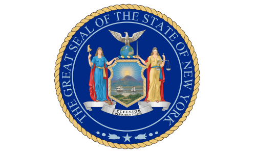
New York, often affectionately referred to as New York City to distinguish it from the broader state of New York, proudly stands as the most populous city in the United States. It is celebrated for its profound impact on numerous domains, including commerce, finance, media, art, fashion, research, technology, education, and entertainment. The image in question showcases the intricacies of The Great Seal of the State of New York. This emblem features a regal blue backdrop, elegantly encircled by a resplendent golden band, emblazoned with the words “THE GREAT SEAL OF THE STATE OF NEW YORK” in prominent display. At its heart, two allegorical figures stand on either side of a shield: Liberty, a symbol of freedom, and Justice, representing the rule of law. Above the shield, an eagle majestically perches upon a globe, signifying the Western Hemisphere. The shield itself portrays a radiant sun ascending behind Mount Beacon over the Hudson River, symbolizing the new day that dawned with the state’s inception. A banner gracefully stretches beneath the shield, bearing New York’s State motto, “Excelsior,” translating to “ever upward,” alongside “E Pluribus Unum,” which signifies “out of many, one.” This seal serves as a profound reflection of New York’s rich history, enduring values, and aspirations.
Philadelphia Eagles
The Philadelphia Eagles, a distinguished professional American football team hailing from Philadelphia, Pennsylvania, partake in the National Football League (NFL) and are renowned for their devoted fan base and triumphant victory in Super Bowl LII. The emblem that represents the Philadelphia Eagles is a dynamic portrayal of the team’s spirit. It features the fierce profile of an eagle head, exuding an intense and piercing gaze. Rendered in shades of silver, black, and white, this depiction accentuates the team’s aggressive and competitive nature. Above this menacing image, the team name “PHILADELPHIA EAGLES” is boldly written in capital letters, forming sharp winged motifs on either side, giving the logo a sense of movement and flight. The color palette of dark green, silver, and black perfectly aligns with the team’s official colors, while the overall design encapsulates the boundless energy and unyielding tenacity of the Philadelphia Eagles and their fervent fan base.
Ramones
The Ramones, an iconic punk rock band that originated in the vibrant city of New York in 1974, left an indelible mark on the music industry. They were celebrated for their fast-paced, short, and straightforward songs, which featured minimal instrumentation and lyrics. This innovative band played a pivotal role in shaping the punk rock and alternative music genres. The Ramones’ logo pays homage to the presidential seal, an emblem synonymous with authority and authenticity, yet cleverly adapted to represent the rebellious spirit of the band. At its core, an eagle clutches a baseball bat, a striking departure from the traditional olive branch and arrows, symbolizing the band’s irreverent nature and deep-rooted American identity. Instead of presidential monikers, the names of the band members—Tommy, Johnny, Joey, and Dee Dee—are inscribed along the border, adding a personal touch to the emblem. The design is further enhanced by a rope-like border adorned with stars, imparting an official and commanding appearance. The entire emblem adheres to a monochromatic scheme, creating a stark and unforgettable visual identity that remains synonymous with the Ramones’ profound influence on the world of rock music.
Smirnoff
Smirnoff, a renowned brand of vodka with its origins tracing back to Russia in the 1860s and currently under the ownership of Diageo, has established a global reputation for its extensive range of vodka flavors and types, including a diverse selection of flavored vodkas and malt beverages. The visual identity of Smirnoff vodka draws inspiration from one of Russia’s most iconic heraldic symbols—the two-headed eagle. While the brand’s earlier logo versions featured intricate and elegant designs, the most recent redesign has transformed the eagle into a modern silver element. This representation consists of two mirrored parts, cleverly overlapped by a glossy red ribbon adorned with white uppercase lettering. This visual transformation retains a sense of heritage while embracing a contemporary and dynamic aesthetic, reflecting Smirnoff’s commitment to both tradition and innovation in the world of vodka.
The Independent
The Independent, a prominent British online newspaper celebrated for its liberal and independent editorial stance, offers comprehensive news coverage spanning politics, business, technology, and culture. The newspaper’s logo features a striking white eagle in mid-flight, set against a vibrant red backdrop, enclosed within an oval frame. The eagle, meticulously detailed, clutches a bundle of rolled papers in its talons, symbolizing the newspaper’s core mission of delivering news and information to its readers. The choice of red and white in the logo design creates a visually impactful contrast, conveying a sense of urgency and assertiveness—attributes that align with the newspaper’s commitment to independent journalism and the fearless dissemination of information. This design imparts a feeling of movement and freedom, symbolizing The Independent’s dedication to unfettered reporting and editorial autonomy.
TicketCity Bowl
The TicketCity Bowl, now recognized as the First Responder Bowl, is a college football bowl game played within the NCAA-sanctioned Division I Football Bowl Subdivision, inaugurated in 2011 and hosted at the Cotton Bowl in Dallas, Texas. The event’s logo prominently showcases a stylized and formidable eagle with its wings outstretched in a posture of strength and determination. Positioned behind a banner that reads “TICKETCITY BOWL” in bold capital letters, the eagle exudes a competitive spirit. This emblem is superimposed on a shield-like structure that incorporates an image of a football, along with the words “COTTON BOWL STADIUM” to signify the event’s location. The color palette encompasses a harmonious blend of dark blue, white, yellow, and brown, mirroring the vigor and excitement associated with college football bowl games. In this context, the eagle emblem represents the intensity and soaring enthusiasm that characterizes collegiate athletic excellence.
U.S. Air Force
The United States Air Force, established on September 18, 1947, stands as the preeminent aerial and space warfare service branch within the United States Armed Forces, distinguished for its cutting-edge aerospace technology and its paramount role in safeguarding the nation. The emblem of the U.S. Air Force is a depiction of the distinguished United States Air Force insignia, characterized by a stylized silver star encircled by a prominent circle, flanked by majestic wings extending outward. This iconic star, renowned as the “Hap Arnold star,” pays homage to General Henry “Hap” Arnold, an exceptional figure who held a five-star rank in two of the United States’ military services. The expansive wings symbolize the domain of flight and aptly represent the Air Force’s jurisdiction. Positioned beneath this emblem, the unequivocal inscription “U.S. AIR FORCE” is rendered in uppercase, bold lettering, providing unmistakable identification of the branch of the United States Armed Forces dedicated to the realms of aerial and space warfare. The choice of a blue color palette pays homage to the boundless skies, which serve as the primary arena for Air Force operations, signifying the branch’s commitment to upholding national security in the aerospace domain.
USAA
The United Services Automobile Association (USAA), established in 1922, holds its place as a Fortune 500 conglomerate, providing a comprehensive range of financial services, including banking, investment, and insurance. These offerings are tailored to individuals and families with a history of service in the United States military. USAA’s logo prominently features a steadfast eagle, depicted in bold navy blue with soaring stripes adorning its wings, evoking a sense of upward momentum and resilience. Positioned below this resolute eagle, the acronym “USAA” is elegantly presented in the same commanding navy blue hue, embodying the essence of the company’s identity. The logo’s simplicity and the eagle’s emblematic presence aptly reflect the organization’s core values of service, loyalty, and trust. These principles deeply resonate with the military community that constitutes the heart of USAA’s customer base. The overall design of the logo conveys the company’s unwavering dedication to delivering financial services to its cherished members.
United States Postal Service (USPS)
The United States Postal Service (USPS), functioning as an autonomous entity within the executive branch of the United States federal government, carries the substantial responsibility of administering postal services across the entire geographical expanse of the United States, encompassing even its remote territories and affiliated states.
USPS’s logo stands as a meticulously crafted graphical representation, encapsulating the very essence of the United States Postal Service. It prominently features the dignified profile of an eagle’s head, an enduring symbol of American liberty and velocity. This iconic eagle is portrayed in a pristine white hue, set against a steadfast and resolute blue background. The deliberate design of the blue backdrop artfully conveys the impression of the eagle’s graceful and swift motion.
Positioned just beneath this emblematic representation, the inscription “UNITED STATES POSTAL SERVICE” is assertively presented in capitalized, sans-serif typeface. To underscore the paramount importance of the postal aspect, the word “POSTAL” is accentuated with a bold red line, invoking a profound sense of patriotism through the deliberate and strategic utilization of the red, white, and blue color scheme.
This emblem serves as a potent symbol of the USPS’s indispensable role in the widespread distribution of mail across the extensive expanse of the United States. It embodies and signifies the core attributes that define the USPS – unwavering efficiency, steadfast reliability, and an unyielding dedication to furnishing essential national service to the citizens of the United States.
Vauxhall
Vauxhall Motors, established in 1857 and presently a subsidiary of Stellantis since 2021, boasts a rich heritage as one of the United Kingdom’s most venerable vehicle manufacturers and distribution companies. The Vauxhall emblem showcases a majestic red griffin, an ancient mythological creature laden with symbolism representing vigilance and strength. This noble creature is enshrined within a circular badge, with a portion of a “V” flag subtly incorporated, cleverly alluding to the brand’s initial. The emblem’s striking red hue set against a pristine white background exudes boldness and immediate visual impact, aligning with the dynamic and robust identity of the brand. This logo is intrinsically linked with Vauxhall Motors, a British automotive manufacturer. The griffin finds its place in the company’s heraldry as a tribute to one of its founders, Alexander Wilson, whose family crest featured the image of a griffin. This emblem expertly encapsulates the brand’s storied heritage while reaffirming its commitment to innovation and excellence in the automotive industry.
Winston
Winston, the iconic cigarette brand introduced in 1954 by the venerable R.J. Reynolds Tobacco Company, has etched its name in the annals of global recognition as one of the foremost purveyors of fine tobacco. Bolstering its reputation is the unforgettable slogan that has become synonymous with the brand: “Winston tastes good like a cigarette should.”
The Winston logo itself is a striking masterpiece, exuding sophistication and an air of timeless appeal. It showcases a stylized eagle in mid-flight, an embodiment of the ideals of liberty and the innate ability to soar to new heights. Positioned regally beneath the majestic eagle, the brand name “Winston” is emblazoned in strong, uppercase lettering, evoking a palpable sense of reliability and eminence.
A deliberate choice of a monochromatic palette further heightens the logo’s memorability, rendering it effortlessly recognizable to enthusiasts worldwide. The eagle, an emblem often associated with vision and power, elegantly complements the bold lettering, alluding to a brand that reigns authoritatively and exudes unwavering confidence within the industry.
This emblem encapsulates an aura of grandeur and resilience, effectively mirroring the essence of the Winston brand identity, one that has withstood the test of time and continues to evoke a sense of timeless excellence.
