American Airlines Logo
American Airlines is a flagship airline in the US, based in Fort Worth, Texas. Launched in 1930, it has transformed into a considerable force in the market due to its number of vehicles and flights, passenger volume, and overall quality of service. The airline began as a merger of several smaller airlines and quickly turned into a pioneer, introducing innovations like the first electronic reservation system.
Meaning and History
Throughout its early years, American Airlines was instrumental in shaping the modern aviation industry, initiating widespread local and global service and promoting significant advancements in aircraft technology. It was a key player in the adoption of jet planes, contributing to the evolution of air travel with the introduction of various new vehicles.
As it moved into the modern era, American Airlines expanded through mergers and acquisitions, most notably combining with US Airways in 2013. Despite facing industry challenges, including economic downturns and the aftermath of 9/11, it has continued to modernize its services and fleet, emphasizing efficiency and global connectivity. Today, American Airlines is recognized as a major force in the aviation industry, symbolizing the growth and transformation of commercial air travel.
Where does American Airlines fly?
They fly all over the world. Naturally, most destinations are in America, but they travel to all habitable continents.
1934 – 1945
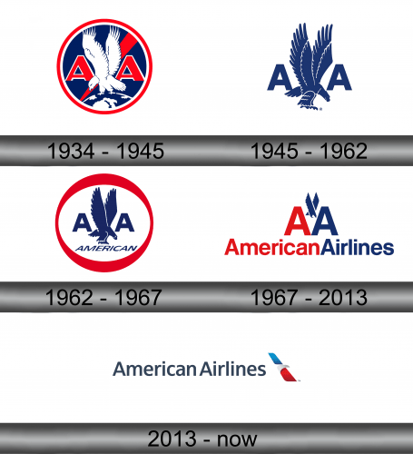
The original logo was a circular shape with the red outline, the main blue space and many white and red pieces on it (the colors of US, in short). The central image was a white eagle clawing into a globe, whose tip protruded out of the circle’s bottom. The bird stretched its wings upwards, so there was room for more stuff on the sides.
That included two red, ‘A’ capital letters with white outlines on each side of the eagle. Directly behind the bird was also a red line that changed width from left to right, thus resembling a plane’s trail.
1945 – 1962
There were some major changed in 1945. Notably, the logo was now largely blue. The eagle turned around and now faced right, and everything except the two ‘A’s vanished. Their style also changed to the most basic sans-serif script. The only thing they added was a pale cloud section in bottom left.
1962 – 1967
Much of the logo stayed after the 1962 remodeling. The eagle and letters were now a deeper blue color and put inside a white circle with a red outline of varied width. Just below the central piece was also the word ‘American’ written in smaller, blue letters. Around the circle’s bottom was the same pale blue cloud.
1967 – 2013
In 1976, they simplified the image a lot. Notably, the eagle was now a small, minimalistic shape between the two ‘A’s – one red and one blue. Respectively, the text below said ‘AmericanAirlines’ (no gap) in the same two colors. The font was still a very basic sans-serif style.
2013 – today
The 2013 style was an even stronger attempt at simplification. The words were now in the very center, much thinner and colored in blue (now with a gap). On the right was the emblem: two simple rectangles of red and blue (but with a perspective) and a white beak-like shape dividing them.
Emblem and Symbol
What is American Airlines?
It’s one of the several giant airlines from America. They aren’t a flag carrier per se, but close.
The AA vessels have a very patriotic livery. The sides are decorated with just the emblem and the word ‘America’ on each side, while the tail is painted after the American flag itself: 6 red stripes, 5 white stripes and 7 blue ones along the inner edge of the plane’s vertical stabilizer.
Color
The color palette across the American Airlines brand has consistently featured the patriotic trio of red, white, and blue, reflecting the brand’s national identity. The earliest logo from 1934 utilized a deep navy blue and an off-white, accented with a robust red, laying the foundation for a color scheme that would endure for decades.
Over time, these colors have been tweaked and adjusted in saturation and tone. The mid-century logos maintained the original palette but balanced the colors differently, often highlighting the blue to emphasize trust and stability. By the time of the 2013 logo, the colors have been brightened, with the red shifting to a lighter coral tone and the blue to a clearer sky shade. This transition signifies a modernization of the brand, aligning with contemporary aesthetic preferences for brighter and more vibrant colors.
Font
The typefaces in the American Airlines logos have transitioned from strong, authoritative serifs to sleek, clean sans-serifs over the years. The 1934 logo featured a bold, classic serif typeface, exuding a sense of tradition and reliability. As the logos evolved, a shift toward sans-serif typefaces occurred, reflecting a modernizing brand. The custom bold sans-serif typeface introduced in the mid-20th century underscored the airline’s forward-thinking and progressive identity during the jet age.
This trend continues with the 1967 logo which presented a more stylized and modern sans-serif font, further simplifying the brand’s appearance. By 2013, the typeface had become even lighter and more minimalist, embracing modern trends and consumer preferences for simplicity and clarity in design. This typographic evolution mirrors the broader trends in graphic design, with a gradual shift towards minimalism and approachability.


