MV Agusta Logo
The MV Agusta is one of the few motorcycle brands that successfully combines racing with an eye-catching design. With almost forty titles, this Italian brand has won more World Grand Prix races than any other European manufacturer. The most accomplished driver in the sport, Giacomo Agostini, also rode an Agusta motorcycle. Since the late 1960s, when the MV monogram first appeared on the tanks of breathtakingly gorgeous bikes, it became a symbol of a grand brand. However, the company’s history starts way earlier and with something completely different.
Meaning and History
Count Giovanni Agusta, a pioneer of flying from Sicily, established his aviation company in 1923. He passed away a few years later, leaving his four sons the firm. Domenico, the son, changed the company’s focus in 1943 and started constructing a simple motorbike, subsequently adding racing bikes. Domenico passed away in 1971, and MV ceased operations in 1980. Claudio Castiglioni acquired it twelve years later. A significant share in MV Agusta was sold to the Malaysian business in 2004 but was later bought back. Harley-Davidson owned it from 2008 until 2010 before selling it back to Claudio Castiglioni. As the brand was failing again, the Sardarov family acquired the business in 2019.
What is MV Agusta?
The world might not have known about MV Agusta motorcycles if a post-war treaty that prohibited the construction of aircraft had not been signed. Agusta’s projects weren’t all a success. Although some of the engines it created were unsuccessful, MV was unafraid to explore alternative opportunities. That very year, it built a two-seater tiny automobile prototype and a scooter.
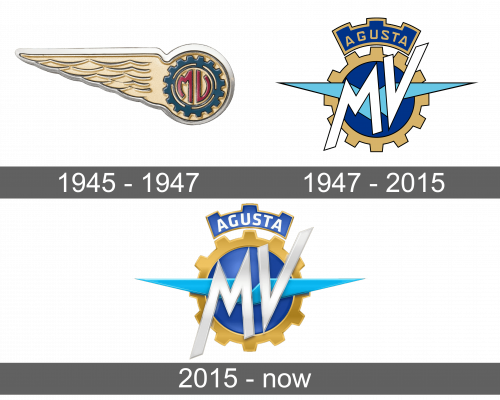
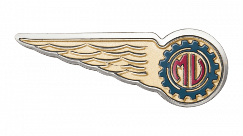
1945 – 1947
The aviation roots were reflected in this MV Agusta logo. A golden wing was stretched out to the left. The feathers on it appeared as if they had volume. The wing was part of a circle on the right, which featured a cogwheel with brand initials. The latter were a muted burgundy color and curving inside the calm blue wheel. The color palette looked very harmonious and made the logo appear sophisticated.
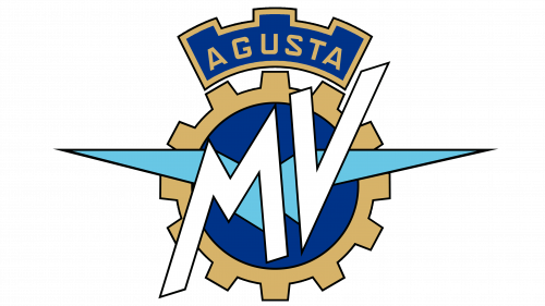
1947 – 2015
A cogwheel with a golden border and deep blue in the center served as the base for larger, white lettering that spelled out “MV”. Inside the cogwheel and under the inscription, there are two sky-blue wings in honor of the aircraft manufacturer. To complete the picture, the emblem had a crown at the top. It had squarish peaks to go with the cogwheel and the same color palette. Considering all the awards the brand has earned, it is well deserved. Across the crown, it stated “Agusta” in golden, all uppercase letters using a basic, non-serif font.
2015 – Today
Metallic and modern details have been added to the logo. all the colors acquired highlights and shadows, which brought the image to life and gave it a 3D appearance. The huge “MV” initials were now even bigger and featured a silver color. The “Agusta” inscription was also changed to white with minimal font adjustments. Otherwise, the color palette and shape of the emblem were kept the same.
Font and Color
The company went for a calm color palette. Golden and deep blue are often considered royal colors and instill a feeling of dependability and stability. The white color is a color of perfection, while the black details add a touch of professionalism. Although the designers went for a relatively simple, sans-serif typeface for the inscription on the crown, they went all out when it comes to the typeface used on the cogwheel. The letters give a feeling of movement and boldness.


