Audi Logo
Audi is a successful German car manufacturer headquartered in Ingoldstadt. It focuses on passenger sedan cars as well as SUVs and electrical cars. It also has sportsbacks, coupes, and even automobiles certified for racing. The Volkswagen Group included Audi since 1964. Today, the manufacturing sites of the automaker are located in over ten countries of the world. This German brand never ceases to please its admirers with high-tech developments.
Meaning and History
August Horch first established an A. Horch & Cie company in 1899, but left ten years later. He launched another one (August Horch Automobilwerke GmbH) and had to rename it Audi (the Latin version of his name). In 1928, the German DKW purchase the brand. It was also one of the German companies that were forced to join the Auto Union due to an economic crisis in 1932. In 1958, Daimler-Benz AG acquired controlling shares in Auto Union, but then sold them to Volkswagen. It was not long afterward that Audi saw a rise in its sales and offered many great new models.
What is Audi?
Audi is an automobile brand that originated in Germany. The brand is owned by the Volkswagen Group. The main Audi factories are located in Ingolstadt and Neckarsulm, where it all started.
1909 (prelaunch)
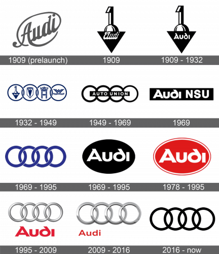
A prelaunch version has the name written in cursive handwriting. It has a darker shade of gray and beautiful, yet simple lines. The word is written at a diagonal with the end going up. The last letter curves up and around the word.
1909
The logo consisted of a combination of different elements. It had a black triangle with one end turned down and “Audi” written in white, cursive typeface towards the top. There was a globe at the top of it that was partially hiding behind. A 3D number “1” was placed right above the sphere. There was definitely some symbolism in the emblem.
1909 – 1932
The designers slightly modified the logo by changing the font used to spell out “Audi”. All the letters were written separately. The white color was preserved.
1932 – 1949
When the four companies brought about the Auto Union, four rings symbolized the united enterprises. The first ring had the logo of the Audi brand. The other rings had other brands’ logos. The emblem was dark blue.
1949 – 1969
The designers kept the rings but removed all the logos inside. Instead, they added a black banner that was placed right across and had “Auto Union” written in plain, uppercase letters. The rings were thicker and black.
1969
A horizontal rectangle served as a backdrop for a wordmark. It was black and had “Audi NSU” done in white. The same font as in the emblem with a triangle was used again for “Audi”, which made the logo more recognizable.
1969 – 1995
Four bold rings in blue were the only elements of the logo. They had a thin white outline and marked a new period in the history of the brand. In addition, they overlapped more than they did before. This was a time when Volkswagen got full ownership of the brand and cars were released under the Audi brand again.
1978 – 1995
The word “Audi” was written using the same font that was seen in several other logos. It was white and contrasted amazingly against a red color of an oval figure behind it. The shape had a double thin border with white being followed by red. It looked vibrant and memorable.
1995 – 2009
The company brought back the rings. They were done in metallic silver and had a 3D appearance. Underneath, there was the familiar “Audi” inscription. It had a bright red color, just like the oval emblem used earlier.
2009 – 2016
The modifications were quite minimal. The “Audi” was written in the same color and using the same font. The only difference was that it was made smaller and placed on the left under the rings. The rings were still silver but had a more angular shape inside instead of being perfectly round. There was also more shadowing for even more depth and volume.
2016 – Today
There was a lot of simplicity in this logo as it was just the familiar four rings. They did not have any volume and were done in black. The brand recognition did not require any additional details.
Font and Color
For almost a century, Audi had a color palette that combined black or blue and white. In 1978, it introduced a red color, which was used in its logos until 2016. Another neutral color, silver was the main color for about twenty years. In 2016, the black was brought back. The word “Audi” was written using the same font since the foundation and until 2009, although in different colors. A simpler typeface was used for other inscriptions.

