NatWest Logo
NatWest stands for National Westminster Bank, a major retail and commercial bank in the United Kingdom. Westminster Bank and National Provincial Bank merged to form it. They established it in London. Its creation aimed to combine expertise and resources to provide more extensive banking services.
Meaning and History
NatWest was established on January 1, 1970, following the merger of National Provincial Bank (established in 1833) and Westminster Bank (established in 1836). These banks brought together their networks to form a new entity aimed at dominating the UK banking sector. Over the years, NatWest expanded its services, adopting modern banking technologies and extending its influence both in the UK and internationally. Significant milestones include the introduction of the Switch debit card in 1988 and becoming part of the Royal Bank of Scotland Group in 2000, which marked a new chapter in its history.
What is NatWest?
NatWest is a prominent banking institution in the UK, providing a wide range of services including personal banking, business finance, and insurance. It operates both physically through its branches and digitally via online banking platforms, catering to millions of customers across the country.
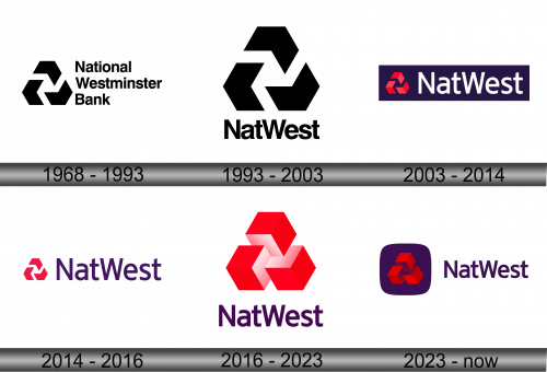
1968 – 1993
The logo consists of three intertwined three-arrows, each pointing in a different direction, symbolizing stability and interconnectedness. With a bold, sans-serif typeface, “National Westminster Bank” stands prominently. The design’s monochromatic scheme conveys professionalism and simplicity. This geometric and abstract motif reflects a modern and progressive banking ethos.
1993 – 2003
The updated logo simplifies to “NatWest,” dropping the full name for a more concise brand representation. The iconic three-arrowed symbol remains, evoking continuity and direction. The typography is clean, bold, and sans-serif, enhancing readability and impact. This redesign signifies a shift towards a more modern, streamlined identity while maintaining the original’s strength and recognizability.
2003 – 2014
The emblem now features a vibrant red hue, replacing the stark monochrome of its predecessor. It sits against a deep blue background, suggesting trust and confidence. “NatWest” adopts a white color, enhancing contrast and visibility. This refreshed palette energizes the brand, conveying modernity and dynamism while maintaining the logo’s established geometry.
2014 – 2016
In this iteration, the logo maintains its red and purple palette, but the design is more streamlined. The three-dimensional effect on the arrows has been removed, giving the icon a flatter, more modern look. The typeface appears unaltered, consistent with the previous design, emphasizing stability within the brand’s evolution. The background is now absent, allowing for greater versatility across various platforms.
2016 – 2023
The logo presents an optical illusion of interlocking arrows transforming into cubes, in a vibrant red gradient that suggests depth. Below, “NatWest” is written in a bold, purple font. The design is a fusion of classic and modern elements, reflecting the bank’s evolution while remaining rooted in tradition. It’s a striking visual that commands attention and reinforces the brand’s identity in the financial landscape.
2023 – Today
The logo has evolved to feature a rounded square, setting off the red, cube-like arrows within it. This shape makes the icon adaptable for mobile and app interfaces. “NatWest” remains next to the symbol, its purple hue matching the background of the icon. The design moves toward a modern, app-centric aesthetic, emphasizing easy recognition in digital spaces. It’s a step that nods to current design trends favoring minimalism and functionality.
