NBC Logo
National Broadcasting Company, abbr. NBC is an American commercial television company founded on November 15, 1926. Throughout its history, the brand has used several corporate logos, the first of which was used in 1926, when the radio network began operating.
Meaning and history
![]()
1926 – 1931
![]()
The original logo of the company is directly related to its broadcasting activities. It was a microphone against the background of a map of America from which lightning strikes in all directions. Above was the abbreviation of the company. All of this was placed on a red or blue background.
1931 – 1942
![]()
Now the logo included trademark capital letters in an oblique line. The image of the map has disappeared, but the images of lightning still remained. The logo obtained a square black mark with rounded corners.
1943 – 1946
![]()
In 1943 brand introduced a new version of the logo with an old-style microphone on it. The image emitted red lightning and electric waves. The company’s name was also located on the microphone body.
1946 – 1952
![]()
In 1946, the emblem was radically changed. The logo now consisted of three NBC capital letters placed inside a black rectangular frame.
1952 – 1953
![]()
In 1943 logo was updated. Letters became larger and, thanks to the black shadow, began to look more voluminous. The serifs disappeared, the logo became to look more powerful, which certainly indicated the reliability and stability of the company.
1953 – 1959
![]()
A new xylophone-shaped logo was invented in 1953. It was black and white, and three keys were inscribed with the letters NBC. The display of the logo was most often accompanied by recognizable chimes played by a seven-tone string.
1956 – 1975
![]()
The famous logo in the form of a peacock with a multicolored tail appeared only in 1956. The author of the idea was John J. Graham. According to the original idea, the eleven feathers were supposed to highlight all the richness of colors used by the television network.
1959 – 1975
![]()
In 1958, the brand introduced another logo that merged the three letters of the brand. N and B have a common partition, and the letter C is glued to them from below.
1976 – 1979
![]()
In 1976, shortly before its fiftieth anniversary, the company again adopted a new logo. Now it was a trapezoidal letter “N”. Its right side was bright red and the left side was blue.
1979 – 1986
![]()
In 1979, the brand brought back its unique peacock, but in a slightly modified form. The bird’s body was now transparent and had a blue outline. The tail had 11 feathers, painted in six colors: yellow, orange, red, purple, dark blue and blue. In the background of the emblem, you can see the thin outline of the geometric letter “N” that was added from the previous emblem.
1986 – 2010
![]()
The 1986 logo also features the already recognizable peacock. However, now his head is turned to the right instead of the left, and the number of feathers has decreased significantly. Now there are only six of them: yellow, orange, pink, purple, blue and green. The outline of the geometric letter “N” disappeared, leaving space for the company abbreviation, written in capital black letters under the peacock.
2010 – 2013
![]()
The logo was updated in 2010. The designers enlarged the image of the peacock and added a clear silvery outline that separates its feathers and makes the image more voluminous. The abbreviation for the company has disappeared.
2013 – 2022
![]()
In 2013, the logo was reduced and the company name was returned. As in the 1986 version, it is located under the peacock, however, the font has been changed to a stricter one.
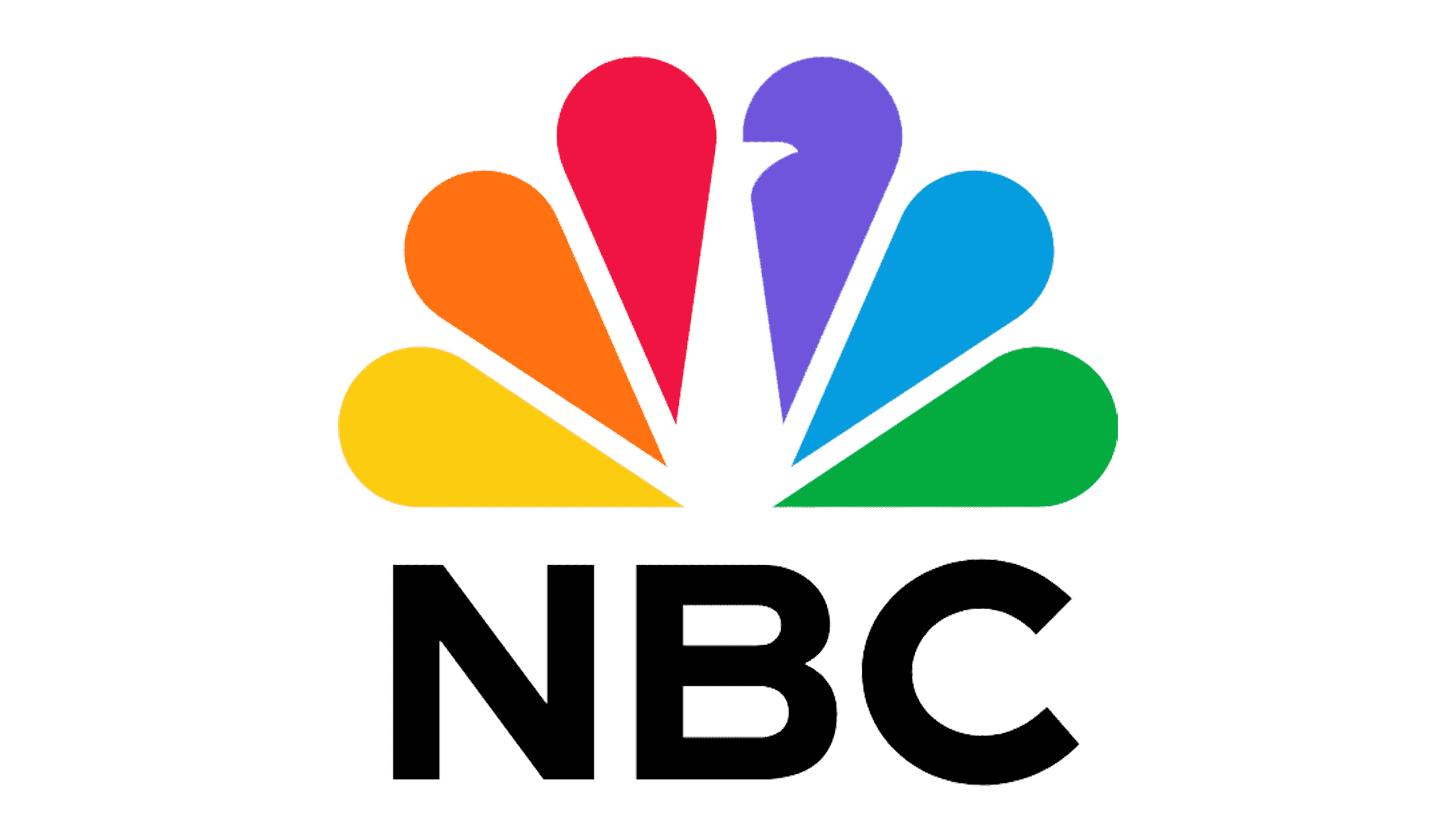
2022 – now
With the redesign of 2022 the NBC corporation decided to come back to simplicity, and changed its three-dimensional colorful peacock emblem to a flat one, with the typeface of the lettering changed to a cleaner and sharper one. Technically, the company has returned to the badge, designed for it in 1986, with some minor, barely noticeable modifications.


