Old Spice Logo
Old Spice is an American marque of male hygiene products, owned by Procter Gamble. It is primarily related to shaving foam, post-shave means, deodorants, shampoos and shower gels. The brand appeared in 1938 as Early American Old Spice, influenced by the British thirteen colonies’ mood.
Meaning and history
Early American Old Spice was introduced in the 1930s as an aroma for women. It was manufactured by Shulton Company, specializing in hygiene goods making. After the female aroma’s success, Shulton Company had decided to develop a male variant of the Old Spice in 1938, focused on shaving means. While founding Old Spice brands, William Schultz, the Shulton’s founder, was curious about the mood of the 18th century British America. He had made his brands with this mood, using some notable attributes of the age in marketing materials a ship, for example. Moreover, the widely recognized as a man’s transport, as it’s hard to imagine a woman as a sailor.
This colonial concept also influenced the naming Old Spice was called so due to the fact that centuries ago spices were afforded only by rich people, and this catchy spice scent accompanied them everywhere, highlighting their status, just like the scent of Old Spice.
The Old Spice product line had been operating under Shulton’s establishment until 1990, when Procter Gamble acquired the marque. A bit later, P&B introduced various male hygiene goods marqued Old Spice: deodorants, soaps, shampoos, and gels. All this allowed the brand to become the top men products’ marque in the US and Europe.
What is Old Spice?
Old Spice is an international brand of male selfcare products, involving deodorants, shaving foams, shampoos and shower gels. It appeared in 1938 thanks to Shulton Company, and now manufactured by Procter Gamble.
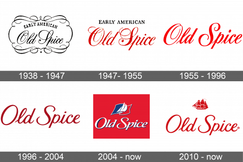
1938 – 1947
The original Early American Old Spice logotype had been using a black nameplate, written in two fonts: the ‘Early American’ part used a capitalized serif typeface with tiny gaps between the characters, while the ‘Old Spice’ portion employed a handwritten script with numerous curls and decorative lines. The whole nameplate was placed inside an ornamental frame with many rounds.
1947 – 1955
Then, they had removed the frame and recolored the ‘Old Spice’ inscription red. The ‘Early American’ lettering, remaining black, was placed above the red part, and it was written in a straight line instead of rounded as in the 1938 version.
1955 – 1996
The ‘Early American’ wording was completely written out of the signature in the 1955 logotype. At the same time, the ‘Old Spice’ lettering got a fresh style. The cursive characters became less rounded, and there weren’t that many decorative lines. The ‘p’ character completely changed its appearance, closing its spiral section.
1996 – 2004
In 1996, shortly after the change of management, Old Spice renovated its logotype, refreshing the lettering’s typeface.
2004 – today
For some time in the 2000s, the brand used a signature, in which the white name stands over a large red rectangle. The characters barely differed from the 1996 inscription. They were a bit flattened, and made volumetric due to a small contour surrounding each symbol. Above the name, they put a small ship with three sails, placed over a flag or some another signature, colored one half blue, one half red. Each part was contoured gray.
2010 – today
The latter nameplate has the same typeface as in 1996. Above the name, they’ve placed an image of a small ship having numerous sails and a large mast.
Font
The ongoing typeface for the Old Spice wordmark follows the traditions of the brand identity. It has a handwritten style, as previously, but the letters don’t have most of the decorative lines and curls. Some character changed completely. For example, the ‘s’ formerly had a very bold main bar with extra thin upper and lower ends, while now it has a more balanced appearance.
Color
The immutable color of the brand is bright and dark red. It associates rage, courage, and power. There are other color codes used in specific cases.

