Outlook Logo
Microsoft Outlook is a set of corporate programs that contains many functions: contacts, a task scheduler, a notebook, a calendar, and, of course, an email client. Outlook provides the ability to send and receive letters, write notes, save messages, and many other interesting functions. Thanks to Outlook, one can connect all the necessary servers to your mail and have all the letters at your fingertips in one place. The built-in task scheduler allows the users to effectively plan time by setting reminders.
Meaning and History
![]()
Founded by Sabeer Bhatia and Jack Smith, Outlook was known as Hotmail before it was bought by Microsoft. The latter first launched Outlook in 1997. It came out as part of Microsoft Office 97. Given the fact that Outlook came out in 1997, Microsoft has had a lot of time to improve the product. Outlook has grown and evolved over the years, releasing several versions. It is a completely different and improved product today than when it was launched.
What is Outlook?
The Outlook service has been operating for many years and is among the most popular in the world. This is an email manager that helps one work with corporate mailboxes. The functionality of the program is designed to receive and send emails. Additional options include scheduling tasks, creating conferences, and mailing lists, among other functions.
1996 – 1997
![]()
The logo featured a red and blue color palette with white accents. The “HotMail” inscription had three-dimensional, rounded, sans-serif letters that cast a shadow on the blue background. The latter had a slightly perforated texture, which added interest. At the same time, the logo looked quite busy and the name was hard to read.
1997 – 1998
![]()
This logo features a more professional, clean design with a name at the bottom and a tilted square above it. The name was printed using an italicized font without serifs using thick strokes and straight cuts that looked similar to Shapiro Pro 97 Italic. The color palette was quite bold and one will surely not miss the logo, even if it was small. The stylized red square was not only placed at an interesting angle but also had two edges had a way pattern and an initial. The latter was done in white and featured fluent and smooth strokes that curved and got thinner toward the end, creating a feeling of movement.
1998 – 2000
![]()
This logo shows that Hotmail is owned by the Microsoft Network, which instantly created an association with a more recognizable and trusted organization. The designers used the red, diagonal emblem with “MSN” printed in white, lowercase letters over it to signify this. The same emblem was used by MSN itself only with a “Microsoft” inscription. This inscription was replaced by “Hotmail”. The company used a bold, sans-serif, italicized font of a contrasting black color. The use of the same color palette made it easier to associate this logo with a service that gained more recognition over a couple of years of its existence.
2000 – 2007
![]()
As MSN changed its logo in 2000, so did Hotmail. The new blue “MSN” wordmark with a colorful butterfly in the upper right corner was now placed right next to the black “Hotmail” inscription. The company continued to use a rather strict and clean font for its name, but this time it looked more like a sans-serif Franklin Gothic Raw Demi font.
2005 (beta)
![]()
As Hotmail transitioned into being Windows Live Mail, the logo was updated as well. First of all, the logo now had a familiar Windows four-colored flag symbol as well as used the same font as the Windows logo. The inscription, though, had “Windows Live Mail” with the first two words being bold. This logo was used during the testing period, so it also had “Beta” printed in a smaller font of an orange color that was also seen in the Windows logo and symbol. The company did a great job creating a unified image for all its products.
2005 – 2007 (beta)
The logo was slightly rearranged to create a more compact emblem. The flag symbol was enlarged and moved above the inscription. It also had slightly different shading while the colors changed only their hue. To make the name appear shorter, the “Mail” portion, which was already separated by the thickness of the strokes, moved right under the word “Live”. The “Beta” note was removed.
2007 – 2010
![]()
Although the company tried to create a more neat look, the logo was unbalanced. Thus, it was decided to return to the one-line logo. The colors in the Windows symbol got brighter, which created a more positive image. In addition, the “Mail” was replaced by “Hotmail”, bringing back a more familiar name. Just like in previous versions, the last word featured finer strokes that set it apart from the rest of the wordmark.
2010 – 2011
![]()
In 2010, a completely new look was presented. Its main feature was a bright orange mailing envelope. It was placed at an angle and featured a gradient that enhanced its three-dimensional appearance. There were also two curvy lines, one behind and one in front, which reflected the fact that one could send mail in a smooth and easy way. To the right, the logo featured a two-line inscription that placed an accent on the word “Hotmail.” while the upper line was done in a much smaller font and said “Windows Live”. The fact that the company continued to use the same font and color for the wordmark as well as a bright symbol made the logo look familiar.
2011 – 2013
![]()
A small update was made a year later. The top line now had “Microsoft” instead of “Windows Live”. The font choice and color as well as the orange envelope remained unchanged.
2012 – 2013
![]()
In 2012, the company tested a flat and completely orange version of its log. It also removed the top line, leaving only the name of the actual service. This logo looked minimalistic and reflected the desire to stay in line with modern trends as well as the simplicity and convenience of sending emails that the service offered.
2012 – 2019
![]()
As Windows moved to a sky blue color palette and promoted its Outlook service, a new logo was designed. The envelope was replaced by a new symbol, which featured a square drawn at an angle with an envelope peaking from behind it. Similar symbols were created for other Microsoft products, which created a cohesive brand image. To keep its emblems easily recognizable, the company continued to use the same font.
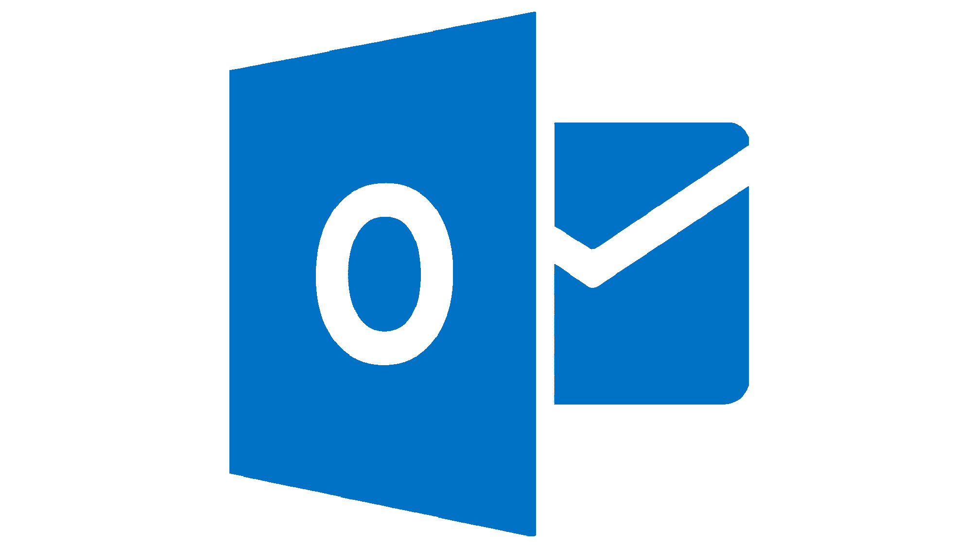
2019 – Today
![]()
The emblem from the previous logo was redesigned as it was now the only logo element. It featured various shades of blue as well as white color. In the very front, the logo had a square of solid blue color with rounded edges and a white “O” in the center. This square cast a shadow onto a three-dimensional envelope with a piece of paper sticking out of it. The latter had a solid blue line across the top and multiple squares of different shades of the same color as the other elements in the emblem. It instantly created an association with a calendar, reflecting multiple features of the service, and also added a pattern and made the logo dynamic.
Font and Color
Originally, the designers went for a rounded, sans-serif typeface with varying thickness of the strokes that appeared to have some volume. The logo introduced in 1997 featured a more clean and strict sans-serif font that resembled Shapiro Pro 97 Italic. It was replaced by another sans-serif font that looked like Franklin Gothic Raw Demi or a similar font with the “MSN” portion being printed using the same font, only italicized. Since 2005 and until 2019, all Outlook logos featured the same font that is typically associated with Microsoft. It is a sans-serif font with clean lines and a combination of straight and diagonal cuts called Segoe.
All the Outlook logos featured a rather bright and/or colorful color palette that was balanced by black. The latter also gave the emblem a more professional, serious, and trustworthy appearance. For a short period, the company used a monochrome-orange color palette. In 2012, the company transitioned to a sky blue color, which is one of the requirements of the New Metro design language.


