PBS Kids Logo
PBS Kids is a vibrant educational programming brand of the Public Broadcasting Service (PBS) in the United States. It was created to offer enriching, educational content tailored for children, fostering learning and curiosity through TV shows, online content, and interactive games. The initiative emphasizes on making learning enjoyable and accessible, targeting preschoolers to young adolescents. Its creation reflects PBS’s commitment to educational media, aiming to support children’s development and educational journey.
Meaning and history
PBS Kids, launched by PBS in 1994, revolutionized children’s TV in the USA. It aimed to educate through fun, interactive content. Originating as part of the public broadcasting mission, it focused on early learning. Shows like “Sesame Street” became iconic. The brand expanded online, offering games and educational apps. It’s recognized for quality, educational value. PBS Kids continues evolving, integrating digital platforms to reach young audiences. It supports diverse, inclusive content, shaping young minds positively.
What is PBS Kids?
PBS Kids stands as a beacon of educational entertainment, crafting a world where learning and fun intersect seamlessly for children. It represents an initiative by the Public Broadcasting Service to mold young minds through thoughtfully designed TV shows and digital offerings, enriching their educational journey with creativity and joy.
1993 – 1999
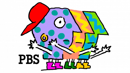
The logo radiates playful creativity with three abstract, multi-colored figures, each brimming with individuality. Adorned with a lively palette of purple, yellow, and green, these whimsical characters sport polka dots and stripes, reminiscent of a child’s carefree drawings. They strike an embracing pose, symbolizing the welcoming and inclusive nature of PBS Kids. At their feet, “PBS” is written in a simple, bold font, anchoring the vibrant scene with a touch of sobriety. This logo is a visual celebration of diversity, learning, and joy.
1993 – 1999
The new logo ditches the abstract figures for a sleek, typographic design. The letters in “PBS for Kids” are bold and chromatic, each a different hue, conveying diversity and vibrancy. The elephant silhouette, black and white, brings a classic PBS touch, symbolizing wisdom and memory. This clean, more mature presentation retains a playful edge, with the varied colors adding a dynamic, engaging quality, appealing to a young, imaginative audience.
1994 – 1999
This rendition of the logo introduces a playful, geometric twist, with a profile silhouette featuring a bold, purple hue and an inquisitive eye. A string of pink circles, reminiscent of a child’s bead necklace, links the head to a vibrant green square housing a stylized letter ‘V’, infusing the design with a sense of connectivity and continuity. The simplicity of shapes and the bright, contrasting colors speak to a youthful exuberance and a creative approach to learning, characteristic of the PBS Kids ethos.
1998 – 1999

Embracing a more rounded and centralized design, this logo encases the iconic PBS profile in a warm, orange circle. Below, a curved yellow banner proclaims “PBS Kids!” in bold, playful letters, exuding energy and excitement. The vibrant color scheme of orange and yellow radiates a friendly, inviting vibe, suggesting creativity and fun, a shift towards a more cohesive and striking visual identity that captures the essence of the brand’s dedication to youthful education and joy.
1999 – 2013
The latest iteration swaps the previous logo’s warmth for a striking green backdrop, introducing a playful, cartoonish character. The face, a simple yet expressive line drawing, exudes curiosity and friendliness, capturing the imagination of the PBS Kids demographic. Nestled within the green sphere, the “PBS” typeface remains bold and prominent, while “KIDS” finds its place below in a straightforward, black font. The entire design radiates a fresh, lively vibe, inviting interaction and learning in a youthful, energetic environment.
2009 – 2022
In this evolution, the logo maintains its circular, green motif but intensifies the contrast with a deeper shade. The character’s face is more defined, with a stylized haircut and an engaging, slightly mischievous grin. “PBS” and “KIDS” now share the same lime-hued space, fostering a stronger connection between the elements. The text is bold and more pronounced against the green backdrop, ensuring readability and impact. Overall, the design tweaks enhance the logo’s playful yet confident character, reflecting a modern and spirited PBS Kids brand.
2022 – Today
The character has been removed, ushering in a minimalist approach with a vivid blue oval backdrop. “PBS KIDS” is front and center in a contrasting lime green, standing out with a playful yet bold font. This simplified design strips away complexity, focusing squarely on the name, signaling a modern, accessible, and direct brand identity. The choice of blue conveys trust and dependability, while the green text injects a zestful energy, keeping the spirit of learning alive and engaging.


