Cocomelon Logo
Cocomelon is a corporate YouTube channel that mostly creates video for preschool audience. It mostly means song videos made with cartoon video created by specifically by the channel. By 2021, it’s become one of the few channels that surpassed a 100-million-subscriber milestone.
Meaning and History
Cocomelon was founded by Jay Jeon and his wife in 2006, originally under the name “ThatsMEonTV.” It was later rebranded to “ABC Kid TV” and eventually became Cocomelon in 2018. The channel started as a simple project to entertain their own children and gradually evolved into a staple in children’s educational entertainment. Among its main achievements, Cocomelon has become one of the most subscribed YouTube channels worldwide and has expanded into offering its content on various streaming services like Netflix. It has also launched its own line of toys and merchandise, further broadening its business model and reach. Currently, Cocomelon holds a significant position in the realm of digital children’s education, continuously impacting young viewers by providing content that combines learning with fun.
What is Cocomelon?
Cocomelon is a children’s entertainment company specializing in educational videos that combine music, nursery rhymes, and 3D animation to aid in early childhood education.
2006 – 2013
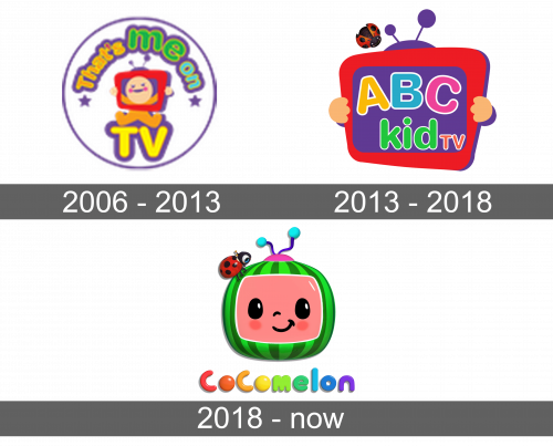
For a few initial years, the project was called ‘Checkgate’ (or ‘That’sMeOnTV’). The logo was a pink circle with an image of a toddler wearing a red TV on its head and sitting on a big yellow word ‘TV’. The rest of the wordmark is written above him in a curve. Each portion in it also uses a distinct color, including orange, green & blue.
2013 – 2018
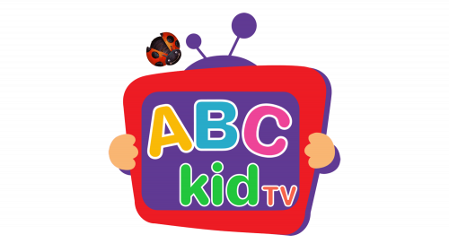
In 2013, the channel was rebranded into ‘ABC Kids TV’. The logo was updated, but the central piece was the same red TV held in someone’s yellow hands. The channel’s name was written with round cartoonish letters inside the TV display, although the ‘TV’ bit was taken out outside of it.
There’s also a ladybug above and to the left of it, which they kept into the next version.
2018 – today
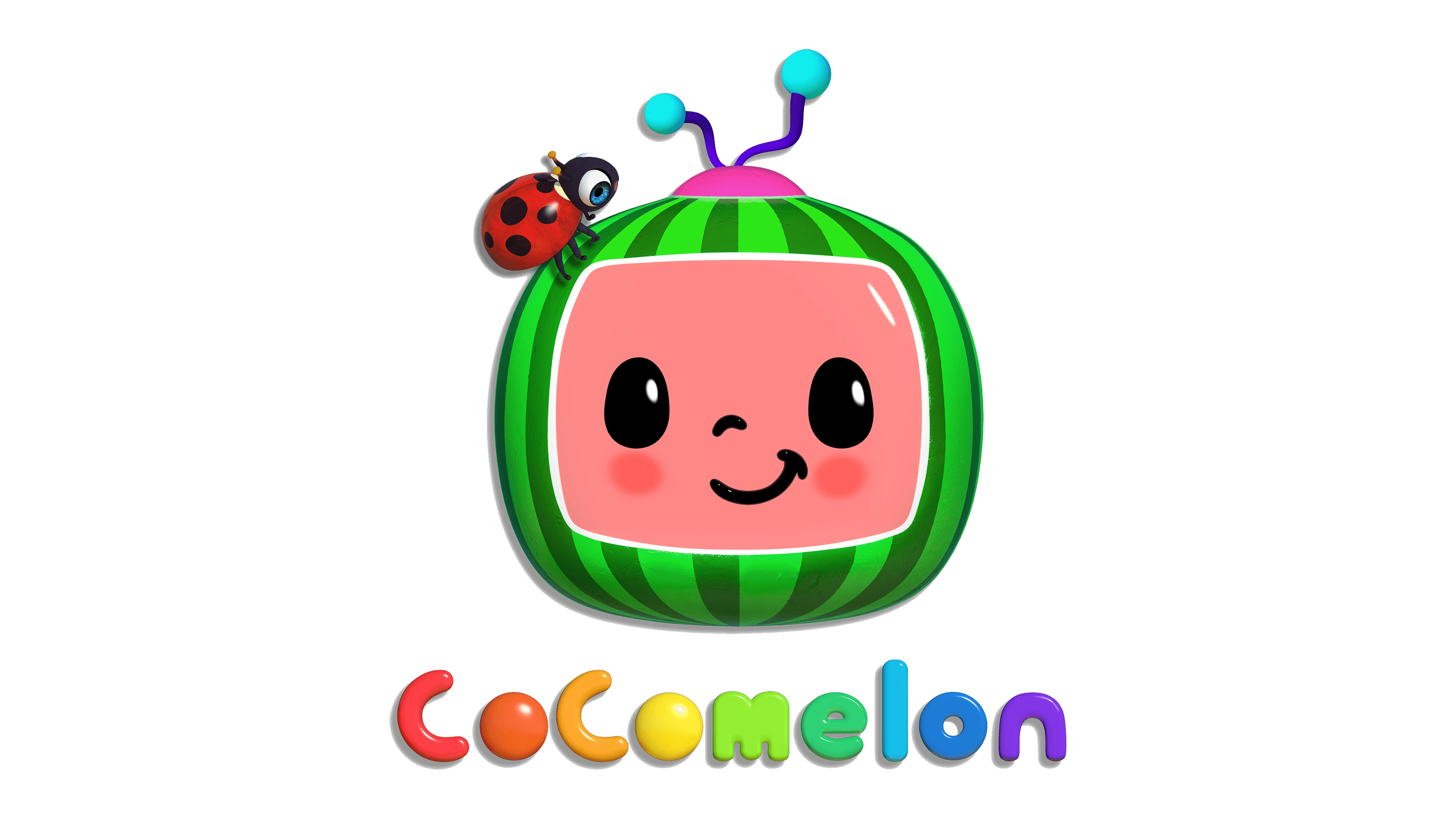
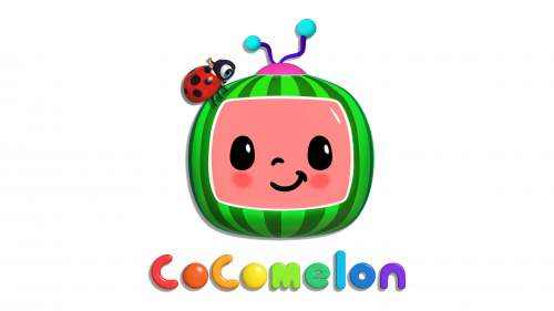
The channel turned into ‘Cocomelon’ by 2018. The logo they adopted then depicted a watermelon modeled like a TV (with an antenna and a ‘display’). The display is actually someone’s pink face with simple features. The usual ladybug is sitting on the watermelon’s corner.
Emblem and Symbol
There is also another logotype – the wordmark used in many other instances. It uses lowercase letters that resemble balloons, and each of them is given a unique color, ranging from red to purple. It’s almost like a rainbow, but with more elements in it.
