PetSmart Logo
PetSmart is a renowned American retail chain specializing in pet services and solutions. Its product line includes pet supplies, food, toys, and more. Moreover, PetSmart offers a range of services like grooming, training, and pet adoption. The company operates primarily in the United States, Canada, and Puerto Rico. It was acquired by BC Partners in March 2015. As of now, the company continues to be a leader in the pet retail industry, catering to pet owners’ needs with its extensive product and service offerings.
Meaning and history
Founded in 1986 by Jim and Janice Dougherty, PetSmart has grown from a single store in Phoenix, Arizona, to become the largest pet specialty retailer in North America, with over 1,650 stores across the United States, Canada, and Puerto Rico.
Initially named PetFood Warehouse, the brand changed its name to PETsMART in 1989, reflecting its transformation into a big-box pet retailer offering a wide range of products and in-store services, such as pet training and grooming.
The 1990s marked a period of significant expansion for PetSmart, as it opened hundreds of new stores and introduced innovative in-store services. In 1994, the company went public, raising capital to fuel further expansion.
In 2000, PetSmart underwent a rebranding, changing its name to PetSmart to emphasize its commitment to smart pet care. The early 2000s also saw the launch of PetSmart Charities, an independent non-profit organization that has since become a leader in pet adoption, having facilitated the adoption of millions of pets.
The company continued to innovate in the 2010s, launching an e-commerce platform and mobile app to cater to the growing number of online shoppers.
In 2015, PetSmart was acquired by a consortium led by BC Partners, a private equity firm, for $8.7 billion, marking one of the largest private equity deals in the retail sector. The acquisition was part of a strategic move by BC Partners to capitalize on the growing pet industry.
Since then, PetSmart has continued to evolve, expanding its product offerings, services, and market presence. The company has also invested in improving its online platform to compete with other online retailers.
Today, PetSmart stands as a testament to the growth and evolution of the pet industry, remaining at the forefront of providing pet owners with the products and services they need to care for their furry friends.
1986 – 1988
The initial emblem was a monochromatic rectangular shape, featuring a dual-lined inscription in black. The words “Pet Food” are prominently displayed at the upper portion, while “Warehouse Ltd.” occupies the lower section. These phrases exhibit a cohesive aesthetic, utilizing the same typography. The characters are substantial and bold, embellished with gentle curves and small, delicate serifs. Notably, the spacing between each letter is negligible, creating an almost interconnected appearance among the characters. This design encapsulates a straightforward yet distinctive identity for the brand, effectively communicating its core business in pet food retail.
1988 – 1989
Subsequent to the rebranding initiative, the proprietors of the pet food brand elected to undertake a comprehensive redesign of their visual identity. This metamorphosis gave rise to a novel emblematic inscription, meticulously segmented into three distinct components.
Positioned on the leftmost side, the term “Pets” makes its presence felt, dominating the visual field with its imposing stature. This element is meticulously crafted in a grotesque typeface, adding a modern twist to the aesthetic.
Adjacent to this, on the right-hand side, one observes a bifurcated textual arrangement. The upper echelon is occupied by the word “Mart,” neatly typeset to harmonize with its counterpart. Below this, the term “Petfoods” makes its appearance. This specific wording represents a synthesis of two separate entities that were previously distinct in the emblem’s earlier rendition.
A notable feature of this design is the encapsulation of the word “Petfoods” within the contours of a stylized bone, a nod to its canine clientele. The culmination of these elements is set against a backdrop of a light grey rectangular field, which serves as a unifying canvas that brings together the diverse components of the emblem in a cohesive and harmonious manner.
This reimagined logo, with its clever amalgamation of typography, symbolism, and color palette, is a testament to the brand’s evolution. It successfully encapsulates the essence of the brand while paying homage to its rich heritage, propelling it into a new era of brand identity that resonates with contemporary aesthetics and the expectations of its discerning clientele.
1989 – 1992
The emblem has undergone a significant transformation, with color now playing a pivotal role. A vibrant red takes center stage, while a cool blue serves as a complementary hue. The designers have ingeniously shifted focus to the store’s name, opting for the stylized “PETsMART” rendition. The letter “s” is demarcated as the focal point, standing out in its diminished stature.
A playful graphical element has been introduced in the form of a ball that appears to strike the letter “s,” propelling it into an upward arc. The trajectory of this dynamic interaction is illustrated through a series of curved lines that mimic the ball’s path.
This energetic motif lends a sense of vitality to the logo, with the wavy lines giving the illusion that the characters are in motion, seemingly springing off the canvas. The letters have been given a modern facelift, now boasting sharp right angles, a stark departure from their previous rounded form.
This reimagined logo is a symbolic representation of the brand’s progression, encapsulating a modern and dynamic aesthetic that aligns with the contemporary landscape of retail branding. It reflects a commitment to innovation and creativity, embodying the brand’s ethos and its dedication to remaining at the forefront of the pet retail industry.
1992 – 2005
The sphere remains strategically positioned above the “M”, maintaining its place of prominence. However, there’s a noticeable shift in the scale of the letter “S” which has been enlarged compared to its predecessor in the previous rendition of the design. This subtle alteration represents the extent of the modifications implemented.
This slight tweak in the logo is a testament to the brand’s commitment to continuous improvement while respecting the essence of its visual identity. It demonstrates an attention to detail and a nuanced approach to design, ensuring that the emblem evolves in a manner that is both thoughtful and impactful. This careful balance between innovation and consistency is what allows the brand to remain relevant and resonant with its audience, solidifying its position in the marketplace and continuing its legacy into the future. The logo, with its blend of tradition and modernity, perfectly encapsulates the brand’s ethos and its unwavering dedication to delivering excellence in all facets of its operation.
2005 – Today
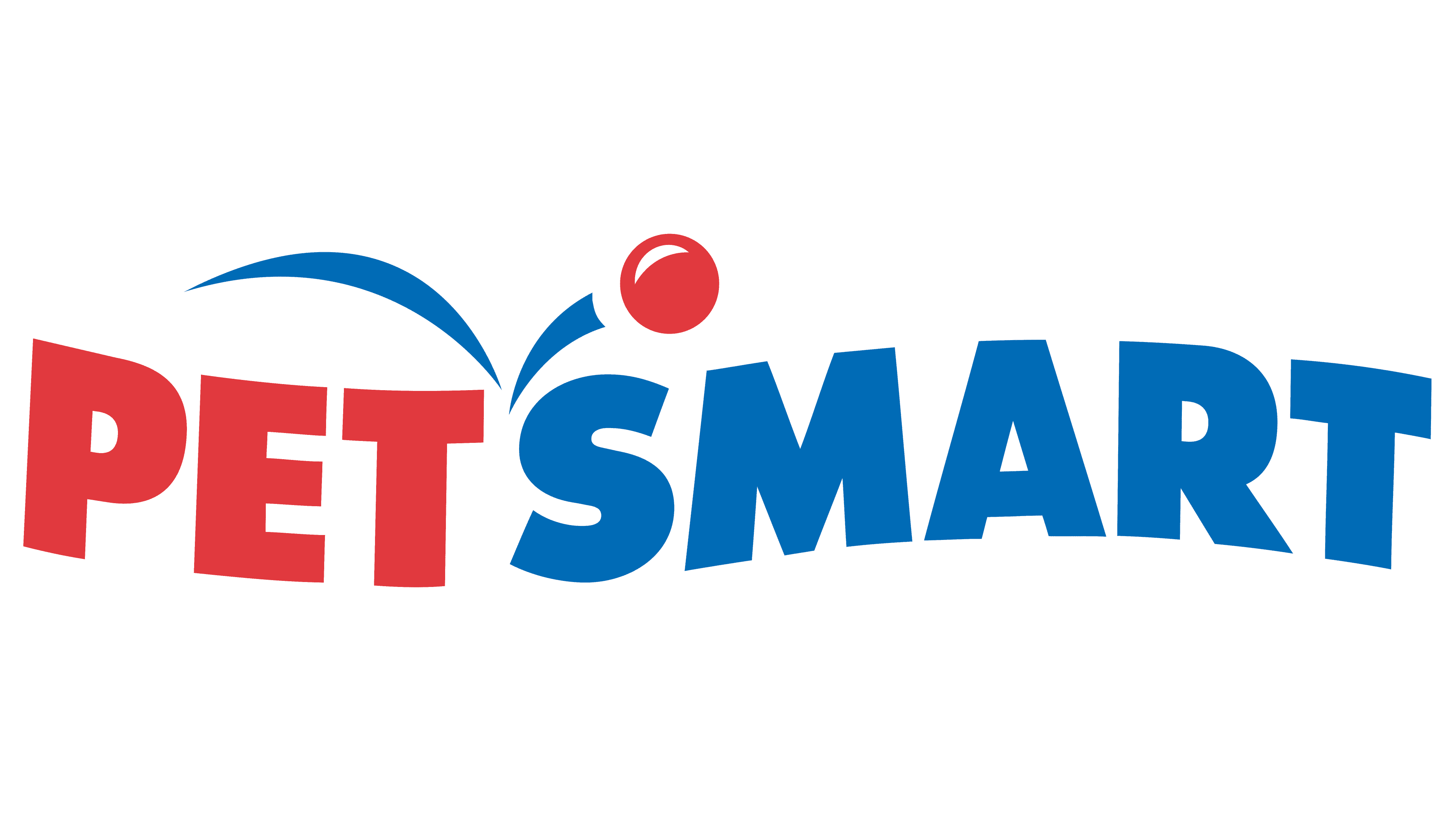
Currently, the foundation of the logo is a reimagined phrase, which is now segmented in a slightly different manner than its predecessors. The phrase is divided into two distinct segments, with “Pet” constituting the first part, and “Smart” comprising the second. Each of these words is uniquely represented by a specific color, with blue signifying “Pet” and red denoting “Smart.”
Furthermore, the separation between these two segments is ingeniously marked by the flight path of a ball, illustrated through two gracefully curved strokes. The intersection of these two strokes cleverly falls between the letters “T” and “S,” seamlessly integrating the visual narrative of the logo.
This new logo encapsulates a harmonious blend of symbolism and aesthetics, reflecting the brand’s innovative spirit and attention to detail. The color palette and the incorporation of dynamic elements such as the ball’s flight path add a touch of vibrancy and movement, infusing the logo with a sense of energy and liveliness. Overall, this refreshed logo is a testament to the brand’s commitment to evolving its visual identity in a manner that resonates with contemporary sensibilities while retaining the essence of its brand ethos.


