Pierce the Veil Logo
Pierce the Veil operates within the dynamic realm of music, specifically the post-hardcore genre, captivating audiences globally with their energetic performances and emotional depth. With roots in rock, their auditory creations often reflect personal and social themes. Led by Vic Fuentes, the ensemble continues to evolve artistically, engaging with international fans through tours and new music, like their recent release “The Jaws of Life” in 2023. The entity’s essence is encapsulated by its passionate delivery and the fervent community that reverberates with every chord struck.
Meaning and history
Pierce the Veil, an iconic American rock band hailing from sunny San Diego, California, has remained remarkably consistent throughout its journey, both in terms of its core members and its unwavering artistic vision. Founded in 2006, the group has been anchored by the Fuentes brothers, Vic and Mike, alongside the dynamic duo of Tony Perry and Jaime Preciado. This stability has been a cornerstone of their musical evolution and ongoing success.
From their humble beginnings, playing intimate local gigs and independently releasing their debut album, “A Flair for the Dramatic,” in 2007, Pierce the Veil rapidly amassed a devoted fanbase. Their sophomore effort, “Selfish Machines,” further solidified their position within the post-hardcore realm.
In a world where ownership and production often fluctuate, Pierce the Veil has admirably remained fiercely independent, guarding their creative autonomy with vigilance. While they’ve partnered with various record labels over the years, they’ve consistently upheld their artistic integrity. This approach has allowed them to organically shape their sound, yielding critically acclaimed albums such as “Collide with the Sky” in 2012 and “Misadventures” in 2016.
Pierce the Veil’s unwavering commitment to their craft and their steadfast loyalty to their original lineup have played pivotal roles in their enduring triumph, establishing them as a revered and everlasting presence within the alternative music landscape. Their devoted fanbase eagerly anticipates their next artistic venture, confident that their distinctive style will continue to captivate audiences around the globe.
What is Pierce the Veil?
Pierce the Veil is an American rock band from San Diego, California. Formed in 2006, the band is known for its energetic music that blends elements of post-hardcore, emo, and pop punk. Their dynamic sound is often highlighted by melodic guitar riffs and emotionally charged lyrics.
2006
The image depicts a three-dimensional, theatrical-style logo with the words “PIERCE THE VEIL” in prominent, ornate lettering, suggesting a blend of grandeur and drama. Below, in cursive, is the phrase “A Flair For The Dramatic,” which adds an air of sophistication and hints at artistic depth. The letters stand upright on what appears to be a wooden stage, evoking a sense of performance and showmanship. The overall effect is one of boldness and flair, with a nod to historical typographic styles.
2010
This logo features the name “Pierce the Veil” in an intricate, flowing script that intertwines gothic and calligraphic design elements. The letters are bold and black, with flourishes and embellishments that give it a sense of movement and artistic flair. This design is less three-dimensional and more graphic, with a clear focus on the elegance of the strokes and the harmony of the typography. This version conveys a more contemporary and stylized aesthetic, emphasizing the name itself as a work of art.
2012
he logo showcases the phrase “Pierce The Veil” in a dynamic, stylized font that conveys motion and energy. The characters are bold and intertwined, with sharp angles and sweeping curves, creating a visual representation of the brand’s edgy and vibrant nature. Compared to the previous logo, this one has a more aggressive and modern twist, with the letters seeming to leap forward. It retains the artistic flair but shifts towards a more contemporary, almost graffiti-like aesthetic, reflecting a youthful and rebellious spirit.
2016
This logo presents “Pierce The Veil” in a raw, sketch-like font, giving the impression of urgency and spontaneity. The red, handwritten style is reminiscent of graffiti, exuding a rebellious and youthful vibe. Each word is enclosed in a loosely drawn rectangle, adding a sense of structure to the otherwise free-form script. In contrast to the previous logo’s sharpness and precision, this design leans into a more informal and energetic aesthetic, suggesting a band in constant motion and evolution.
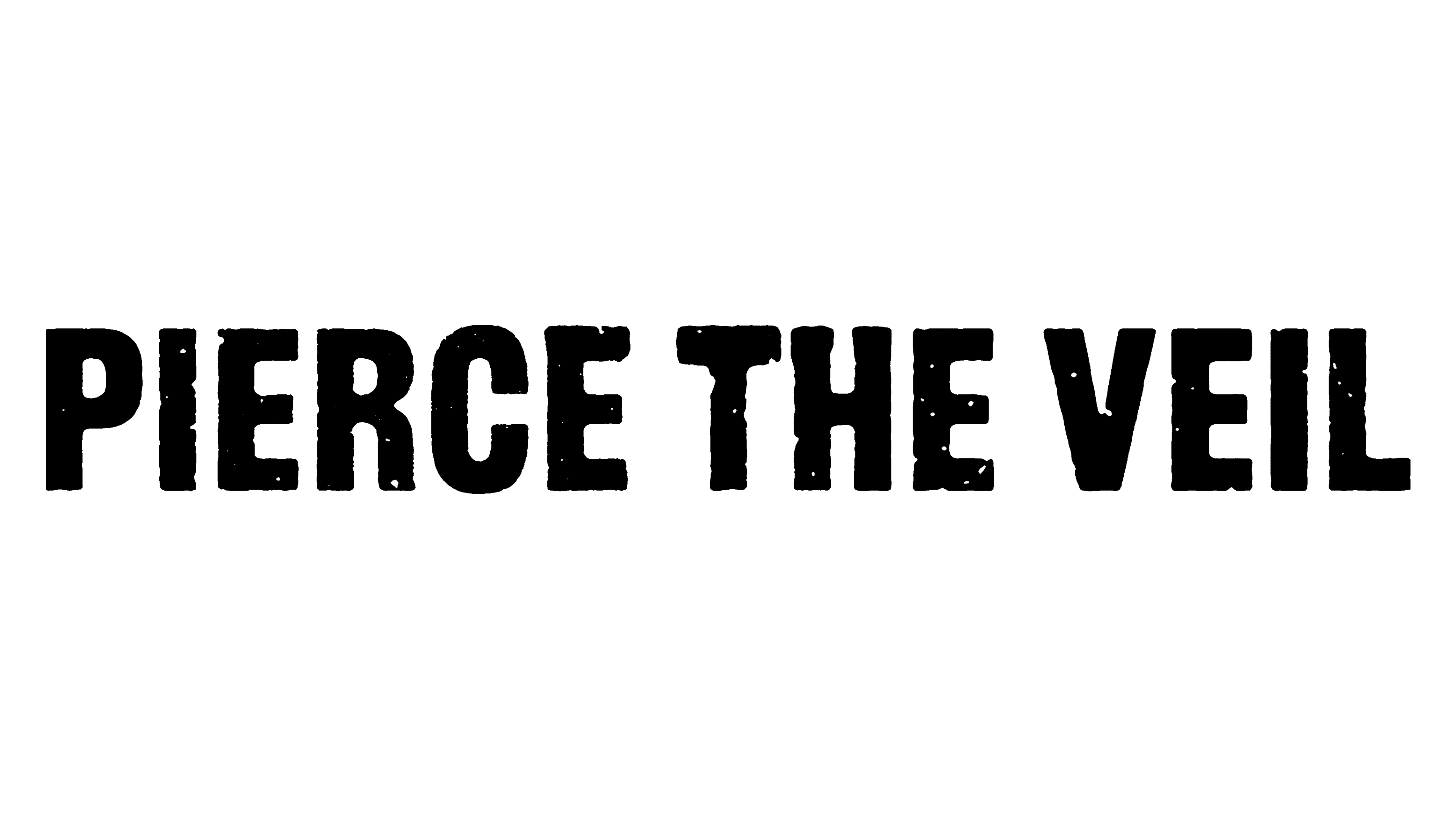
2023
The displayed logo is a stark, black text on a white background, spelling out “PIERCE THE VEIL” with a distressed, stencil-like font. The rugged edges of the letters suggest a worn, vintage effect, as if the text has been stamped or sprayed onto a surface. This design deviates from the previous iteration’s hand-drawn appearance, opting for a more uniform but still raw aesthetic. It communicates a straightforward, no-frills attitude, diverging from the more elaborate and ornate styles seen earlier, reflecting perhaps a back-to-basics or gritty approach.


