PJ Masks Logo
PJ Masks is a children’s animated TV series, originating from France. It was created by Romuald Racioppo, based on his book series “Les Pyjamasques.” The series blends action, fantasy, and educational elements, making it popular among preschoolers. Its themes of friendship, bravery, and teamwork have resonated with young audiences worldwide.
Meaning and history
PJ Masks centers on three 6-year-olds: Connor, Amaya, and Greg. By day, they’re normal kids; by night, superheroes. Connor transforms into Catboy, fast and agile. Amaya becomes Owlette, with flying and seeing abilities. Greg turns into Gekko, mastering camouflage and climbing. They access powers through their pajamas and animal-themed masks. The trio faces villains like Romeo, a child genius; Luna Girl, controlling moths; and Night Ninja, with ninja minions. Headquarters is their high-tech treehouse. The Cat-Car, Owl-Glider, and Gekko-Mobile aid their missions.
Stories blend action, problem-solving, and moral lessons.Themes include teamwork, friendship, and handling everyday challenges. Despite clashes, they learn from mistakes and grow. They emphasize helping others and doing right. The show’s appeal lies in relatable characters and imaginative adventures. It teaches kids about cooperation, understanding differences, and the value of friendship.
What is PJ Masks?
PJ Masks is an animated children’s series featuring young superheroes. By night, three friends transform into Catboy, Owlette, and Gekko to tackle villains and embark on adventures, blending fantasy with lessons in teamwork and bravery. The show is celebrated for its imaginative storytelling and positive messages for preschool audiences.
2014
The logo is dynamic and colorful, capturing the essence of a children’s superhero show. Three characters, each in a vibrant costume reflecting their namesake powers, leap forward energetically. On the left, a figure in blue embodies agility and speed, while the center character in red, with a cape, suggests the ability to soar through the skies. The character on the right, dressed in green, hints at a connection with natural stealth and strength. Below them, the bold, capitalized letters of “PJ MASKS” are emblazoned in a bright orange, outlined in blue, giving off a playful yet striking effect. The background is a deep blue with lighter accents, mimicking a night sky that alludes to the nocturnal adventures of the trio. The overall design conveys a sense of youthful adventure and the thrilling escapades that await viewers.
2015 – 2019
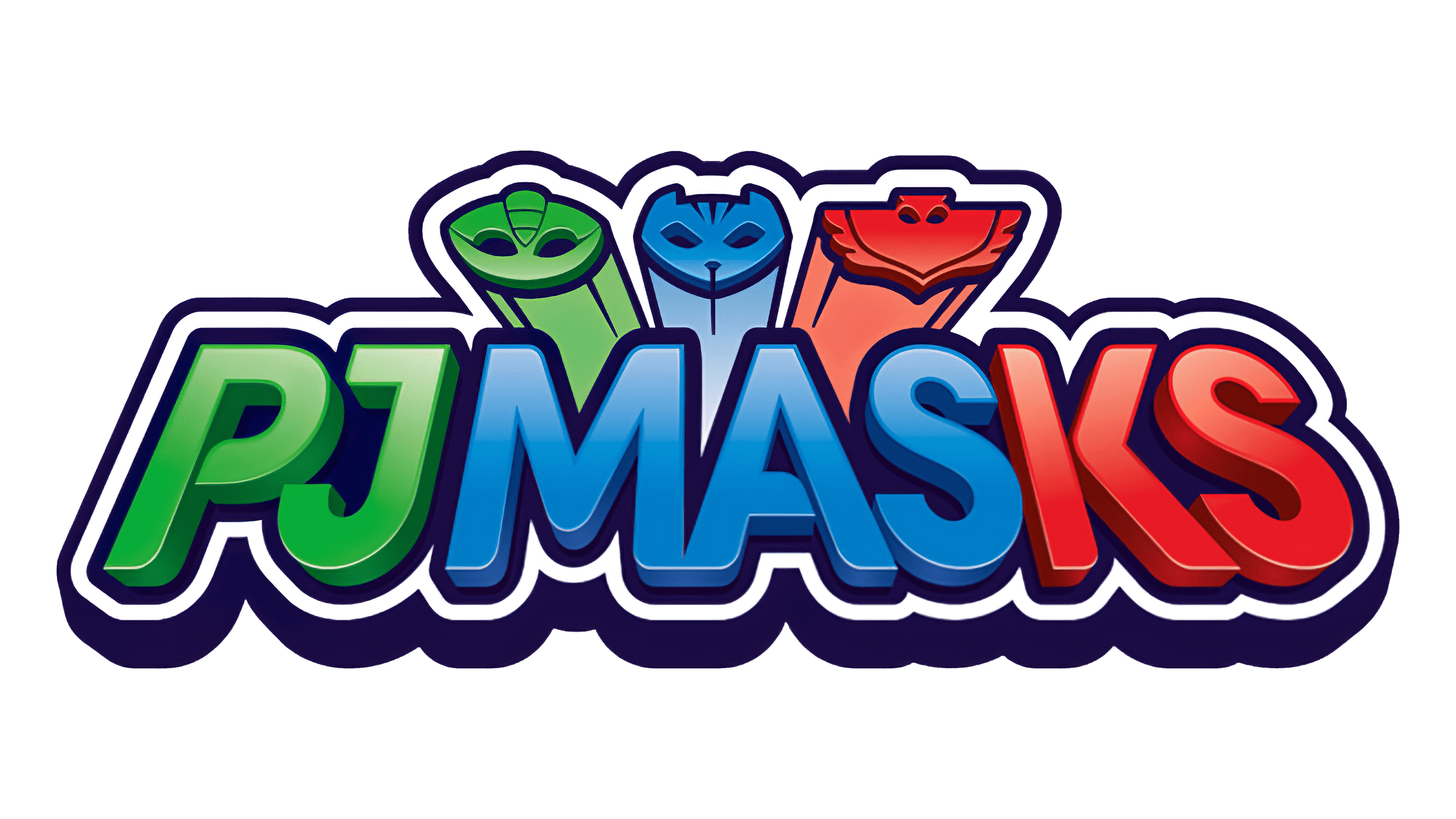
In this logo iteration, the focus is on the bold, stylized lettering of “PJ MASKS.” Each character of the title is infused with a distinctive color corresponding to the superhero trio. The ‘PJ’ shines in a gradient of green, reflecting Gekko’s colors, the ‘MAS’ in blue echoes Catboy, and the ‘KS’ in a gradient from blue to red resonates with Owlette’s palette. Above the letters, the tops of the superhero masks peek out, adding a playful element that hints at their alter egos. The design uses a pronounced shadow effect on the text, giving it a lifted, almost 3D appearance that stands out.
This logo variation is more streamlined and direct, focusing on the name itself while still referencing the characters’ superhero personas through color and subtle mask imagery. The overall look is sleek, modern, and very much in tune with a superhero theme, aimed at capturing the attention and imagination of its young audience.
2019 – Today
This rendition of the logo introduces a more pronounced outline, giving a bold, cut-out effect to the “PJ MASKS” text. The color scheme remains true to the superhero identities—green for Gekko, blue for Catboy, and red for Owlette. The characters’ masks, more defined and front-facing above the letters, add a distinct superhero touch. The colors inside the letters now feature a subtle gradient, enhancing depth and visual interest. A glossy finish gives the entire logo a modern, animated feel. The overall design maintains the adventurous spirit of the series while emphasizing the characters’ vigilance and readiness for action. The alterations create a more striking and cohesive visual that is instantly recognizable and engaging for the target audience.
