RBC Logo
RBC, or Royal Bank of Canada, is a leading global financial institution. Currently, RBC offers a comprehensive range of services, including personal and commercial banking, wealth management, and capital markets operations. Primarily anchored in Canada, the bank has a significant presence in the US and other international markets. As of now, RBC operates as a publicly traded company, with shares listed on the Toronto and New York Stock Exchanges. Ownership is diversified among individual and institutional shareholders. Its strong reputation and vast reach make it a dominant player in the global banking landscape.
Meaning and history
Founded in 1864 in Halifax, Nova Scotia, the Royal Bank of Canada (RBC) started as the Merchants’ Bank of Halifax. Initially, it aimed to facilitate the vibrant Atlantic trade after the Civil War. In the early 20th century, RBC rapidly expanded across the country and then ventured overseas, establishing branches in the Caribbean and later in Europe, Latin America, and Asia.
In 1910, the bank moved its headquarters to Montreal, reflecting its expanding ambitions. Over the decades, acquisitions became a growth strategy for RBC. In the 1940s and 1950s, it acquired smaller entities, bolstering its presence in Canada.
The latter half of the 20th century marked RBC’s expansion into the U.S., setting the foundation for its strong North American presence. Mergers and acquisitions, such as the purchase of Centura Banks in 2001, strengthened RBC’s foothold in the American market.
During the global financial crisis of 2008, RBC emerged resilient, primarily due to its prudent lending practices and strong capital position. Post-crisis, the bank continued its growth trajectory, with acquisitions like the Los Angeles-based City National Corporation in 2015.
Today, RBC operates as a publicly traded entity. Its ownership has shifted over time from a handful of investors in the 19th century to a broad mix of individual and institutional shareholders in the 21st century. The bank’s growth story is a testament to its adaptability, robust management, and unwavering focus on serving its clients.
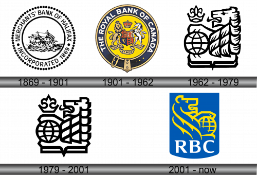
1869 – 1901
1901 – 1962
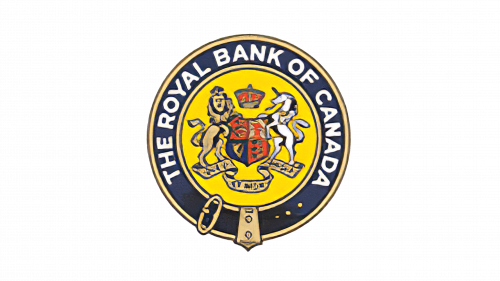
In 1901, the Merchants Bank of Halifax embarked on a transformative journey. It rebranded itself as the Royal Bank of Canada, letting go of its hallmark three-tiered ship symbol. To underline RBC’s deep-rooted connection to Canadian heritage, the creators incorporated a detailed Canadian crest at its core. This emblem showcased a lion, a Scottish unicorn, a shield, a regal crown, and a banner bearing the country’s motto, “AMARI USQUE AD MARE.” All these elements were ensconced within a golden orb, framed by a navy blue band. Encircling this were the complete designations of the banking entity.
1962 – 1979
In 1962, RBC unveiled a revamped logo, simplifying its previous intricate design. While the coat of arms was phased out, certain age-old symbols were preserved. The emblem retained the lion, but its orientation shifted to the left, zooming in to emphasize just its majestic head and mane. The beast’s paw rested atop a globe, highlighting RBC’s international reach. Atop the globe was a stylized crown, and a heraldic emblem graced the bottom, encapsulating the entire imagery. This fresh rendition stood in stark contrast to its predecessor, not just in its design but also in its restrained gray and white color scheme, exuding a modern minimalism.
1979 – 2001
In 1979, subtle but effective changes were made to the RBC logo. The design team opted for a shift from gray to a more definitive black, infusing the emblem with a sharper and more pronounced appearance. Simultaneously, they refined the contours and opted for a more streamlined look, doing away with a few intricate elements. The intent behind these modifications was to keep the logo contemporary and in tune with the evolving design aesthetics of the time, ensuring that the bank’s image stayed relevant and resonated with its diverse clientele.
2001 – Today
The emblem now features a reimagined heraldic shield, distinct from the one found on Canada’s coat of arms. This modern shield boasts a rectangular silhouette with a gentle curve at its base and is adorned with a rich blue hue. This backdrop accentuates the emblem’s core elements: a majestic, golden lion positioned above a globe and the “RBC” inscription displayed in stark white at the shield’s base. The lion, now oriented to the right, has been re-envisioned, boasting an artistry starkly different from its predecessor, highlighting the bank’s forward-looking perspective and embracing a fresh design aesthetic.


