Rick and Morty Logo
The basic premise of Rick and Morty TV show is an infinite number of alternate realities. Everything that could happen has already happened; everything that can be thought of has already been thought of. In other words, a lack of uniqueness is a basic principle for the world where the characters live. The main character Rick, sarcastic, unprincipled, skeptical, and unbridled, knows this very well. Plus, the omniscient scientist definitely knows he’s from a cartoon. “Rick and Morty” is not only a sci-fi adventure but also a sitcom about a family where everyone is trying to solve their problems.
Meaning and History
The beloved series Rick and Morty was released for six seasons, with the first premiere in 2012 and the last one ending in 2022. The seventh season should have 10 episodes, like all the other seasons, and debut on Adult Swim on October 15, 2023. The creators of the animated series, Justin Roiland and Dan Harmon, developed the idea for the series based on a short film they made as part of a special project for Adult Swim. The show has been nominated for numerous prestigious awards, including the Emmy Award, where it won for Outstanding Animated Series in 2018.
What is Rick and Morty?
Rick and Morty is a crazy but very intelligent sci-fi cartoon for adults that turned out to be one of the best TV shows. Marvel Cinematic Universe producer and head of Marvel Studios Kevin Feige once remarked “Every episode of this show has an amazing sci-fi concept that could be used to build a movie around.”
2013 – Today
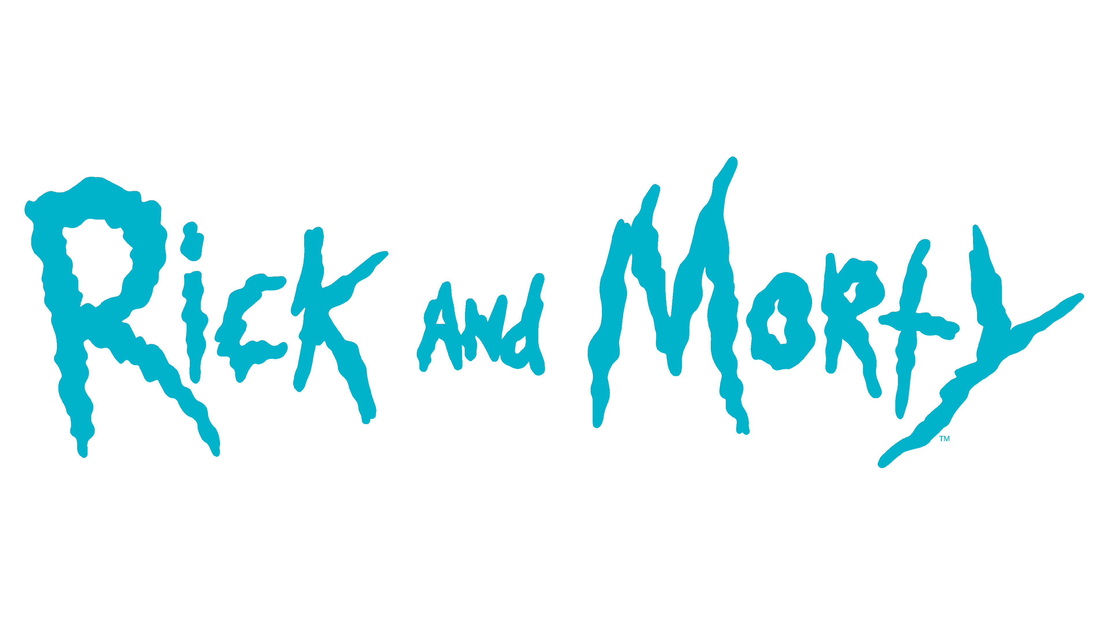
![]()
Rick and Morty logo is just as fun and bewildering as the unexpected and dangerous situations Rick and Morty face as they travel through different worlds and universes. The rough edge of the strokes and extraterrestrial design contribute to the dangerous and mysterious look of the wordmark. The fact that the edge did not have sharp elements but rather featured a wavy line created a feeling of movement through the space. The color palette was also quite unusual, featuring a combination of turquoise and light green outline. The colors likely refer to the water/sky and the green planets.
Font and Color
Turquoise is associated with the sea or ocean and sky, which perfectly reflects the traveling through different universes. Turquoise is also a calming and cool color that is associated with energy, wisdom, calm, friendship, love, and joy. A light green color, which is also seen in the logo, means overcoming all obstacles and liberation from the captivity of conservatism. All these qualities are present in this sci-fi cartoon.
When it comes to the typeface chosen for this logo, the designers went for a funky font with an uneven edge. It is known as The Get Schwifty font and was designed by Mr. Jonizaak. Inspired by the logo, Jon Moore recreated the font and called it Get Schwifty Font.


