Rolls-Royce Logo
Charles Rolls and Henry Royce’s astonishingly successful business partnership gave birth to this brand. Although they had very different social backgrounds, they worked together to design a vehicle that has come to represent prosperity in all its forms. Reliability has been the key value of the company from the very start. The brand has undergone both tremendous failures and resounding achievements, yet each time it has recovered and proved to be a true representation of a luxurious brand.
Meaning and History
Although many might know that the company is named after its founders, not all know how it all started. One of them established C.S. Rolls & Co. in 1902, while the other ran Royce & Co., a mechanical shop. However, they both had dreams about creating their own automobile, and in 1904 they met. The new brand enjoyed popularity for over 50 years, creating the image of a high-end British automobile. Even during the depression times, the business was successful. Another major crisis broke out in 1960. The brand eventually filed for bankruptcy. The government covered the debt to preserve a brand that was associated with the country itself. The rights to the brand were bought by BMW.
What is Rolls-Royce?
Rolls-Royce are premium automobiles that are typically purchased to showcase the status and social position of the owner rather than for their dependability. The renowned automobile company has always stood for technical excellence and prestige.
1906 – 1934
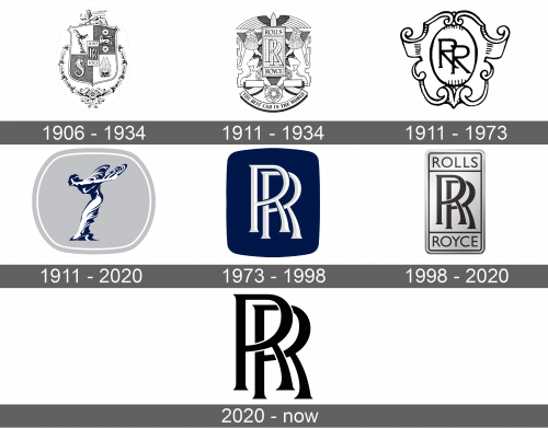
Like many companies during this time period, Rolls-Royce used a coat of arms as a base for its logo. It was decorated by an elegant, detailed wreath that was wrapping about two-thirds of the bottom portion of it. The iconic element of this emblem was placed in the center. It was a vertical rectangle featuring two “R”s overlapping each other. The background was dark, except for the two white strips at the top and bottom where the full name was written.
1911 – 1934
This emblem was just as ornate as the original one. The rectangle with the name was also featured here, only in a lighter color palette. It was placed on a stylish heraldic badge with a banner at the bottom. The banner stated in bold, uppercase letters “The Best Car In The World”.
1911 – 1973
This is yet another brand image that was introduced in 1911. It is much simpler than other versions, but it looks very sophisticated and worthy of a luxurious car brand. The coat of arms was white and had black details. In the center, it had an oval shape with two overlapping “R”s. The latter were done in a different way than seen in other emblems.
1911 – 2020
The center element of this emblem is a figure of the Spirit of Ecstasy. It was done in deep blue and white. It stood out on the light gray color of the rounded shape in the background. It appeared in 1909 when Lord Sir John Montagu bought the brand’s car and ordered a lucky charm figurine from a sculptor to set his car apart from others. With permission, the figure was placed on other cars as well.
1973 – 1998
A bold and stylish logo was presented in 1973. The base emblem had rounded corners and deep blue color. Two large white letters with light gray accents that gave them volume were almost filling the shape. These were the familiar initials of the brand.
1998 – 2020
This is a silver plate with initials, similar to the one seen in the original emblem. The initials, the full name, and the framing on the plate were black. The combination of these colors, its minimalistic style, and its recognizable emblem made this logo a true representation of the brand.
2020 – Today
The automobile brand went with a timeless look for its new logo. It was just the initials written in sans-serif bold font used by Rolls-Royce for more than a century. This emblem reflected the company’s loyalty to its origins and its trustworthiness.
Font and Color
The two “R”s are written using a font that resembles Souvenir Gothic URW T Regular. Black and white colors were the key players in the logos. However, there are also well-known versions that feature dark blue.
