Silk Logo
Silk is a brand of dairy-substitute products now owned by Danone. The Silk brand includes soy milk, almond milk, soy and almond yogurts and many others. The Silk products’ line is spread in many countries of the world, but the main market is North America.
Meaning and History
The story of Silk began in 1977, when Whitewave Foods in the city of Boulder, Colorado. The product line launched in 1996, and it gained the name Silk. There is no certain information on why did the founders call it Silk, although it’s possible a hint that the products were supposed to be smooth and mild to taste, just like silk is to touch.
What is Silk?
Silk is a company that specializes in plant-based food and beverages, particularly non-dairy alternatives to milk. They offer a wide range of products made from soy, almond, cashew, and other plant-based ingredients, providing a dairy-free option for those with dietary preferences or restrictions. Silk is known for its commitment to sustainability and producing products that are both delicious and environmentally friendly.
1996 – 2016
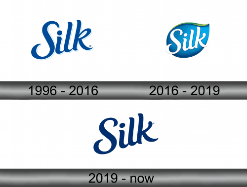
As the brand concept didn’t require many extra details, the initial brand logotype had the simple sans-serif inscription of the bright blue color.
2016 – 2019
The next logo was brought in 2016, and it had the white inscription on the blue drop-like background.
2019 – Today
And the current brand logo depicts the same simple sans-serif inscription without any background, as it was in the 1996 version, but a bit darker.
Emblem and Symbol
In some regions, Silk use different logotypes. For instance, the Spanish and Central American branches use the dark blue inscription with the leaf as a dot upon the letter ‘i’. In this case, the whole inscription also turned less sharp. And due to the font and the color, the inscription looks great in any version.
