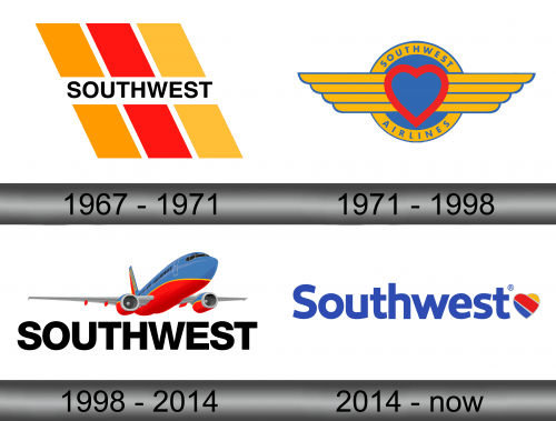
Southwest Airlines Logo
Southwest Airlines is a large American airline company that mostly provides low-cost flights across the United States and into some surrounding countries. It’s the biggest airline firm of this sort in the world. Their central hub is located in Texas, and they provide a lot of destinations across the Southern States.
Meaning and History
The company was created in 1967 as Air Southwest and then renamed to what it is today in 1971. Initially, it was simply a regional airline, with most flights being Texas intrastate travels. Right now, they operate across the continent and have one of the biggest fleets in the world.
What is Southwest Airlines?
It was originally a regional airline for Southern States. Now, they are an international airline with preference for USA.
1967 – 1971
Initially, the logo consisted of three skewed lines of yellow, red and yellow respectively, as well as a strip of blank space piercing their middle. There was also a single word ‘Southwest’ written in uppercase sans-serif letters across this blank space.
1971 – 1998
By 1971, the company began operations in earnest, adopting a new name and logo. The central piece was a red heart outline with two yellow protruding from its each side. Directly behind was a blue circle, surrounded by a yellow frame with the same shape with the words ‘Southwest’ and ‘Airlines’ engraved on top and bottom.
1998 – 2014
For the 1998 logo, they basically took the written part from the very first emblem, enlarged it and put it right below the picture of a plane. That’s what their planes looked like back then – a blue hull with grey wings and a red belly.
2014 – today
The 2014 name inscription was a similar style, except mostly lowercase and colored in blue this time. Directly to its right was a heart, colored in the usual Southwest Airlines palette of yellow, red and blue.
Emblem and Symbol
Where does Southwest Airlines fly?
Despite being headquartered in Texas, they fly all over the states. And beyond that, they prefer Europe, Asia and Latin America.
The company doesn’t use the heart emblem (from 2014) as their planes livery. However, they do use the same pattern of three skewed blue, red and yellow lines for their tail. It fits, because the lines are parallel to the inner rim of the vertical stabilizer that protrudes from the plane’s rear.


