AirAsia X Logo
AirAsia X Berhad (formerly FlyAsianXpress Sdn. Bhd.) is a subsidiary of AirAsia, one of the largest Asian airlines. AirAsia X flies to countries in Asia, Australia, and the United States of America. The Air Asia X slogan is consonant with the brand name and sounds like “Now Everyone Can Fly Extra Long”. The word “long” in this case has two meanings at once, describing the benefits for the consumer: an indication of the company’s long-haul routes, which expands the opportunities for travelers and low prices for flights that allow them to become regular customers of the airline and use its services for a long time.
Meaning and History
![]()
In 2006, the FlyAsianXpress airline was founded by Malaysian businessman Tony Fernandez. It was engaged in regional transportation. A year later, it was decided to work under the Air Asia franchise and refocus on long-haul routes. In 2007, Fernandez announced a launch of scheduled flights from Malaysia to Australia, emphasizing that instead of the popular but expensive Sydney airport service, the company would focus on cheaper alternatives. This is how an international low-cost airline was born. In 2011, AirAsia X company announced the discontinuation of regular flights in the European direction and to the airports of India in early 2012.
What is AirAsia X?
This is a Malaysian-based low-cost airline. It operates regular domestic and international flights. The airline’s air fleet consists of 11 wide-body aircraft from the Airbus concern.
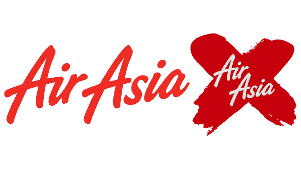
2007
![]()
The first logo had an abbreviation of the company’s name done in large, uppercase letters with the full name or rather the website of the company underneath. The abbreviation features a red color and casually painted letters that do not have the same width or height. Underneath, it says “flyasianxpress.com” using a basic black font without serifs and all lowercase letters. The letters “F”, “A”, and “X” are done in red.
2007 – 2022
![]()
The new AirAsia X logo was adopted in 2007. It was an improved version of the original logo. After changing its name to “AirAsia X”, the company also decided to change the badge to a more suitable one. It closely resembles the logo of the parent company. AirAsia X even used the same font and style, except the words “Air Asia” looked more stacked together to fit the “X” shape in the background. The “X” is part of the airline’s name, which is why a handwritten symbol “X”, inside of which the brand’s name “AirAsia” is placed, was chosen for the background. It looks as if the round red emblem used by the parent company was erased in some places to create an “X” shape. The main colors are bright red and white. They create an impression of a powerful and ambitious company.
2022 – Today
![]()
Font and Color
Throughout its history, the company had changed its logotype only once. Initially, a basic sans serif font was combined with a funky handwritten style. Then, the company used the same cursive font that the parent company had used until 2020. It featured rounded, thick letters. The first letters were capitalized. The choice of color for the Air Asia logo is logical. In Asian culture, red symbolizes good luck, happiness, love, and nobility. Therefore, it is no coincidence that this color is present in almost every flag of the countries of Southeast Asia and the logo of this airline. The other two colors seen in the logos are black and white.


