Square Logo
Square is a financial services and mobile payment company. Jack Dorsey, also the co-founder of Twitter, created it. He developed Square in San Francisco. The company provides tools for payment processing and business management. Square aims to simplify commerce through technology.
Meaning and history
Jack Dorsey launched Square in 2009 to make financial transactions easier and more accessible for small businesses. The brand name reflects its simplicity and completeness. The company debuted its first app and service in 2010, allowing users to accept credit card payments via a small device that plugs into a smartphone. Over the years, Square has expanded its offerings to include a variety of business services, including financing and real-time analytics. It went public in 2015, further establishing its footprint in the tech and financial industries.
What is Square?
Square is a technology company that offers business solutions ranging from payment processing to financial planning. It helps small businesses grow by providing easy-to-use tools for daily operations. Its products are integral to modern commerce management.
2009 – 2011
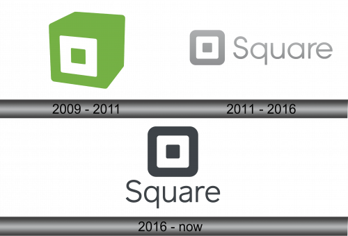
The logo presents a three-dimensional cube with a distinctive green shade. Its front features a white square with rounded edges, centered meticulously. The design embodies balance and accessibility. It’s an abstract representation of the company’s core service: seamless transactions. The green color suggests growth and prosperity, harmonizing with the financial nature of Square’s business. The logo is minimalist, modern, and easily recognizable, crafted to stand out in the digital economy.
2011 – 2016
The logo transitions to a more streamlined, two-dimensional design, with a gradient of grayscale. The iconic square shape remains, now nested within another square, conveying depth in simplicity. “Square” is spelled out in sleek, sans-serif type, emphasizing clarity and modernity. This evolution reflects a refined focus, aligning with a matured brand identity. The overall aesthetic is clean and professional, symbolizing the company’s commitment to accessible and straightforward financial solutions.
2016 – Today
In this iteration, the logo adopts a monochromatic palette, shedding the previous gradient for solid black. The design further simplifies, achieving stark contrast with a bold square enclosing a smaller one. Typography follows suit, presenting a bolder, more pronounced “Square” in a sans-serif font. This evolution suggests a modern, confident brand that values strength and simplicity in its visual identity. The minimalism here is not just a style but a statement of the brand’s philosophy: direct, reliable, and uncluttered.


