St. Louis Cardinals Logo
The St. Louis Cardinals, established in 1882, represent St. Louis, Missouri in Major League Baseball (MLB). Known for their iconic “birds on the bat” emblem, the Cardinals are one of the most successful franchises in MLB history. They’ve clinched 11 World Series titles, producing legendary players like Stan Musial and Bob Gibson. With a rich history and passionate fan base, Busch Stadium, their home, frequently resonates with cheers. The Cardinals not only celebrate past glories but continuously strive for excellence, cultivating talent and enhancing the baseball legacy of St. Louis.
Meaning and history
The St. Louis Cardinals, a beacon of baseball tradition, hail from St. Louis, Missouri. Formed in 1882 as the St. Louis Brown Stockings, they underwent several name changes before settling as the Cardinals in 1900.
From their inception, the Cardinals were more than just a team; they became a symbol of St. Louis pride. While their early years were marked by modest successes, the 1920s ushered in a golden age. In 1926, they clinched their first World Series title. This victory set the stage for a legacy that would witness 11 World Series championships, making them one of the most triumphant teams in MLB history.
During the 1930s and ’40s, the Cardinals dominated the National League, producing legends such as Dizzy Dean and Stan Musial. Musial, often termed “Stan the Man,” remains an emblematic figure for the franchise, exemplifying dedication and prowess on the field.
The 1960s saw the rise of Bob Gibson, a dominant pitcher, and Lou Brock, a base-stealing maestro. Together, they steered the Cardinals to two World Series titles in 1964 and 1967.
The 1980s and early ’90s were marked by notable players like Ozzie Smith, whose defensive wizardry at shortstop amazed fans. The turn of the century brought renewed vigor. Under the leadership of manager Tony La Russa and talents like Albert Pujols, the Cardinals secured World Series titles in 2006 and 2011.
Busch Stadium, the Cardinals’ home since 2006, isn’t just a ballpark; it’s a temple of baseball memories, echoing with historic moments and legendary performances.
The team’s dedication to nurturing young talent ensures they remain contenders year after year. Their farm system is heralded for producing elite players, maintaining the Cardinals’ reputation as a powerhouse.
Off the field, the Cardinals foster a unique bond with their community. The sea of red in the stands during home games illustrates a dedicated and passionate fan base. The team’s commitment to charity work, especially through the Cardinals Care initiative, underscores their role not just as sportsmen, but as pillars of the St. Louis community.
In essence, the St. Louis Cardinals are more than a century-long baseball saga. They are a tapestry of athletic excellence, community spirit, and timeless moments that have indelibly marked the annals of Major League Baseball.
1900 – 1919
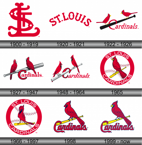
The inaugural emblem of the St. Louis Cardinals showcased intertwined red initials “STL.” Two petite white diamonds adorned the “S” letter. This distinct design first graced the team’s hats and arm patches in the year 1900.
1920 – 1921
The subsequent emblem artistically presented the name of St. Louis, rendered in a vibrant red hue. These letters, elegantly curved, formed an arch-like design, reminiscent perhaps of the city’s iconic Gateway Arch, symbolizing its storied history and prominence in the realm of baseball. This arched representation not only highlighted the club’s connection to its home city but also emphasized its deep-rooted legacy and commitment to its fans and community. Through this design evolution, the team continued to reflect its pride in representing St. Louis and its aspiration to honor the city’s spirit in every game.
1922 – 1926
In a pioneering design shift, the emblem prominently featured a pair of crimson cardinals, each perched gracefully at either end of a timber-hued baseball bat. Beneath this bat, the word “Cardinals” is inscribed, with the initial letter “C” ingeniously intertwined with the bat’s handle. This distinctive imagery not only emphasizes the team’s name but also encapsulates the spirit of baseball. The merging of nature’s elegance, represented by the cardinals, with the sport’s quintessential equipment paints a picture of tradition, pride, and the inherent beauty of the game that the team passionately plays and represents.
1927 – 1947
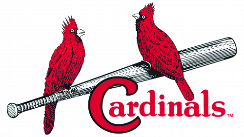
An evolved rendition of the preceding emblem emerges with subtle yet impactful modifications. By incorporating diverse hues of red, the birds gain a more three-dimensional and lifelike appearance. The baseball bat, previously bathed in a warm brown tone, now adopts a shimmering silver finish. Positioned underneath, the team’s moniker stands proudly, connecting the heritage of the past with the aspirations of the future. This enhancement not only accentuates the fine details but also breathes fresh life into the emblem, reflecting the team’s continuous evolution while honoring its rich legacy.
1948 – 1964
A further refinement brings forth a renewed portrayal of the twin cardinals, perched upon a gleaming silver baseball bat. Enhancements to the avian figures include the addition of striking black chest markings and pronounced crests, lending them a distinct and vivid character. The initial “C” in the team’s designation now boasts a bold black encirclement, setting it apart. These meticulous alterations not only deepen the visual appeal but also accentuate the symbolic significance, reflecting the team’s unwavering commitment to excellence and its ceaseless journey towards blending tradition with innovation in its identity.
1965
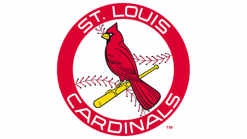
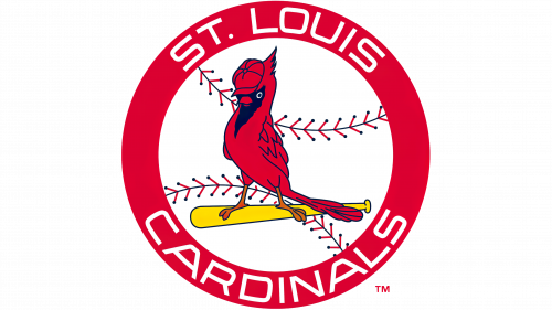
The St. Louis Cardinals’ sixth emblematic representation showcases a crimson cardinal gracefully perched upon a diminutive, sunlit-yellow baseball bat. This entire imagery is encapsulated within a vibrant red circle. Within this boundary, the team’s complete moniker elegantly spans its circumference, resonating its storied legacy. Central to this emblem, reminiscent of the heart of the game, is a pristine white baseball, adorned with its timeless stitches. This design ingeniously combines elements of tradition with a touch of modern flair, emphasizing the team’s rich history while simultaneously looking ahead to its bright future in baseball.
1966 – 1997
The St. Louis Cardinals’ sixth emblematic representation showcases a crimson cardinal gracefully perched upon a diminutive, sunlit-yellow baseball bat. This entire imagery is encapsulated within a vibrant red circle. Within this boundary, the team’s complete moniker elegantly spans its circumference, resonating its storied legacy. Central to this emblem, reminiscent of the heart of the game, is a pristine white baseball, adorned with its timeless stitches. This design ingeniously combines elements of tradition with a touch of modern flair, emphasizing the team’s rich history while simultaneously looking ahead to its bright future in baseball.
1998
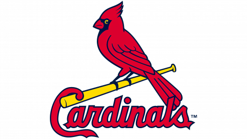
When juxtaposed with emblems from preceding years, the 1998 insignia distinctly features a cardinal, bathed in a deep maroon hue, poised elegantly on a sunlit baseball bat. Below this illustrative ensemble, the moniker “Cardinals” is proudly showcased. Notably, the initial “C” uniquely extends, curling over the bat’s edge. This design intricately marries tradition with a touch of contemporary flair, highlighting the team’s continual evolution while preserving nods to its cherished past. The attention to detail in this version underscores the team’s commitment to a blend of heritage and modernity in its visual identity.
1999 – Today
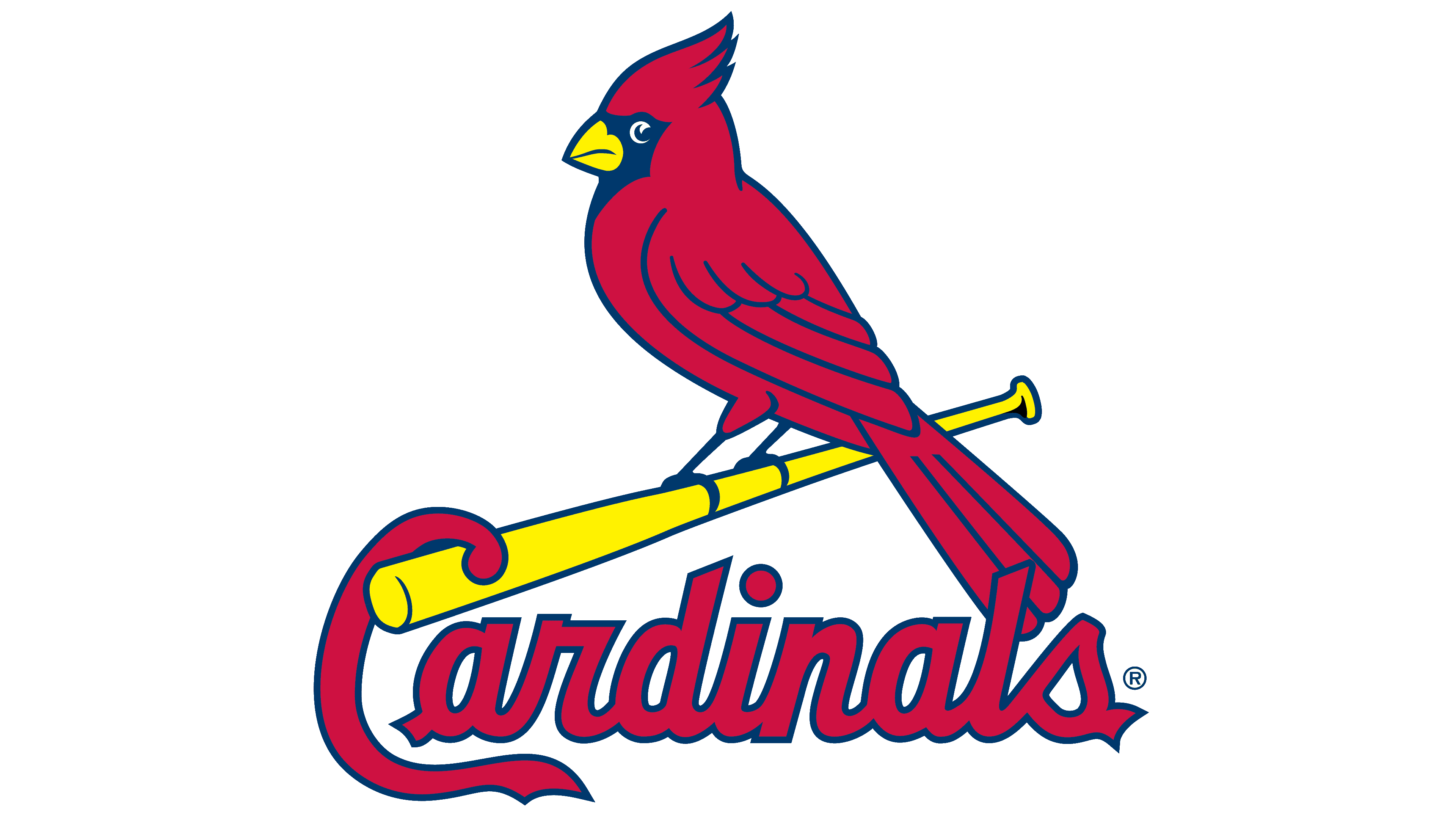
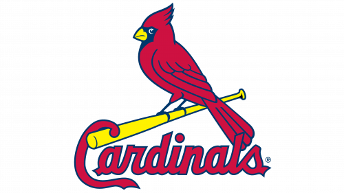
The emblem underwent a refreshing transformation: the cardinal, rather than merely perching, now appears to clutch the baseball bat firmly. The “C” in the team’s name intriguingly seems to dangle from the bat’s edge. The script now exudes a more robust presence, yet retains its calligraphic charm. This semi-connected style is distinct, with the initial character standing alone, while the succeeding ones flow together seamlessly.
Beneath the bat, cradling the cardinal, rests the inscription “Cardinals”. Every element in this design is accentuated by blue outlines. The red, used for both the avian figure and the team’s moniker, is richer and more vibrant than in earlier renditions. Both the bat and the bird’s beak shine in a zesty lemon-yellow, with its eye painted in a stark contrasting white, adding depth and dimension to the overall visual appeal.
