Staples Logo
Staples is a supermarket specializing in office supplies, which will have everything necessary for both small businesses and students. Today, small businesses, which make up 98% of all US businesses, are the backbone of the American economy. To keep up with ever-increasing demand, Staples never stopped growing. Over time, the corporation added catalogs, contracts, and e-commerce departments. More than 1,000 office supplies supermarkets are opened worldwide, with close to 200 of them in Europe.
Meaning and History
The future giant of the global office supplies market, Staples, took its first step into the office supplies trade in May 1986. After leaving his employer, Thomas G. Stemberg founded his own company but immediately discovered that the supply of office supplies was worse than ever. This was when he realized that he had found a niche for himself. The hard work, determination, and creativity of its founder led the corporation to success that was so stunning that over the next two years, about 20 competitors converted to similar retail schemes. Staples has unsuccessfully attempted to merge with other office supplies giants, including Office Depot, but it seems that it manages to stay on top on its own.
What is Staples?
Staples, Inc. is one of the world’s largest retailers of office supplies, office equipment, and office furniture. Its clients include both individuals and companies, ranging from so-called “home offices” to giants of the American and European markets.
1986 – 1988
The company logo consists of its name printed in classic black. The company used a clean, sans-serif font with fine lines that resembled TraditionSansXLight. The corners were slightly rounded to make the logo look more welcoming. In addition, the designers added a unique detail by adding a curved line at the top of the “L”. Besides resembling a pen, the stylized “L” could also be associated with a paper clip, which directly references the direction of this business. The logo turned out stylish and timeless.
1988 – 1998
A few years after the company was founded, the logo was slightly redone. It looks like the wordmark was simply made bold. However, a new font, which resembles Warownia Narrow with a custom “L”, was introduced. It is also a sans-serif font with clean lines and straight cuts but the characters here appear shorter than in the original logo.
1998 – 2019
The most notable change here is, obviously, the color. The company introduced a bright and bold red color that surely attracted everyone’s attention and could be visible from afar. The font was kept the same, but the inscription looked bolder as the characters got even shorter. Most importantly, the company preserved the unique element designed from the very start – a custom letter “L” with a paper clip.
2019 – Today
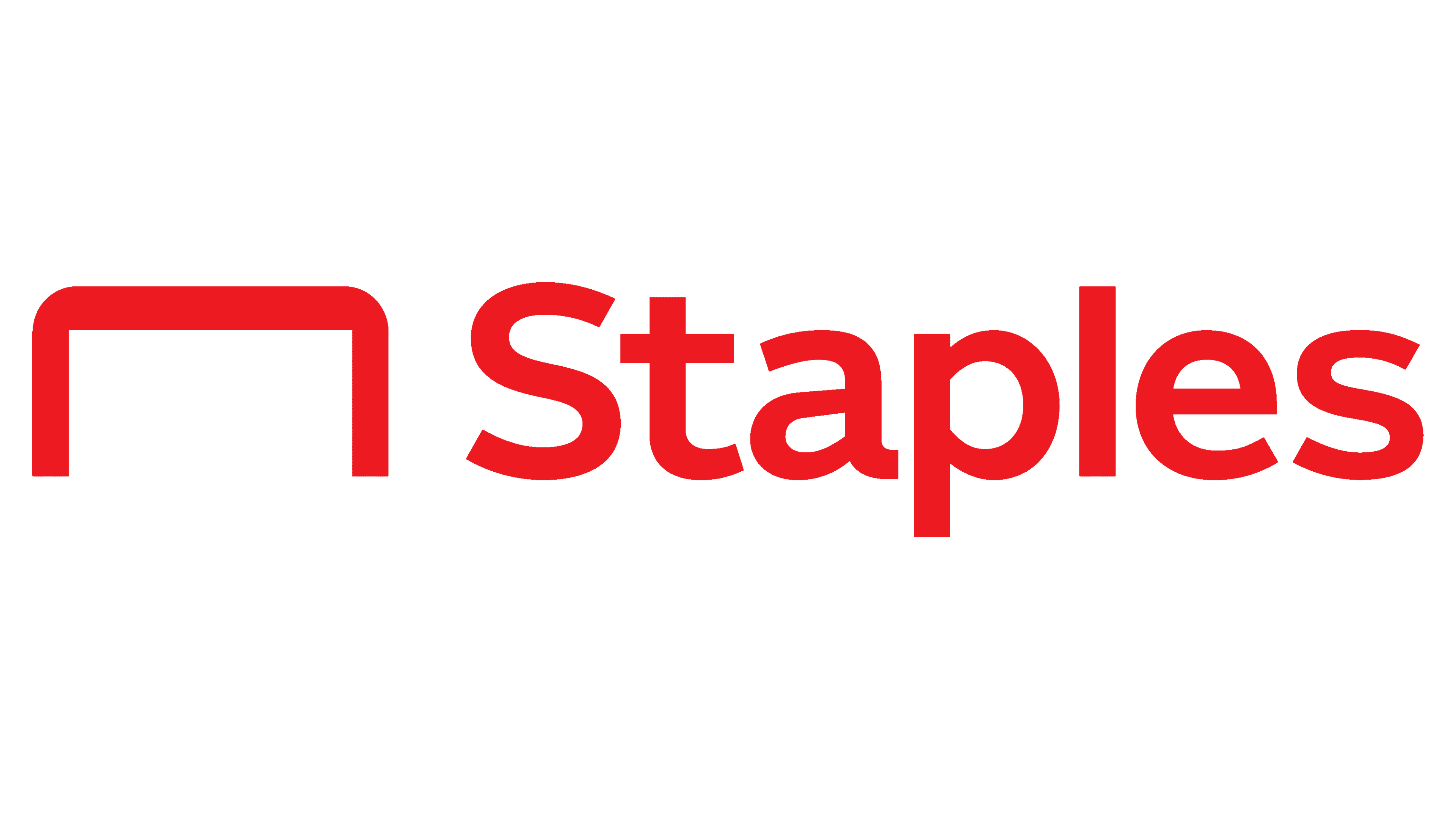
A new font, which closely resembled Freight Sans Semibold, was introduced in 2019. Although the company preserved the red color, the logo was completely redesigned to reflect the fact that the company never stops improving and developing. Besides changing all caps to a sentence case, the company removed the paper clip its logo was closely associated with. It was replaced by an arch on the left that was meant to stand for a staple. Given the company name, it was surely a more appropriate symbol. The company had many loyal customers and great brand recognition, so a major logo change did not hurt it but rather brought even more attention.
Font and Color
The latest logo features a sans-serif font that closely resembles Freight Sans Semibold. Earlier, the company used two other sans-serif fonts, one of which looked like Warownia Narrow, while the other resembled TraditionSansXLight. Until 2019, all company logo versions featured a customized letter “L” that had a rounded corner and the top of the vertical stroke stylized as a paper clip.
When it comes to the color palette, the company was quite conservative for the first twelve years and used a classic black color. It is often associated with authority, power, stability, strength, and intelligence. The red color, which the company started using in 1998 is also a powerful color that symbolizes action, strength, energy, and passion. It is used to attract attention and motivate and stimulate the buyers to make a purchase.
