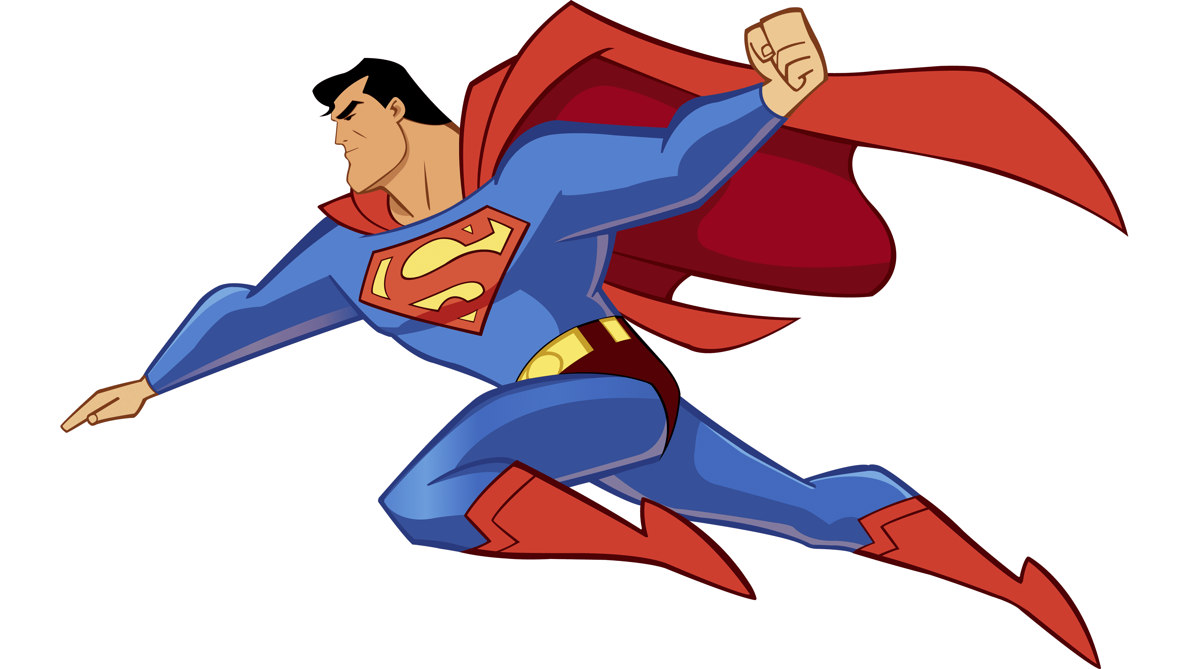
Superman Logo
Superman is one of the oldest and most iconic superheroes in history. In fact, the very word ‘superhero’ is derived from his name. In addition, the behavior, principles and general spirit of comic books heroes from then on were in many instances inspired by Superman. He can be considered a pioneer of the genre.
Meaning and History
![]()
Superman as we know him now first appeared in 1938, although the name derives from his precursor, who was, in fact, a villain who wanted to take over the world. That Superman was likely inspired by the Nazis and their idea of ‘superhumans’. The Superman hero simply inherited the name.
1938 – 1938
![]()
The very first iteration was fairly simplistic. It only featured a yellow shield outlined in thick black, as well as a red letter ‘S’ in the center. Unlike the letter we have now, this one as just a stroke of paint, nothing elaborate.
1938 – 1939
![]()
They continued experimenting with the layout, and it wasn’t until at least 1941 that the logo took on its contemporary style. In this iteration, it was just a yellow triangle with an outline – now red – and a basic letter ‘S’. They apparently decided to see how a simple typographic letter would look like on a triangular form.
1939 – 1940
![]()
The third design became closer to the modern layout – mostly in that the letter became more elaborate and now was spread across the background from side to side. The coloring also became more saturated, but that’s about it.
1940 – 1940
![]()
For this one, they pretty much used the same design, but switched the outer frame from red to yellow and added notches on the ends of the letter.
1940 – 1940
![]()
Another version featured a much more bulky shield. It’s actually much closer to the modern design, although not completely. Basically, the style reverted to the 1939 attempt, but everything was stretched horizontally, and they also added two flat shoulders onto the shield.
1940 – 1941
![]()
This one is the first example of DC trying out a white-black-red color scheme for Superman. In terms of coloring, the outer frame was now white with just a little thin black line to mark the edge, while the background turned black. Design-wise, they returned to the triangle shape, but made the bottom angle rounded.
1941 – 1943
![]()
By 1943, however, the first version of what can be considered a modern Superman logo design was publicized. It was again a red-and-yellow triangular shape, although the frame lost some thickness, and the upper angles were flattened out.
In addition, the designed decided to widen the upper half of this shield, which is the decision carried onto even today.
The letter was again as if crammed into the interior of the shield – it was fluid and very uneven.
1943 – 1944
![]()
Not much changed for the next attempt, although the color scheme noticeably became paler. In addition to that, the shoulders (the flattened angles) became even longer, which is also a common trope in the later designs.
1944 – 1944
![]()
A few changed happened in 1944. Notably, they made the letter less unpredictable and more like a natural letter ‘S’. It now didn’t look crammed, and the stroke was much more consistent.
1944 – 1977
![]()
They used pretty much the same design for the three decades. The colors became rather darker, and the positioning of the letter slightly shifted. Once more, it became rather inconsistent with a focus on the central part. Notably, they also added a little curl on the bottom end, as well as bar on the top end.
There have been several very minor changes over the years – mostly involving shifts in the letter’s positioning, but nothing substantial changed.
1955
![]()
This design was almost the same as before, save for some minor changes. The letter was stretched down, so the tip was way lower now, and the character as a whole wasn’t as tightly grouped. The same happened to a shield, but to a smaller extent.
1977 – today
![]()
In 1977, DC developed this logo for the use in the upcoming ‘Superman’ movie. The differences are slight, but still important. They made the shield outline much straighter, for instance. The letter became much as if squeezed from the top and bottom, and the colors got slightly darker.
They also kept using this for all the comics from that point on, while cartoon and movie logos changed all the time.
1986 – 1997
![]()
For 1986, they widened the top half of the shield, made the top part of the letter thinner and definitely made the entire letter curvier. Nothing else changed, basically.
1997 – 2001
![]()
In 1997, they introduced the ‘electric’ version of the logo. In addition to the outer red frame, they added the white inner outline and also changed the design of the letter. Instead of a fluid stroke, there are now 3 striking lines of different sizes, all to make it look electric. Oh, and they repainted it white to fit the style.
2001 – 2011
![]()
The 2001 version is basically the usual 1977 version but with the black background instead of the classic yellow one.
2011 – 2011
![]()
For this one, they pretty much changed the background from the black to pale yellow, as well as widened the top part of the shield, so it now looks like a diamond.
2011 – 2016
![]()
In 2011, they took the previous logo, made it a bit paler and removed some minor details. That’s about it.
Emblem and symbol
Besides the symbol, the other major Superman symbol is his man on most comic books. In fact, it saw little change in the latest years. It basically features a cartoony-looking font with a lot of depth in it. It’s also mostly tilted down and to the right, so you can clearly see the massive depth behind.


