Sysco Logo
The Sysco Company is the US’s largest supplier of food – primarily for restaurants and other establishments that sell meals. They actually control a sizeable portion of the American food industry, which almost makes them a monopoly. Still, they are known for good quality and generally neat service.
Meaning and History
Sysco came to be in the year 1969. The name was originally an acronym, and it stood for ‘Systems and Services Company’, usually followed by ‘Food Services’ or other continuations. As with many other companies, the acronym quickly evolved into a simple word used as a name for the company.
1969 – 2008
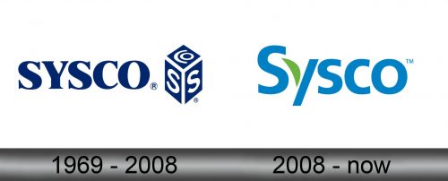
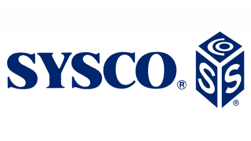
The initial Sysco logo was developed when the company still sported an acronym in its name. That’s why all five letters were capital in this iteration. In terms of style, they were all rather usual serifs with moderate boldness. As a result, the logo looked like a plain typographic nameplate.
In terms of color, they’d usually paint the letters blue, but black and white were also common enough.
In addition to the written part, they also had an emblem at this stage. It was a cube (slightly stretched upwards) with blank edges and blue sides. Two of them on the left and right held white letters ‘S’, and the one on the top was branded with ‘CO. The blank space between the sides made up the ‘Y’ part, naturally.
2008 – today
In 2008, they changed the logo to a more friendly design. This time it was styled as an ordinary word with a simple uniform type without a trace of serif or other special provisions. They were largely light blue, except for a left line on ‘y’ – that one was a green stroke that, no doubt, was meant to symbolize nature and environment.
Emblem and Symbol
There are many variations of the 2008 Sysco logo accompanied by various slogans they used throughout the years. They are usually written in the same style and color somewhere around the logo proper. These include mottos such as: ‘Bringing more to the table’, ‘Good things come from Sysco’ and more.
