Tennessee Titans Logo
Bud Adams brought a new team to the world in 1960 and owned it all the way till 2013. Just like many other teams, it became part of the NFL ten years after it has been created in 1960. The Titans play against three main opponents in AFC South. They also have historic games with divisional teams, including Pittsburgh Steelers and Buffalo Bills. When the players were still known as the Houston Oilers, the Dallas Cowboys were their main in-state opponents.
Meaning and History
The Tennessee Titans were not always Titans because when they started playing back in 1960, they were named Houston Oilers which was based on their location at that time. At the end of the 90s, the Oilers changed location to a stadium in Tennessee for one season. The players moved again a year later to Nashville. For a couple of years, they played as the Tennessee Oilers. The Titans part came to life during the 1999 season.
What is Tennessee Titans?
A team of Titans has settled in the city of Tennessee and plays football professionally. It has changed the location several times, but one thing stayed the same for many years – the founder has been with the team for the rest of his life. The team currently plays at Nashville’s stadium, which has been built at the end of 90s.
1960 – 1961
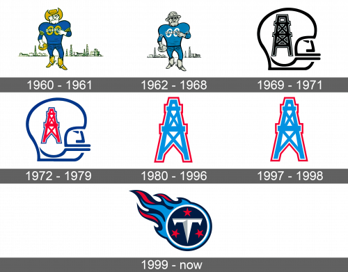
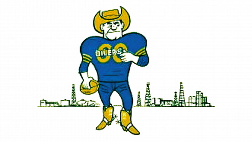
The logo is a cartoon drawing of a player dressed in yellow cowboy boots and a hat. He is wearing a blue uniform with yellow details and the word “Oilers” written on the shirt in white. In large capital letters, the word “Go” is written behind “Oilers”. The player is holding a yellow football in his right hand and looks very determined. An outline of a large city in the back serves as a background.
1962 – 1968
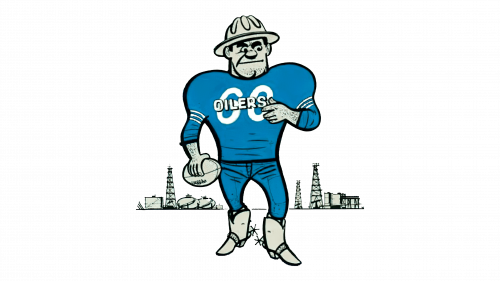
It might seem that there have been almost no changes to the logo, except for the gray color being used instead of yellow. However, an attentive person would notice that a hat was swapped for a helmet, while sweatpants are changed to jeans. The city line has also changed its shape and looks further behind.
1969 – 1971
Like many other football teams, Titans (Oilers at that time) decided to incorporate a helmet into its logo. It was a minimalistic contour drawing of a head in a sports helmet. The lines were thick and black. An oil rig, which related directly to the team’s name at that time, was added to the side of the helmet. It had a thin white followed by a black outline for volume and more contrast. A completely different style than what the team had before has been created.
1972 – 1979
A couple of years later, the team brought some colors back. The oil rig turned bright red with a blue outline. It also has changed its shape to a more pointy one and the lines became thinner. The helmet and the player were drawn in blue. Otherwise, the logo looked a lot like the previous version.
1980 – 1996
In 1980, the team took the drilling structure from the previous emblem and gave it some different colors. The main element was drawn in sky blue color with straight, clean lines. It was set on a white background with a white outline around it followed by a little thicker bright red border.
1997 – 1998
For this period, the same image continued to represent the team. There was a slight change to the colors, which seem to be a little darker. No wordmarks or other elements were added to the emblem.
1999 – Today
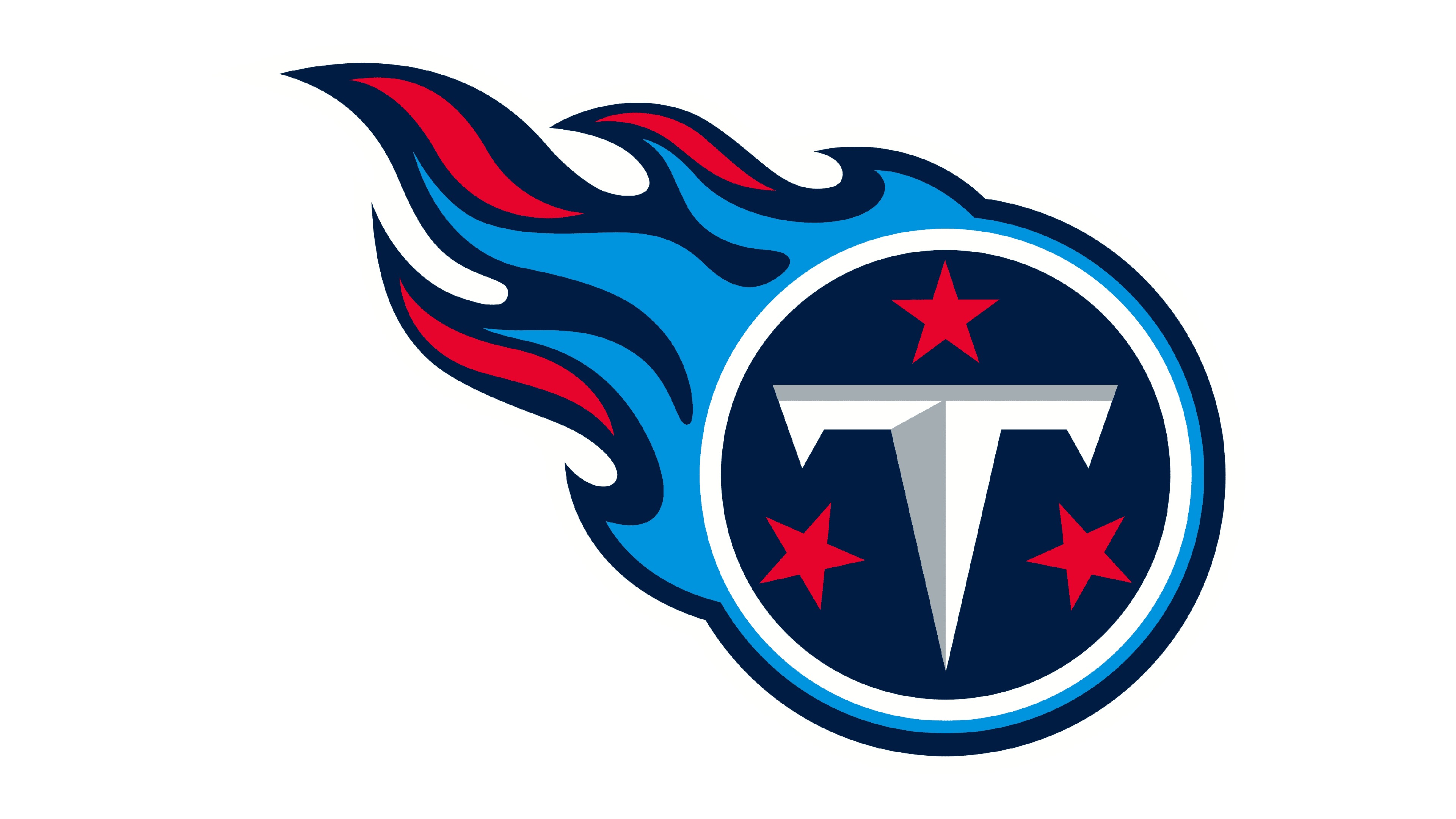
A brand-new logo was introduced at the end of the 90s. It featured a round dark blue symbol with a 3D white “T”. At the top and on the sides of the letter, there were three five-point red stars. The emblem had a white border that was followed by sky blue and dark blue. The latter were stretched to form flames coming out of the symbol in the upper left corner. For a more striking effect, the blue colors of the flames were accented by a red color.
