The Body Shop Logo
The Body Shop is the name of a cosmetics franchise founded in London, in 1976. The chain is occupied in manufacturing and selling of high quality body caring items, male and female perfumery and cosmetology. They have around 1000 items, spread across the world via more than 3000 points of presence in many countries. Now, The Body Shop operates as a subsidiary of Natura.
Meaning and history
The Body Shop was registered in 1976 by Anita Riddick. Initially, the company settled down in Brighton district of London. Now, they have two main offices, located in London Bridge and Littlehampton, West Sussex.
During the first decades, they were mainly focused on the British market. The business produced ecologically clean and completely natural products taken directly from the producers. The first American points were opened in 1988 after the British Body Shop bought the wordmark rights for the American Body Shop.
Throughout the last two decades of the 20th century, the brand took part in various social and ecological initiatives. They also partnered up with Greenpeace and Amnesty International in the 80s.
The acquisition of the franchise by L’Oréal in 2006 allowed it to grow quickly. Due to this, the company has spread its operations across the Europe and Asia, opening thousands of shops during the following ten years, and expanding the product line. In 2017, The Body Shop was resold to Natura – a Brazilian body care brand from São Paulo.
What is The Body Shop?
The Body Shop is an international body care business, headquartered in London, UK. The company produces around a thousand of cruelty-free skin care products and various aroma perfumes for men and women. They have around 3000 locations across the planet, and 10000 plus employees. The Body Shop is now owned by Natura, a Brazilian cosmetics company.
1976 – 1990s
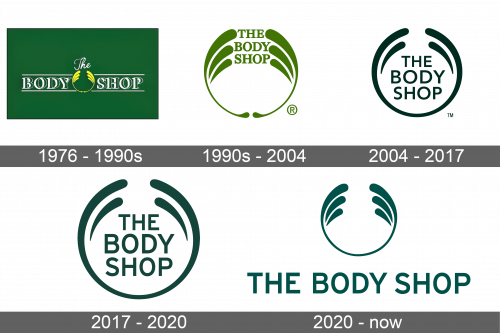
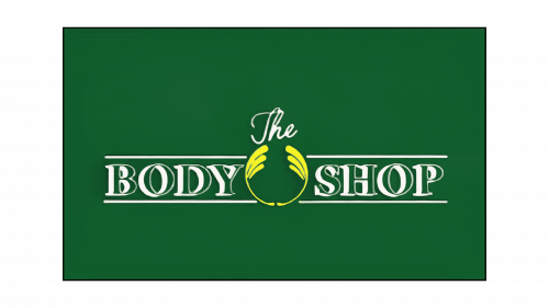
The very first logotype was a green rectangle. Its central zone was given to the nameplate, written in all caps except for the word ‘the’, handwritten above the name caption. The ‘Body Shop’ serif lettering was green and had bold white contour, making a 3D effect. Above and below the words, there were slim lines limiting the inscription. The words were separated by two yellow semicircles getting bolder at the upper edge. Each of them covered two bold strokes in their upper areas.
1990s – 2004
These two semicircles became the company’s official signature in the 90s. The capitalized name stood amidst the two shapes, colored green instead of yellow as before.
2004 – 2017
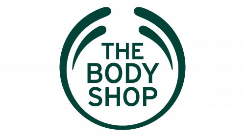
In 2004, the company’s logotype had gone through a major redesign, affecting the wordmark and the semicircles. With the new version, the two shapes became a single circle with a gap centrally at the top. Inside the circle, the drew one bold stroke to the right and left. At the circle’s center, they wrote the uppercase ‘The Body Shop’ name in a soft sans-serif typeface.
2017 – 2020
The 2017 redesign focused on the minor changes, such as the coloring and the size of glyphs. The whole logotype became dark green instead of black. Moreover, the circle and the name became bolder and larger.
2020 – today
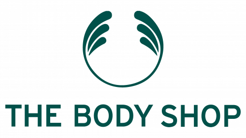
the latter redesign shows a thin circular emblem with a gap centrally at the top. The tips, formed by this interval, are bolder than the rest circle. It also contains two bold strokes in each side of the circle. Below the watermark, there is a caption with the name written in a single line.
Color
The whole logotype is colored dark green and based on a white background. The green shade is often linked to nature, which makes it suitable to the company putting pure and natural products’ production at the center of its operation.
Font
Their corporate typeface has a semibold style with small inter-letter gaps. These sans-serif glyphs don’t have any curls nor rounds, which adds minimalism and professionalism to the whole logotype. The fonts, closest to this one, are Ricaro Bold and FF Yoga Sans Pro Medium.
