The North Face Logo
The North Face is the undisputed leader in the market of goods for tourism and outdoor activities. The founders were fond of tourism and outdoor activities, so they developed quality goods for all the outdoor enthusiasts out there. This is one of the most famous brands in the travel and backpacker segment, which it has influenced more than any other company. A down jacket legend, a master craftsman for durable winter boots, and a streetwear icon, The North Face is a one-of-a-kind brand.
Meaning and History
In 1964, Douglas and Susie Tompkins founded The North Face brand. The name was chosen in honor of the most difficult and cold side of the mountain slope. The Tompkins wanted to emphasize that The North Face gear is up to the task of even the most extreme feats. Initially, the Tompkins family business was acquired by former employees of another travel gear brand. However, the company was quickly resold to Kenneth Klopp. He led the brand for the next 20 years and turned it into a global brand. By the 1980s, The North Face had already conquered the European and Eastern markets. In 1988, the company was bought by Odyssey holding.
What is North Face?
The North Face is by far the most recognizable outdoor clothing brand. This is an American company with a 60-year history, whose slogan “Never Stop Exploring” reflects the desire to go beyond what we are accustomed to, create new things, and make discoveries.
1966 – 2010
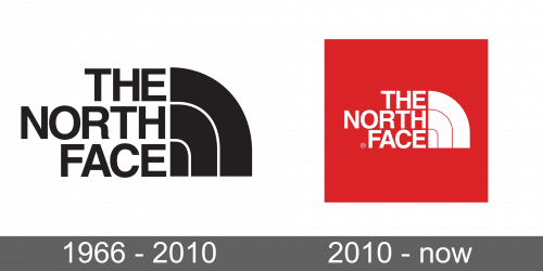
Kenneth Klopp wanted to create an original identity that would help make the company popular. Designer David Alcorn helped the businessman to implement his ideas. “The North Face” inscription was done in all uppercase bold letters and aligned to the right. The letters did not have serifs and featured rather straight lines, with an exception of the “R” which had a curved leg. There was a likeness of a rainbow on the right of the inscription with a line coming out of each word and curving down. This element was meant to represent a Half Dome, though, which is a granite rock and a natural monument in Yosemite Park. The black and white color palette made the logo look professional and timeless.
2010 – Today
The original idea of the logo was preserved, but the overall feel completely changed with the introduction of red. It looked more powerful and full of energy and passion. It symbolized the courage, energy, and passion of the people who used the brand’s products and, more importantly, the brand’s passion to create the best product in the industry. The red was used for a square that was placed behind the emblem the brand used for many years. The inscription and quarter circle were white now.
Font and Color
The brand image was presented in two versions – black and white and red and white. The colors were not chosen by chance. As conceived by the designer, red symbolizes courage and passion, while black symbolizes excellence and elegance. The designer went for a basic, grotesque, sans-serif font for the name. The letters look very similar to the ones seen in the Helvetica World Bold. It was not changed since the first logo appeared.
