Three UK Logo
Three UK shines as a vibrant mobile network provider. Hutchison Whampoa, a giant conglomerate, birthed it. The UK became its cradle, aiming to revolutionize the mobile telecommunications landscape. Three UK set out to offer customers a new level of connectivity, embracing the digital era with open arms. It stands as a beacon of innovation, tirelessly working to connect people across the United Kingdom.
Meaning and history
Three UK embarked on its journey in 2003, marking a new chapter in mobile communications. With its inception, it became the UK’s first commercial video mobile network. A significant milestone in 2007 saw Three UK pioneering the roll-out of high-speed mobile broadband. Fast forward to 2010, and it introduced the country to the first-ever MiFi device. Each step, from its 2012 Ultrafast network launch to the big 5G roll-out in 2019, underscores Three UK’s commitment to pushing boundaries and enhancing connectivity for its users.
What is Three UK?
Three UK operates as a trailblazer in the UK’s mobile network domain. It excels in providing a wide array of services, from voice to data, ensuring seamless connectivity. Known for its innovative offerings, Three UK keeps setting new standards in the telecommunications industry, making it a go-to choice for many.
2003
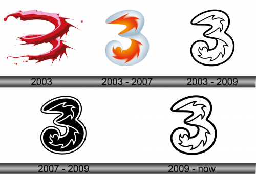
The logo leaps forward with a crimson splash, its essence dynamic and fluid. It boasts sharp, angled edges that suggest movement and innovation. Resembling an abstract numeral three, the design fuses modern artistry with bold, forward-thinking symbolism. A gradient of red shades gives it a sense of depth, embodying passion and energy. This emblem stands as a striking representation of a brand that’s all about progress and connectivity.
2003 – 2007
This logo presents a graceful evolution from its predecessor. The numeral three morphs into a soft, flowing form, embodying a gentle yet spirited essence. A calm white pairs with fiery orange accents, creating a harmonious balance. It suggests flexibility and a user-friendly approach, while maintaining a zestful character. This logo whispers of innovation with a touch of warmth and approachability, signaling an evolved identity.
2003 – 2009

In this iteration, the logo adopts a minimalist approach. Stark black contours replace the previous gentle gradients, conveying a bold simplicity. The iconic number three retains its shape but stands out more assertively. These lines speak of clarity and precision, reflecting a direct and unambiguous brand identity. It’s a return to the basics, a statement of clear vision and strong foundations in the visual language of branding.
2007 – 2009

The logo’s transformation is striking-black fills where outlines once were. The number three is bolder, exuding strength and presence. Contrast defines its form, a visual statement of power and confidence. This design shift reflects a brand that’s not just seen, but felt. It’s a symbol of a company carving its distinct mark in the world.
2009 – Today

The logo reverts to an outline from the previous solid fill, a stylistic backstep that refreshes its character. The starkness remains, delivering a strong visual punch. It embodies a modern edge with a classic twist, echoing a brand that respects its roots while embracing the future. This design reflects a clarity in purpose and an openness to innovation, a smart play of contrast and tradition.


