ThunderCats Logo
“ThunderCats” is an iconic 1980s animated series, blending science fiction with epic fantasy. Created by Tobin “Ted” Wolf, it was developed in the United States. The story revolves around the ThunderCats, humanoid cats from the planet Thundera, as they seek refuge on Third Earth, battling evil forces like Mumm-Ra.
Meaning and history
“ThunderCats” chronicles the saga of space-faring humanoid cats. Escaping the destruction of Thundera, they crash-land on Third Earth. Their leader, Lion-O, wields the mighty Sword of Omens. With it, he battles the sorcerer Mumm-Ra and other foes. The team includes Cheetara, Panthro, Tygra, and the young WilyKit and WilyKat. They seek peace, defending their new home against evil. Mumm-Ra covets the sword’s power, leading to epic confrontations. Friendship, courage, and honor guide the ThunderCats. Their motto: “ThunderCats, Ho!” inspires many. A tale of adventure, mysticism, and legacy unfolds.
What is ThunderCats?
“ThunderCats” is a captivating tale of cosmic feline warriors battling malevolent forces on Third Earth. With mystic prowess and futuristic tech, they defend their adopted realm against the dark sorcerer Mumm-Ra, embodying courage and unity.
1985 – 1990
The logo radiates a vibrant 80s vibe, with its dynamic script that seems to roar as loudly as a thunderclap. Bold, gold letters with sharp edges spell “ThunderCats”, conveying movement and power. A crimson circle cradles a blue feline silhouette, symbolizing the fierce heart of the team. Lightning-like flourishes add an electric energy, suggesting these cat-like warriors are swift and forceful. It’s a timeless emblem of animated heroism.
2011 – 2012
This iteration of the ThunderCats logo exudes a more pronounced three-dimensional effect with a metallic sheen. The iconic red and black emblem now contains a more detailed, embossed feline silhouette, giving a stronger impression of depth. Golden letters with gradients of yellow and orange pop out, casting shadows that enhance the visual impact. The textures suggest wear, hinting at the enduring legacy of the ThunderCats saga. This logo is a modernized homage to a classic.
2020
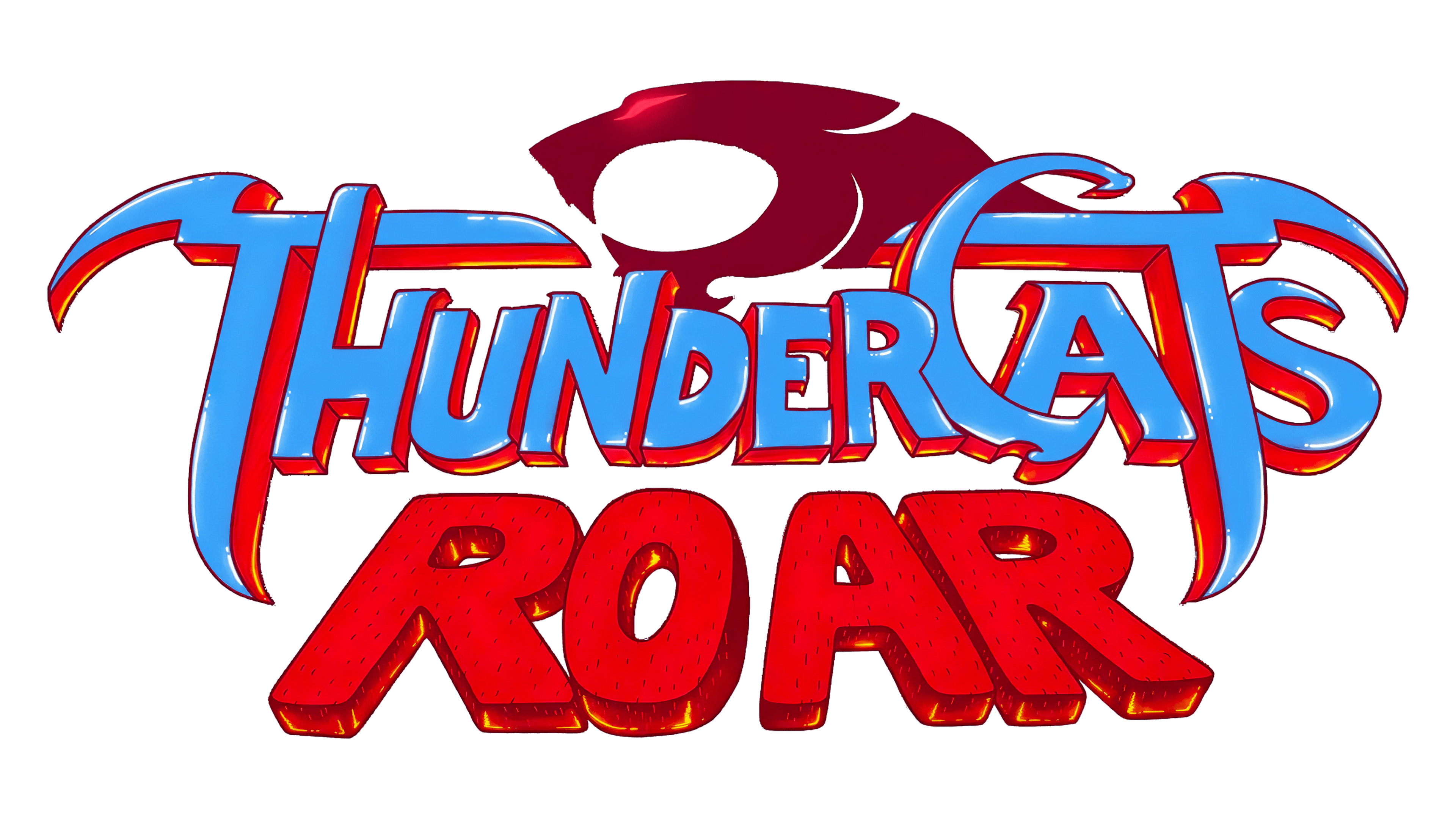
This logo transforms the ThunderCats brand with a playful, cartoonish flair, signaling a shift towards a younger audience. Bold, red block letters spell out “ROAR”, filled with textures resembling scratches, perhaps hinting at a cat’s claw marks. The “ThunderCats” script above it is sleek, with a red outline that contrasts sharply with the blue , adding a pop of comic book zest. The classic silhouette of the cat’s head now has a more simplified and stylized design, in keeping with the energetic and modern reboot of the series.


