Today Show Logo
The Today Show is one of the most famous and iconic morning television programs in American history, first airing in 1952 on NBC. Known for its mix of news, entertainment, lifestyle segments, and interviews, it has become a staple for viewers starting their day. Over the decades, the show has evolved with the times, offering live coverage of major events, celebrity interviews, and in-depth discussions on current affairs, while also maintaining light segments like cooking, fashion, and weather reports.
Meaning and history
The Today Show debuted on NBC on January 14, 1952, revolutionizing American television as the first of its kind—a morning news and talk show. Created by Sylvester “Pat” Weaver, it combined hard news, interviews, and lighter segments. Over the years, *Today* became a cornerstone of morning TV, influencing the format globally. Iconic hosts like Dave Garroway, Jane Pauley, Katie Couric, and Matt Lauer shaped its legacy, while features like live concerts and outdoor audience interactions became signature elements. Today, it remains a dominant force in morning news, adapting to changing media trends.
Set in the iconic Studio 1A at Rockefeller Plaza, the show invites audiences to feel part of the action, with fans gathering daily to wave through the glass windows. Whether covering breaking news, presidential elections, or the latest viral trends, The Today Show adapts to the times, maintaining its relevance through a mixture of hard-hitting journalism and light-hearted segments. Its current team of hosts—led by Savannah Guthrie, Hoda Kotb, Al Roker, and Craig Melvin—brings diverse perspectives and chemistry that resonates with a broad viewership.
By today, The Today Show has become more than just a television program: for millions of Americans, it is a full-fledged morning ritual. Through triumphs, controversies, and a constantly shifting media landscape, it remains a trusted source of information and entertainment for generations, solidifying its place in the fabric of American life.
Its vibrant blend of serious journalism and more casual, human-interest content makes it widely appealing to a broad audience. The Today Show covers everything from breaking news and political analysis to lifestyle trends and pop culture. The show’s longevity is also a testament to its lineup of charismatic hosts, past and present, who’ve become household names.
What is Today Show?
Today Show is the name of an American pioneering morning television program. Launched on January 14, 1952, by NBC, it was the first program to combine news, interviews, weather, and entertainment into a single live broadcast, establishing a format that would be imitated by morning shows around the world.
In terms of visual identity, the Today Show has changed a lot of images and styles throughout its long history, however, the main thing, that unites all of the badges is the positivity and liveliness, which suit best the morning mood, to start the day with.
1951 – 1952 (pre-launch)
The very first logo for the famous morning TV show was created in 1951 and stayed active for a few months. It was a black lowercase “Today” lettering in a modern geometric sans-serif typeface with a minimalistic dial inscribed into the “O”. The idea of the emblem was taken by the designers while creating the first official Today Show logo.
1952 – 1960
The previous badge was rethought in 1952, with the lowercase lettering rewritten in a more classy font, and each of the characters set in one of the following colors: yellow, green, red, pink, and blue. The bold letters were outlined in steel gray, with the same shade used for the dial in the “O”.
1960 – 1969
The redesign of 1960 has introduced a completely different logo for the Today Show. The new concept was based on a strict style and minimalistic palette — the bold uppercase “Today” was written in an italicized geometric sans-serif typeface, with thick distinctive bars and straight cuts. The wordmark was set in black against a plain white background.
1969 – 1971
In 1969 the Today wordmark was rewritten in the title case, with the typeface switched to a narrow and a more traditional one. The bars got thicker, and the contours of the characters — taller. The only thing that was left unchanged was the black-and-white color palette.
1971 – 1974
The typeface from the logo of 1960 was brought back in 1971, with just one difference — the uppercase slanted characters were now colored in a bright shade of yellow, with a distinctive black outline of each letter.
1974 – 2006
In 1974 the designers completely rethought the idea of the Today Show logo, introducing a modern and cool combination of a graphical emblem and a confident lettering. The bold black uppercase wordmark was now set under a minimalistic emblem, depicting a semicircle composed of several arcs in gradient shades of orange, reminiscent of a sunrise. The badge was named “Sun logo”.
1974 – 1984
Another version of the iconic Sun logo was executed in a minimalistic style, with the orange element replaced by a thick black arched line. The arc was set above the black inscription, against a plain white background, with no color accents.
1977 – 1982
The redesign of 1977 has worked with the color palette of the Today Show logo and added some volume to both of its elements. The white wordmark under the gradient white-to-orange sun emblem was now placed against a bright blue background, with thin black shadows added to the characters and the image.
1982 – 1984
In 1982 the contours of the Sun emblem were blurred, while the shades of the background got darker, with lighter gradients around the graphical part of the logo. As for the inscription part, it got thicker and flatter, keeping the geometric style and white color of the characters.
1984 – 1985
In 1984 the main Sun logo of the Today Show was accompanied by a secondary badge, which featured two-leveled lettering in white and gradient orange, where the white line consisted of the “NBC News” in small capitals, and the orange was the large “Today” underlined with a thin red straight stroke.
1985 – 1988
Another secondary Today Show badge was introduced in 1985. This time it was a more laconic inscription, in a bold slanted sans-serif typeface, written in cold silver gradients against a dramatic dark background depicting the Statue of Liberty on the morning sky.
1988 – 1990
The iconic Sun logo of the morning TV show was revamped in 1988. In the new version, the Sun got lighter and brighter — its upper part became all yellow; and the inscription was now overlapping the emblem at the bottom, written in bold gold three-dimensional capitals of the same geometric typeface.
1990 – 1992
Another version of the Today Show logo was used by the program at the beginning of the 1990th. It was a rectangular banner with white and striped inserts in orange and white, and lettering in two styles: the solid white sans-serif “NBC” and “Today” and the contoured serif “News” in between them.
1992 – 1994
A more complex version of the secondary Today Show logo was introduced in 1992 but also stayed for just a couple of years. The narrow golden banner with diagonally cut edges and a silver uppercase lettering on it was overlapping a wide vertically oriented ribbon in golden gradients, decorated by the iconic peacock emblem on top.
1994 – 1999
The redesign of 1994 has reduced the number of layers in the famous sun emblem from eight to four, and slightly refined its color palette, adding lighter yellow tones and a brownish red one. As for the lettering, it was still black and still executed in the same geometric sans-serif font.
1995 – 1999
The new on-screen banner was created for the show in 1995. It was quite simple in terms of composition — with the three-dimensional “Today” inscription written in uppercase, in glossy transparent yellow shades, against a yellow background with burgundy rings, where the name of the program was set in gold and silver capitals.
1999 – 2002
The colors of the rings on the iconic Sun logo of the Today show intensified in 1999. Now there were four rings — yellow, orange, red, and burgundy. As for the lettering part, it remained untouched, keeping its massive geometry and solid black color of the characters.
2002 – 2004
The Today Show on-screen logo from 2002 was executed in yellow, red, and blue semi-transparent gradients with light accents and glossy surfaces. The name of the program was written in the center of the composition, in strict geometric capitals with no graphical additions.
2004 – 2005
In 2004 the on-screen banner for the morning TV show was redesigned again, keeping the color palette and style of the previous version, but changing the geometry to a circular one and rewriting the inscription in bold silver characters with metallic surface and three-dimensional shapes.
2005 – 2006
The sun logo was redesigned again in 2005, but the new version stayed active for just several months, and it obviously was losing to the clean and minimalistic one, used before. The refined version consisted of a glossy emblem in orangy rings and a voluminous silver lettering in a thin gold outline.
2006 – 2009
The classic flat version of the Today Show logo was brought back in 2006, with just the color palette refined — the black uppercase lettering turned dark blue, which created a more vivid and lively composition. As for the sun emblem, the white lines in between the colorful rings became more visible now.
2009 – 2013
The redesign of 2009 has changed the lettering into black again, and refined the contours of the characters, making them thinner and more laconic. As for the graphical part of the logo, it has thicker white separation lines in between the rings, and more intensified shades of yellow, orange, and red. Another new thing in is version was the small white dot at the bottom of the emblem.
2012 – 2013
The logo, designed in 2009, got its three-dimensional version in 2012. The lettering and the emblem were placed on a background with light silver elements, and a slight yellow stroke in the middle, which made it resemble the first sun rays of the day. The surface of the inscription became glossy too.
2013 – 2015
The redesign of 2013 has introduced a more modern interpretation of the Today Show logo, refusing the number of rings to three, painting them all in one shade of orange, and rewriting the black wordmark in a more minimalistic geometric typeface. Both elements were drawn in a three-dimensional style with a glossy candy-like coating.
2015 – 2018
The new voluminous Today Show logo was placed on an ornate background in 2015. It was a morning orangy drawing of a city landscape, with lots of tender gradients, resembling a sunrise and setting a light and pleasant mood for the whole day.
2018 – 2019
The redesign of 2018 has made the Today Show logo flat again, setting it in solid colors against a plain white background. The shade of orange in the sun emblem intensified and gained a reddish tone, while the inscription remained simply black.
2019 – 2021
The on-screen version of the Today Show logo, used in 2019, depicted a minimalistic orange and black badge on a gradient light-gray background with a strict city landscape and orange rectangular elements on top and bottom of the composition.
2021 – 2023
For version 2021, the Today Show logo was placed on a blueish background, and for this matter, the uppercase sans-serif lettering was rewritten in plain black, for better contrast and a more airy image. The orange additional elements were now set in the upper left and bottom right corners of the screen.
2023 – Today
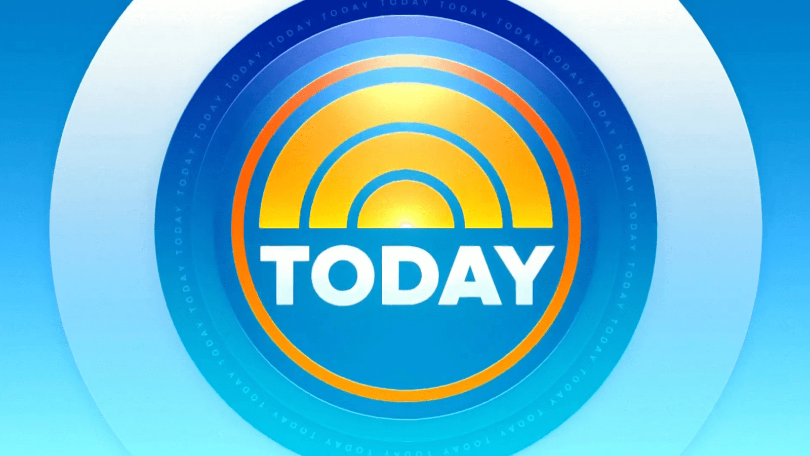
In 2023 the glossy gradient shades of the sun emblem on the Today Show logo gained yellow tones and glossy accents. As for the lettering, it is still set in white, and the background gained more intense blue shades and a geometric pattern with circular elements, making it resemble a camera lens.
Font and color
The bold uppercase lettering from the primary logo of the Today Show is set in a neat geometric sans-serif typeface, which looks pretty similar to such commercial fonts as Integral CF, Grand Wilson, or Sweet Sanstrade, with some minor modifications.
As for the color palette of the Today Show visual identity, its main shades are orange and black, which symbolize passion and excellence, and the secondary colors are white and blue, signifying professionalism and reliability.
