Trivago Logo
Trivago serves as a global hotel search platform. Rolf Schrömgens, Peter Vinnemeier, and Stephan Stubner founded it. They established the company in Düsseldorf, Germany. The platform aims to simplify the process of finding and comparing prices on hotel rooms from various websites.
Meaning and history
Trivago emerged from a small office in Düsseldorf, Germany, its mission: to simplify hotel searches. Three entrepreneurs, Rolf Schrömgens, Peter Vinnemeier, and Stephan Stubner, shared this vision. In 2005, Trivago began as a user-centric hotel aggregator. It stood out by comparing prices from various booking sites. Expedia Group saw potential and acquired a majority stake in 2012, fueling growth. Trivago went public in 2016, a move that underscored its market impact. It’s a go-to platform for travelers seeking hotel deals globally. Trivago’s journey mirrors the evolving digital travel landscape, always focusing on user experience.
What is Trivago?
Trivago is a hotel search engine that compares room prices from various websites. It allows users to find deals on hotels worldwide. The platform is user-friendly, enhancing the ease of planning travels.
2005 – 2007
Looking at the Trivago logo, it combines simplicity with a distinct color scheme. The “t” in a blue, roundel encapsulates the company’s global reach. The rest of the letters are in a lowercase, sans-serif font, emphasizing approachability. The “tri” part of the name is in grey, signifying reliability, while “vago” in orange evokes energy and enthusiasm. The straightforward design aligns with the brand’s user-friendly ethos, suggesting ease in finding travel accommodations.
2007 – 2013
The Trivago logo displays its name with distinct color coding: “tri” in shades of blue, “va” in yellow, and “go” in red. This color division could symbolize various aspects of travel – the blues representing the skies and seas, the yellow perhaps indicating sunny destinations or the variety of options available, and the red for passion and excitement. The logo employs a sans-serif typeface, which is friendly and approachable, and the use of lowercase letters adds a casual, welcoming feel to the brand.
2013 – 2015
The updated Trivago logo presents a more streamlined design with flat colors and no gradients. “Tri” is in light blue, “va” in a solid orange, and “go” in red, each part uniformly colored to enhance clarity and recall. The font is sans-serif, straightforward, and the letters are now two-dimensional, reflecting a trend towards minimalist design in digital branding. The registered trademark symbol at the end signifies Trivago’s established brand status.
2015 – 2023
The Trivago’s logo retains its distinct color triad but softens the hues for a more modern appeal. The ‘tri’ now dons a lighter shade of blue, enhancing approachability. The ‘va’ shifts to a softer, paler yellow, suggesting ease and accessibility, while the ‘go’ sports a less intense red, maintaining visibility but with subtlety. These gentler colors reflect a trend towards user-friendly, digital-first branding, while the clear, sans-serif font remains indicative of the brand’s straightforward approach to hotel search and comparison.
2023 – Today
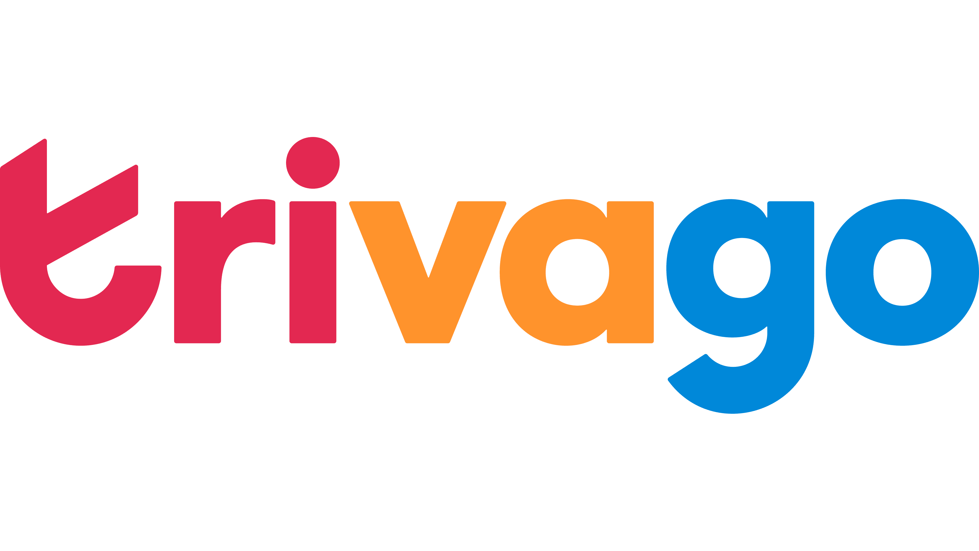
This Trivago logo variation embraces a more vivid color scheme. The ‘tri’ now appears in a deeper pink, transitioning from the previous lighter blue. The ‘va’ part stands out in a brighter yellow, compared to the former orange hue, energizing the logo. The ‘go’ concludes in a more saturated blue, a shift from the earlier red, suggesting reliability. This refreshing color update aligns with modern design trends, aiming to capture attention and symbolize a dynamic, user-focused service.


