Volvo Logo
Volvo specializes in the production of SUVs, buses, sedans, station wagons, and coupes, as well as engines and parts. Early on, Volvo focused primarily on passenger cars, but at the end of the last century, Volvo sold off its passenger car division to focus on commercial vehicles. It has strong partnerships with over two thousand intermediaries of one hundred national companies for promotion throughout the world market.
Meaning and History
The history of the Volvo brand began in 1915 in Sweden. It was founded by former college classmates Assar Gabrielson, an SKF employee, and Gustav Larson. The year 1935 played an important role in its history as the company gained independence. Production ramps up with several open- and closed-top series launched. Ford bought out Volvo Personvagnar, the passenger car division, in 1999. Just a dozen years later, though, the Chinese Geely Automobile became the new owner. As a result, the Volvo brand is now used by two separate companies: The Volvo Group, a manufacturer of commercial vehicles owned by Sweden. Volvo Cars is a manufacturer of vehicles owned by Geely. The word “Volvo” is of Latin origin and means “I roll”.
What is Volvo?
The concern is known for the production of cars and trucks, engines for construction equipment, and buses. The rights to the trademark are held by the country of manufacture of the Volvo machine, Sweden, the Volvo Group, together with Geely.
1927 – 1930
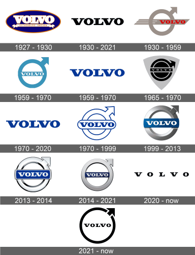
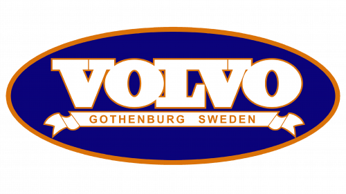
The name of the brand was placed into a blue oval shape with a golden border. The name, which featured bold, uppercase, and white letters, also had a thin golden border. Under the name, there was a banner with the birthplace of the brand.
1930 – 2021
For almost a century, the company used its name as one of its logos. The letters featured slab serifs and thick lines. It was bold and made the company look powerful and strong. The black color gave it a truly timeless look.
1930 – 1959
This was the first time the company introduced a circle with an arrow in the upper right corner pointing diagonally upwards. This Volvo emblem is an ancient chemical symbol for iron. The associations that this emblem is supposed to give rise to are reliability and durability. It had a horizontal strip with diagonally cut ends going through it and holding the brand name on its right end. Thanks to the addition of white strips on this strip, there is some motion in the emblem.
1959 – 1970
1959 – 1970
For quite a long period of time, the brand also used only its name. It was done in bold letters with slab serifs, which gave the logo a confident and professional appearance. The font resembled the inscriptions seen in previous versions. The logo was done in blue color, which is used to stand for trust, loyalty, and security.
1965 – 1970
1970 – 2020
1970 – 1999
The company kept the round emblem as another logo version but without the horizontal strip. The circle and arrow were now white with a blue outline. Across the circle, there was a white banner with rounded corners and a thin blue outline. It features the name written in the same style as the one used separately.
1999 – 2013
The logo was given a more edge and modern appearance. The round emblem now had a 3D appearance and a silver metallic color. The banner that was running across it was no blue while the letters were done in white.
2013 – 2014
There was minimal change in the logo appearance. The circle and arrow now have a lighter shade of gray with darker shadows. The banner with the name also acquired a light silver frame. It looks even more stylish and elegant.
2014 – 2021
The designers played with the same logo and just gave it a slightly different, updated look. There was still a silver circle with an arrow that had a 3D appearance, although it had a less rounded edge. The name was also inside the circle, rather than overlapping it. This made the brand look even more part of the symbolism the circle was meant to represent.
2020 – Today
For just a year, the company tried to use only its name as it did back in 1959. This time, though, it was done in a solid black.
2021 – Today
It looks like the name alone was not a good idea as it brought back the iron symbol that was now strongly associated with the brand. It was a very simple version of it with just a solid black line for the circle and the arrow.
Font and Color
White, blue, and different shades of black served as the main colors of the brand image throughout its existence. The black gave it a formal, powerful, and luxurious appearance, while the white added a touch of perfection. Blue was used to symbolize the trustworthiness of the brand. When it comes to fonts, the company always went for bold, serif fonts. They are all very similar and resemble the Clarendon Text Bold font.
