Warner Bros Logo
Warner Bros. is an American corporation specializing mainly in entertainment. The company produces, distributes and sells numerous different types of media products, including movies, shows and many more things beyond that. The entity was created in 1923 by the four Warner brothers.
Meaning and History
Warner Bros. Entertainment Inc. was established by four Warner brothers: Harry, Albert, Sam, and Jack L. Warner in 1923. The company started as a small film studio but quickly rose to fame with its introduction of the first “talkie” movie, The Jazz Singer in 1927, revolutionizing the film industry by introducing sound to motion pictures. This innovation marked the decline of silent films and positioned Warner Bros. as a leading studio in Hollywood.
Over the decades, Warner Bros. has achieved numerous milestones, including the creation of iconic characters like Bugs Bunny and the development of blockbuster franchises such as the Harry Potter series and the DC Extended Universe. The studio has also been at the forefront of technological advancements in cinema, embracing color film, television production, and digital filmmaking.
Today, Warner Bros. remains a titan in the entertainment industry, consistently producing critically acclaimed films, television shows, and animated features. Its current position reflects a legacy of artistic innovation and commercial success, making it one of the most respected names in global entertainment.
What is Warner Bros?
It is a renowned film and television production company, initially founded by the Warner siblings in 1923. Known for its significant contributions to cinema and television, Warner Bros. continues to be a leading force in the entertainment industry worldwide.
1923 – 1925
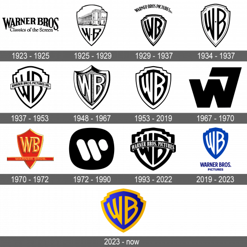
The original logo was the first and the last proper wordmark logo they had (until this point). They basically just wrote ‘Warner Bros.’ in big black letter using an unremarkable serif font. The words were curved upwards, creating an arch of sorts. Beneath, they also put the words ‘classic of the screen’ in a similar, uncurved style.
1925 – 1929
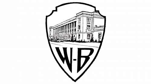
The 1925 logo is the first instance of the WB shield they kept on using ever since. It had a similar shape to the contemporary emblem – tall, with stair-like corners. This one was a black-and-white creation, whose top half was occupied by the drawing of the company’s premises. The bottom held two sharp letters ‘W’ & ‘B, and a dot between.
1929 – 1937
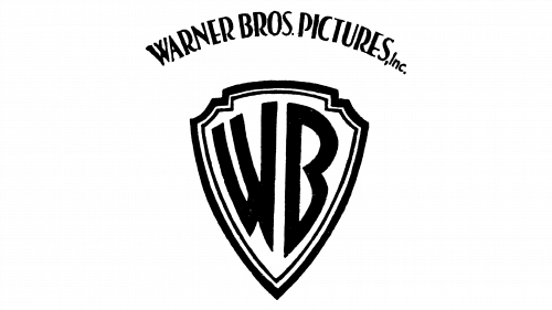
By 1929, they decided the letters should occupy the whole height of the shield. That’s also when they adopted the more-or-less contemporary look for these characters. In this edition, there was also an additional thin line on the inside of the shield’s outline. Moreover, the ‘Warner Bros. Pictures’ wordmark was written above the main emblem.
1934 – 1937
The 1934 logo was largely the same, except the letters aren’t as bold, there’s a dot between the two, and the wordmark above is now gone. This was a secondary emblem, by the looks of it.
1937 – 1953
For this one, they made the emblem wider (including both the shield and the letters), got rid of the dot and instead put an image of a ribbon. On it, they’ve written the same wordmark from the 1929 design.
1948 – 1967
The 1948 design was an attempt to create a pseudo-3D logo. It’s basically the same shield, but they drew the borders of the shield and the letters with much more volume. There was also a good deal of shading (made mostly from black paint and hash strokes). The space behind the letters was grey, while the rest became mostly white.
1953 – 2019
That’s the direct evolution of the 1937 logotype. They got rid of the ribbon and its contents, made the emblem itself a bit narrower and repainted it. The letters, as well as an enlarged shield frame, became white, while the background space turned black.
1967 – 1970
Here’s an experiment they did: they took a normal black ‘W’, but extended its right line and then turned it to the left. Consequentially, if you’d turn it sideways, you’d see something like an unfinished letter ‘B’.
1970 – 1972
Another experiment: this time they used a tall red shield, put the golden letters ‘W’ & ‘B’ in its top (the font was a lot more typical than usual). The bottom section supported a long red bar with the words ‘Warner Bros.’ in wider, small letters of the same golden color.
1972 – 1990
It’s a black square with heavily rounded corners. In its center, the designers put three white diagonal lines, the third half the length of the others. As a result, they got a minimalistic letter ‘W’ made from unconnected figures.
1993 – 2022
The color scheme for this one is inversed (relative to the 1985 design) – the letters became black, and so forth. Moreover, the elements themselves became rather wider than before. And lastly, there’s the old ‘ribbon-with-a-wordmark’ trick in the center of the logo once more – this time featuring a black ribbon with white letters.
2019 – 2023
The logo introduced in 2019 uses the 1985 design as basis. However, it uses just the black space with letters in it, without the framing. The black is also replaced with deep blue in this one. There’s also a ‘Warner Bros. Productions’ wordmark that uses a darker blue shade. It’s below the main emblem.
2023 – now
The recently introduced logo bears a close resemblance to the one utilized from 1993 to 2022, albeit with a few subtle changes in color. It features a base executed in a blue gradient, with the initials and border highlighted in a rich golden hue. Additionally, the designers opted to eliminate a banner previously stretching across the shield, giving prominence to the initials. This timeless design, commemorating the anniversary, was crafted by Chermayeff, Geismar, and Haviv.
