Welch’s Logo
Welch’s (aka Welch Foods) is a sizeable American producer of fruit products. They mostly make snacks using the juice of the fruits – primarily grapes. But there are also lines of Welch juices, soft drinks and snacks made out whole products. They are considered the top brand of their field in America.
Meaning and History
The company was started by the Welch family back in 1869, hence the name. That makes them amongst the oldest snack producers in the country. In the 1950s, they’ve become a subsidiary of a large grape growing conglomerate, the ‘NGCA’, which prompted them to use more grape as raw material.
1910 – 1947

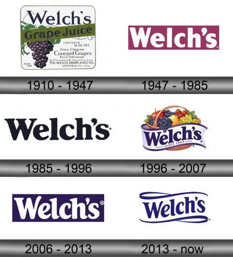
In 1910, Welch’s introduced the first emblem that could be used on the merchandise. However, it was really more of a booklet – a square space with an image of a grape cluster below the company’s name written in the purple color and the name of the product they used to make exclusively then – ‘Grape Juice’.
There is also a lot of additional information meant for the buyer’s comfort – this emblem was mostly used as a label for the grape juice by Welch, as you could guess.
1947 – 1985

This was the first real company logo – a lilac rectangle with the white word ‘Welch’s’ in it in largely the same style as today: a bunch of wide, thick letters with some lack of uniformity.
1985 – 1996

In 1985, they actually adopted the now-iconic look of the company’s emblem – at least for the written part. This logo was just a black brand name. They added some serif and reworked the letters to make them look softer and more fluid.
1996 – 2007

The 1996 saw a sudden shift in style. They decided to opt for an archaic, nostalgic emblem style. It was a basket of various fruits (with grapes occupying a good third of the space), encircled by a white ribbon with purple rim.
On the ribbon was the now-usual style of the brand’s name, written in purple this time. Below it was also a small text addition, ‘since 1869’ – referring to the year when the enterprise started.
2006 – 2013

The 2006 logo was the written brand’s name once more, although with some alterations in regards to the letters. This time, they were white, and the rectangle where they put the thing was purple (after grapes, of course).
2013 – present

The 2013 emblem was visibly inspired by the 1996 emblem, although this one was simpler and lost the basket. The ribbon was still there, and the layout mostly stayed (except for the ‘since’ part).
Emblem and Symbol
Although the main color has been purple for many decades now, it’s not uncommon to see the black and blue variants. The choice behind the purple is likely prompted by the owners, who make their fortune growing grapes.
Alternatively, they also sometimes place the whole fruit basket behind the main emblem, although it’s not that common


