Yahoo Logo
Yahoo is a venerable and hoary internet corporation that once reigned supreme as a prominent web portal and search engine during the earlier years of the cyberspace era. The firm, founded in the antediluvian times of the internet in 1994 by Jerry Yang and David Filo, offered a variety of services, such as email, news, finance, and sports, to name a few, to users worldwide.
Meaning and history
The moniker “Yahoo” derives from the abbreviation for “Yet Another Hierarchical Officious Oracle.” The company’s co-founders, David Filo and Jerry Yang, initially created Yahoo as a hobby while studying at Stanford University in 1994. It began as a web directory of other websites that were manually curated by the founders and organized hierarchically by topic. However, it rapidly evolved into a global internet company and one of the most prominent brands of the dot-com era.
In the early years, Yahoo’s primary source of revenue was advertising, and it quickly became one of the most visited websites on the internet. As the company grew, it expanded its services beyond search and into email, news, finance, and other areas. Yahoo was also known for its acquisitions, such as the purchase of the popular web hosting service GeoCities in 1999. Nevertheless, Yahoo’s fortunes began to wane in the early 2000s, and it struggled to compete with emerging tech giants like Google and Facebook. In 2016, Yahoo was acquired by Verizon Communications and was merged with AOL to form a new company, Oath Inc.
Despite Yahoo’s tumultuous history, its legacy lives on as a pioneer of the internet and a symbol of the dot-com boom and bust. Its story serves as a cautionary tale of the risks and rewards of entrepreneurship and the constantly evolving landscape of technology. Today, the Yahoo brand still exists as part of Verizon Media, and its websites and services continue to be used by millions of people worldwide.
What is Yahoo?
Yahoo, an aged internet firm founded by Jerry Yang and David Filo in 1994, once reigned supreme as a leading web portal and search engine. It offered various services like email, news, finance, and sports. Despite pioneering contributions, Yahoo faded into obscurity, losing its luster to more innovative technology companies.
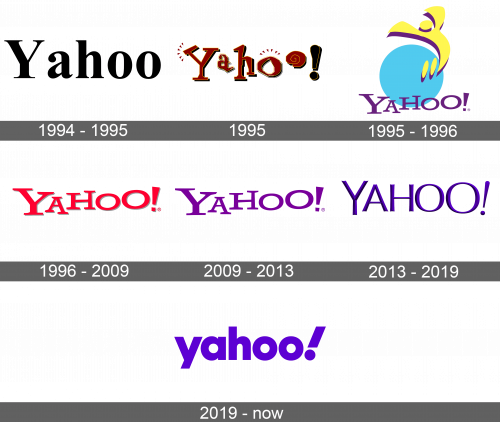
1994 – 1995
Upon creating a website directory platform, Jerry Yang and David Robert Filo appeared indifferent to the notion of brand identity. Consequently, their initial Yahoo emblem presented itself in a rudimentary guise, sporting conventional black lettering, set in the celebrated Times New Roman font.
1995
During the year 1995, the enterprise augmented the appellation by appending an exclamation point to circumvent any likeness with the homonymic producer of sauce named Yahoo. The wordmark underwent a makeover wherein the characters were painted in a combination of crimson and amber hues, with an irregular and unsteady arrangement. Additionally, the edges were encircled with a dim outline, with the exclamation point being situated at the tail end. This particular rendition remained in circulation for a duration of five lunar cycles.
1995 – 1996
During the latter half of 1995, the Jumping Y Guy logo came into being, devised by David Shen, who was the seventeenth worker at Yahoo. The curvilinear yellow “Y” signified a diminutive male leaping with delight, owing to Yahoo’s help in finding whatever he required. The blue circle backdrop represented the Earth. In the same year, the organization hired an eco-friendly ad firm to refurbish the logo, intending to make it horizontal instead of vertical. To accomplish this, the phrase “Yahoo!” was appended to the bottom of the circle. The lead designer Kevin Farnham chose the Able font and raised the final letters, the ascending word connoting dynamism.
1996 – 2009
During the latter part of the 1990s, a reworked logo was unveiled. The creators eliminated Jumping Y Guy, leaving just the wordmark. The typography was changed to a vibrant shade of red with a delicate, faint, light gray outline.
2009 – 2013
In 2009 Yahoo launched an epic campaign to revamp its platform, including a repaint of its name. The brand opted for a palette centered on the color purple, giving a fresh, modern look to its classic 1995 emblem. Unlike its previous versions, the new logo is devoid of shadows and outlines, lending it a more contemporary and minimalistic feel.
2013 – 2019
In 2013, the illustrious CEO of Yahoo, Marissa Mayer, took the helm of the company’s redesign efforts. Despite her limited Adobe Illustrator expertise, she enlisted the in-house design squad to concoct a fresh logo in a mere weekend. The outcome was a modified emblem that preserved the purple chromatic scheme, implemented a sans-serif font, and incorporated a subtle gradient for a three-dimensional effect. The solitary conspicuous alteration was the 9-degree slant of the exclamation mark.
Nevertheless, Mayer’s proclivity for micromanagement and her fanatical control over the redesign process provoked reproach. Her conduct even triggered the departure of the manager and chief designer responsible for selecting a new hue for Yahoo Mail. Some regarded the redesign as unnecessary, executed merely for the sake of change rather than advancement.
2019 – today
Towards the end of 2019, Yahoo enlisted the help of design agency Pentagram to streamline its branding. The experts advocated for striking lowercase letters and opted for a modified version of the Centra No. 2 font. The exclamation mark at the end serves as a symbol of amplification.
Color
From 2003 onwards, Yahoo has consistently used various shades of purple in their branding. A popular legend suggests that this color choice was influenced by David Robert Filo, who had apparently purchased a large amount of lavender paint for Yahoo’s offices, forcing the company to adopt this color as part of their corporate branding.
Font
The emblem creators opted for the Centra No. 2 Extrabold and subtly altered the shape of the characters. The exclamation mark was given a 22.5-degree inclination. The letters appear more compressed and geometric in comparison to the previous design.


